
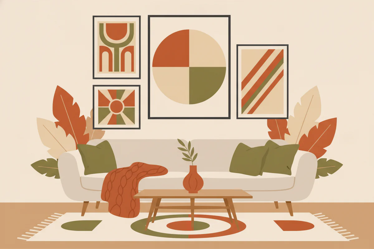
Why autumn palettes feel different this year
There's a shift happening in how people are using fall color at home. A few years ago "autumn decor" basically meant orange pumpkins and plaid throws. What's showing up now is more considered - deeper rusts that read almost terracotta, olive greens that sit somewhere between sage and army, and warm neutrals that aren't beige so much as raw linen or dried grass. These tones feel seasonal without screaming Halloween aisle.
The useful thing about this particular group of colors is that they layer well. Rust and olive, for instance, are both mid-saturation colors from opposite sides of the warm spectrum, so they create tension without clashing. Add a warm neutral - something in the oatmeal-to-wheat range - and the whole combination settles. It's the kind of palette that works in a living room that isn't being redesigned, because each color has enough warmth to connect to what's probably already there.
Breaking down the combinations that actually work
Rust + warm white + a touch of raw umber
This is probably the most transferable of the autumn combinations because it doesn't require anything in the room to be particularly dark or dramatic. Rust is doing the heavy lifting as the focal color, warm white keeps it from feeling heavy, and raw umber (that deep brown-orange that shows up in dried oak leaves) grounds it. If your room already has any wood furniture, light wood floors, or cream walls, this palette is going to land without any effort.
In wall art, this combination works beautifully in botanical prints - dried grasses, pressed leaves, close-up seedpod studies. Also in abstract work where the color relationships are doing the composition rather than a recognizable subject. The key is that the rust reads as a proper color, not a brownish-red fudge.
Olive + warm gray + soft terracotta
Olive is doing something interesting in interiors right now. It used to be reserved for kitchens with butcher block and open shelving, but it's moved into living rooms and bedrooms in a way that feels less trend-dependent. Paired with warm gray (not cool, not blue-toned - it has to lean toward greige or stone) and softened with a faded terracotta, it produces something that feels genuinely autumnal without being loud.
This is the combination I'd reach for in a room that already has a cooler palette and needs warming up. The olive does the bridging work - it's not demanding the whole room shift, it's just nudging the temperature. A single large print in these tones on a light wall can genuinely change the feel of a space. That's not hyperbole, it's just that warm color in a cool room creates contrast that reads fast.
Deep ochre + charcoal + natural linen
This one's a bit bolder. Ochre - the yellow-gold end of the autumn spectrum rather than the red end - paired with charcoal creates high contrast that still feels warm. The linen tone (think undyed fabric, raw canvas, the color of a dry corn husk) is what stops it from feeling stark. Together they produce something that has energy but isn't aggressive.
It works particularly well in rooms with darker paint or dark wood because the ochre carries even in low light. And in rooms with a lot of white, it introduces enough weight to feel intentional. Landscape photography often hits this palette almost accidentally - golden hour light on a field, for instance, will give you ochre and charcoal and every neutral in between.
Using wall art to introduce the palette without repainting
Repainting is a commitment most people aren't making in September. The practical value of autumn color palette wall art is that a well-chosen print does a lot of the palette's work on its own - you're introducing the color within a frame rather than across an entire surface, which means the risk is low and the effect is actually significant.
A 30x24 inch print in a rust and olive palette, hung above a neutral sofa, will pull warmth into a room the way a plant does - it's a contained gesture that changes the read of the whole space. You're not committed to rust walls. You're just committed to this print, and if it stops working in spring you swap it out.
A few things worth knowing practically: framing choice matters a lot here. A natural wood frame - light oak or walnut depending on the palette - will reinforce the warmth. Black frames can work with the ochre-charcoal combination but tend to fight with softer rust and olive pairings. And size is worth getting right; a print that's too small in a large room won't anchor anything, it'll just look like an afterthought. For most living room walls, anything under 20x16 is going to underperform.
If you're unsure where to start, browsing by color family rather than subject matter is actually more efficient. EnjoyPoster's autumn wall art collection is organized in a way that makes it easier to find prints that hit specific palette ranges - useful when you know you want rust-and-olive but you're not sure whether you want it in a botanical print or an abstract.
A note on mixing prints (because most rooms need more than one)
If you're hanging more than one piece, the palette approach becomes even more important - and also more forgiving. Two prints that share even one color from the same autumn palette will read as intentional even if the subjects are completely different. A close-up botanical and an abstract landscape can share a wall if both have that same dusty olive in them. The eye finds the connection and treats it as a decision rather than an accident.
What doesn't work: mixing a warm autumn palette print with something that has cool blues or true greens without any warm tones. That's not a gallery wall, that's two different rooms arguing with each other. The fix is usually just swapping one piece, not starting over.
Autumn palettes in particular are good for this kind of mixing because the colors have natural variation built in - rust can go from a light paprika to something almost mahogany, olive from bright khaki to deep forest, and they'll still read as part of the same family. You have room to work with.
The whole point of working with a seasonal palette rather than just buying art you like is that you end up with something that feels considered. It doesn't have to be difficult - pick your anchor color, find something in that range that you'd genuinely want on your wall, and let the palette do the rest of the coordinating for you.


