
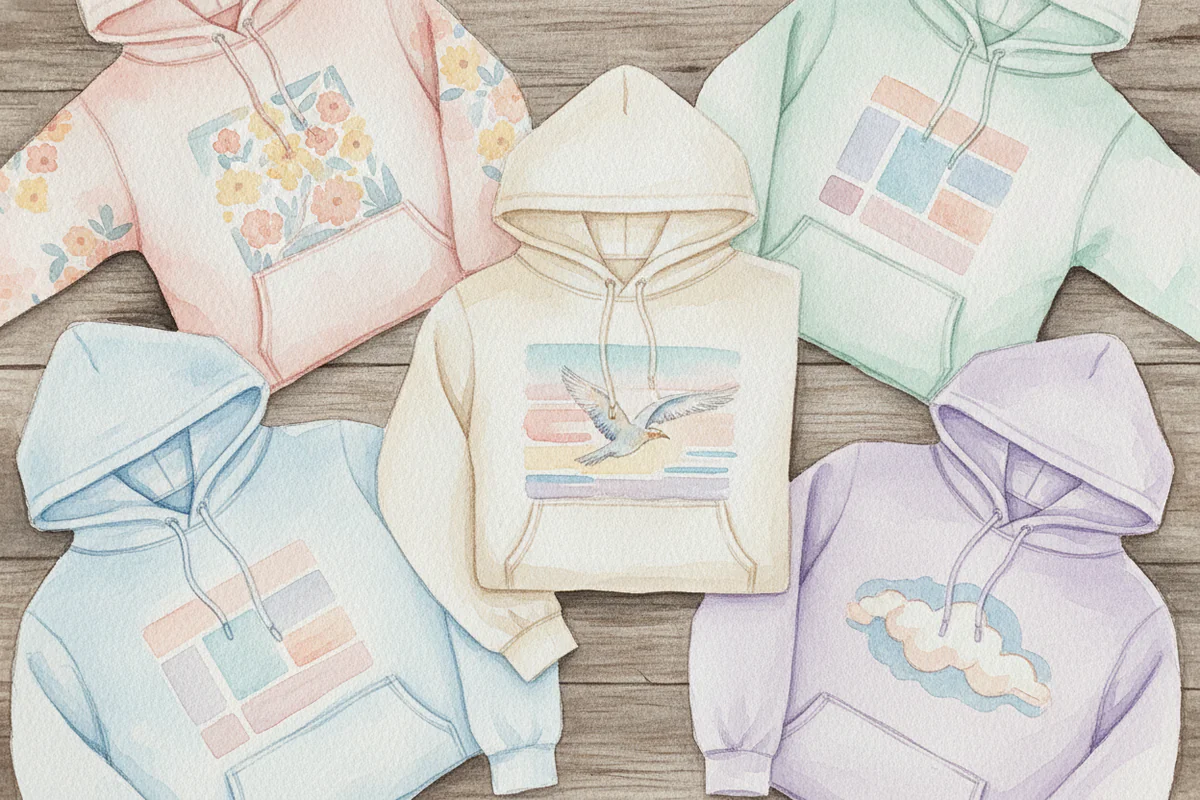
The base color does more work than you think
Most people pick a graphic first and then grab whatever hoodie is available. Which is fine, but it explains why so many graphic hoodies end up looking muddy or weirdly flat once you're actually wearing them. The base color isn't background noise - it's doing half the job. It sets the contrast level, affects how colors in the print read, and can either make a loud design feel intentional or make it look like it's fighting for space on a too-busy canvas.
So here's a breakdown of which base colors actually work for bold graphic prints, and a few that quietly sabotage them.
Black: the obvious one that's obvious for a reason
Black is the default for graphic hoodies and it earns that status. Any color you print on black - red, yellow, white, neon green - reads at full saturation. There's no bleed, no visual noise from the base, nothing competing. If your print has a lot of white or light tones in it, black is genuinely the strongest choice you can make.
Where black starts to fail is with dark prints. Navy lettering on black, deep burgundy illustrations, dark forest green line art - all of it gets swallowed. The print is technically there, but nobody's seeing it. So black works best when the graphic itself skews light or multicolor with a lot of brightness in it.
White and off-white
White hoodies get underestimated. They give a graphic print a clean platform, especially for designs that have black ink, dark outlines, or a lot of fine detail. Line-based art - think vintage botanical prints, dense illustration work, anything with a lot of crosshatching - reads incredibly well on white because every thin stroke stays legible.
Off-white or cream is actually better in a lot of cases. Pure white can flatten certain ink colors, making reds look slightly orange and blues look harsher than intended. Cream softens that. It also makes the whole thing feel a bit less clinical, which suits certain graphic styles (hand-drawn stuff especially) better than a stark white does.
The one thing to watch: if your print has a lot of white space built into the design, white or cream can make the edges of the graphic disappear. You need contrast between the print and the base, and when both share the same color that contrast vanishes.
Slate gray and heather gray
Gray is genuinely versatile in a way that doesn't get said enough. Heather gray especially - the slightly textured, slightly variegated look of it - gives a print some visual separation without the starkness of white or the heaviness of black. It works well with prints that have a vintage or faded quality, because the base adds to that feeling rather than contradicting it.
Slate gray (the darker, cooler version) is good for prints with a lot of bold color. The base is neutral enough to stay out of the way but has enough depth that it doesn't make pale ink colors look washed out. It's a more interesting choice than black for someone who still wants a dark base but doesn't want to go full streetwear-default.
Navy blue
Navy is one of those colors that punches above its weight as a base. It reads as dark without being as flat as black, which means prints with white, yellow, orange, or light blue tones in them tend to pop very well. There's also something about navy that suits a wider range of graphic styles - it works with athletic graphics, with retro-style artwork, with simple typographic designs, with detailed illustrations.
Where to be careful: any print that features navy or dark blue within the design will obviously disappear. And some reds can read slightly cooler or more purple-ish against navy than they would on white or black. Worth checking if color accuracy in the print matters to you.
Washed or faded colors (olive, dusty rose, faded terracotta)
These are the interesting ones. A washed olive or a faded terracotta base doesn't feel like a neutral, but when paired with the right print it gives the whole thing a cohesive, almost editorial look. The trick is that the print needs to either pick up tones from the base color or deliberately contrast it. A graphic with ochre, rust, or tan in it on a faded olive base can look really considered. A neon green graphic on that same base is going to look like an accident.
Dusty rose gets slept on for bold graphics. If the print has strong black or dark navy outlines, that ink sits really well against a muted pink-beige base. It's not a typical streetwear move but it reads as intentional in a way that a lot of the default color choices don't.
Colors that tend to cause problems
Royal blue, bright red, and Kelly green bases are all difficult. The base color itself becomes part of the visual noise, and unless the graphic has been specifically designed to work against that color, there's going to be competition rather than contrast. These colors can work, but they need a graphic that's almost entirely black or white to have any chance of reading cleanly.
Same goes for yellow - it's a hard base for almost any print because it already demands attention and most ink colors either clash with it or look sickly on top of it. Bright yellow with a black graphic is actually fine. Everything else is a gamble.
A few specific pairings worth trying
- Heather gray base + vintage-style multicolor print with a distressed or faded look
- Black base + any graphic with strong white or neon elements
- Off-white base + dense line art or black-ink illustration
- Navy base + bold typographic print in white or orange
- Faded terracotta base + graphic with earthy tones and strong dark outlines
- Slate gray base + a print with a lot of saturated color and no gray in the design itself
If you're building a wardrobe of graphic hoodies rather than just buying one or two, it's worth thinking about the base color as a consistent logic - pick two or three neutrals that work for your collection and let the prints vary, rather than buying every hoodie in the most vivid base color option available just because it looks bold on a product page.
Anyway - the best place to start is with a graphic you actually want to wear, then work backwards from there. Browsing graphic print options by style or theme makes it easier to narrow down which base tone is going to suit the design rather than guess at it in the abstract.
The one thing I'd push back on is the idea that safe neutral bases are boring. Black, gray, and navy are defaults for a reason - they make the print the point. And that's usually what you want.


