
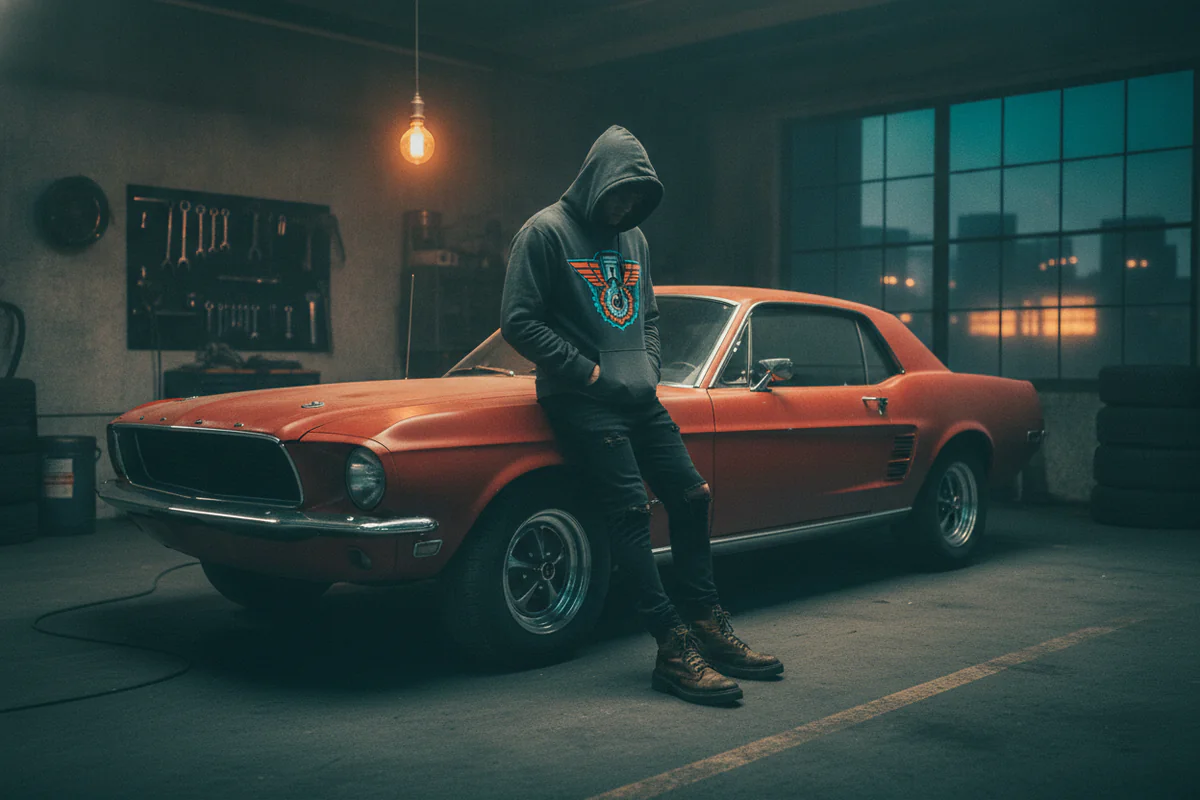
Somewhere between the rise of Japanese bosozoku fashion in the 80s and the Supreme-era obsession with motorsport imagery in the 2010s, cars stopped being just subject matter for garage posters and became actual graphic language in clothing. A car-print hoodie today sits in a very different cultural space than the free Castrol fleece your uncle got at a trade show - but the gap between "intentional" and "promotional item" is still easy to fall into if you're not thinking about it.
This is about closing that gap.
Why automotive graphics work in streetwear now
Graphic streetwear has always borrowed from subcultures with strong visual identities - skate, punk, hip-hop, military surplus. Car culture has one of the strongest visual identities going, partly because it developed independently for decades across so many different scenes. American muscle collectors, JDM tuners, Formula 1 paddock regulars, vintage European rally fans - each group built its own aesthetic, and those aesthetics eventually bled into fashion the way they always do: slowly, then all at once.
What makes the current moment interesting is that the references have gotten specific. A decade ago, a "car hoodie" meant a manufacturer logo or a vague speed-line graphic. Now you'll find hoodies featuring exact model silhouettes - a Hakosuka Skyline in profile, a cutaway engine diagram of a flat-six, a 1967 Shelby GT500 rendered in something close to technical illustration style. Specificity is what separates clothing from merch. Anyone can print a logo. It takes actual enthusiasm to nail the proportions on a 917K.
The promotional-item problem
Here's the thing: a lot of car-print hoodies are promotional items. Event sponsorship apparel, manufacturer giveaways, racing team fan gear - most of it is designed to advertise, not to be worn with intention. The graphic is loud and centered, the brand name is as large as the image, and the colorway is whatever the sponsor uses in their style guide.
Wearing that kind of piece unironically requires a level of confidence most people haven't earned yet, and even then it usually works better as a single archival piece than as a styling move. The fix isn't to avoid bold car graphics - it's to look for pieces where the graphic is doing something besides advertising.
Signs a car-print hoodie will actually style well:
- The car image is the main event, not a vehicle for a brand name underneath it
- The colorway could exist outside of motorsport sponsorship palettes (earth tones, washed blacks, off-whites, even a good dusty red)
- The print has some graphic sophistication - linework, halftone, a considered composition - rather than a clean product-photo crop dropped onto fabric
- There's no "presented by" language anywhere on it
Some of the best automotive graphic apparel right now comes from independent designers and art-adjacent print shops rather than official manufacturer stores, for exactly this reason. The goal is closer to wearing a band tee than wearing a team jersey - the reference is there for people who know, not announced to everyone who doesn't.
How to actually wear it
The instinct with a graphic hoodie is to neutralize everything around it - all-grey everything, white sneakers, jeans that disappear. That works, and it's fine, but it also produces the most forgettable possible version of the outfit. A few slightly less obvious moves:
Match the era of the car, not just the color
If the print features something from the 70s - a Datsun 240Z, a Ferrari Dino, a classic Porsche 911 - vintage-adjacent clothing makes the whole thing feel considered rather than random. Straight-leg or slightly flared trousers instead of slim jeans. A coach jacket layered over instead of a tech fleece. Suede sneakers or even leather loafers if you're going that direction. The outfit and the graphic start telling the same story.
For something more modern - a GT3 RS, an EV with sharp bodywork, something with carbon fiber in the design language - cleaner and more technical clothing reads better. A structured bomber, slim cargo pants, clean low-profile trainers.
Let it be the only loud thing
A detailed car graphic is already carrying a lot of visual weight. Fighting it with another loud pattern, a branded cap, and heavily distressed jeans turns the outfit into noise. The hoodie earns more attention when the rest of the outfit is relatively quiet. This isn't about dressing down everything else - quality basics and clean silhouettes aren't "boring," they're contrast.
Layering without burying the graphic
Open layers work better than closed ones here. An unbuttoned overshirt, an open zip-up jacket, a loose canvas chore coat - anything that lets the hoodie show when you move or when the outer layer falls open. Zipping a puffer all the way up over a graphic hoodie in November is completely practical and also defeats the purpose of having an interesting hoodie.
Anyway - sizing matters more than people admit with graphic pieces. A hoodie that's slightly oversized puts the graphic in a better position on the chest and makes the whole thing look more deliberate than a fitted one that stretches the image across your torso.
Where car prints and wall art converge
One thing worth saying: the same impulse that makes a well-drawn automotive graphic compelling on a hoodie makes it compelling on a wall. The linework, the subject, the sense that someone spent real time getting the proportions right - that translates. If you're already thinking about car wall art for a room or garage, the visual language overlaps more than you'd think, and it's worth treating both as extensions of the same aesthetic rather than separate categories.
Not a hard sell, just an observation - but the people who care about what's on their hoodie usually care about what's on their walls too.
A few things worth avoiding
Besides the promotional-item problem already covered:
- All-over prints that tile a car image across the entire fabric - they almost never work outside of very specific fashion contexts, and even then they're difficult
- Hoodies where the sleeve, chest, and back all have different competing graphics from the same car or brand - busy without adding anything
- Color-matched sets where the hoodie and the sweatpants both have the same car graphic - this is a costume, not an outfit
And honestly - flame graphics. Just leave those in 2004.
Car print hoodie style works best when it's specific, edited, and worn by someone who clearly knows what the car is. The reference doesn't need to be explained, and it shouldn't need to be. If someone walks up and asks what kind of car is on your hoodie, and you can actually answer them, you're doing it right.


