
The man cave assumption
Somewhere along the way, car art got filed under a very specific category of room: dark, basement-adjacent, possibly featuring a mini fridge and a dartboard. And sure, that room exists and people love it. But it meant that anyone who wanted to hang a clean print of a 1960s Ferrari in their hallway or a minimal racing poster in their home office felt like they were doing something slightly embarrassing. That assumption is worth dropping.
The subject matter - cars - does not determine whether something belongs in a grown-up room. The art direction does. A high-contrast black-and-white photograph of a vintage Le Mans racer, matted and framed against a white wall, reads the same way a good architectural print does. The content is automotive; the effect is just calm, interesting wall art.
What makes car art work in a real room
The pieces that end up looking out of place usually have a few things in common: heavy use of neon, aggressive typography, or the kind of photorealism that leaves nothing to the imagination. Those are fine in a dedicated hobby space. In a dining room or a study, they fight everything else in the room for attention and mostly win - not in a good way.
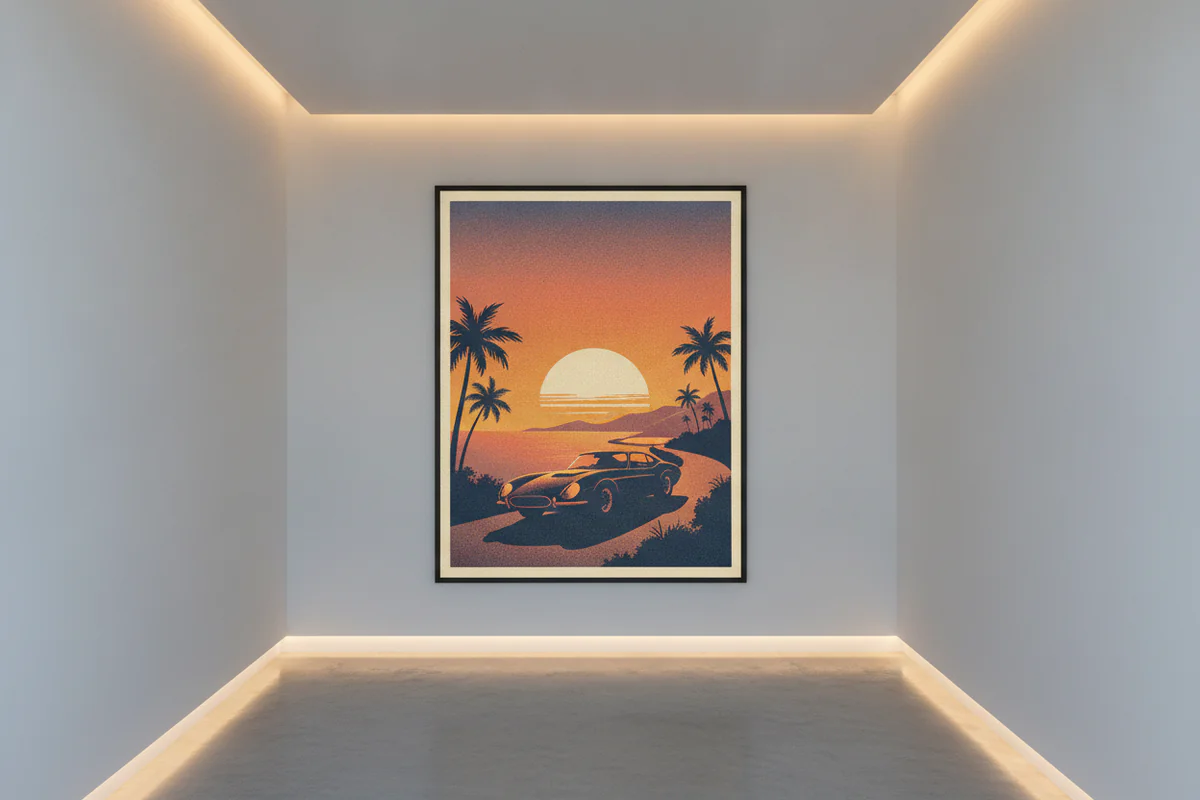
What works instead tends to be restrained. A single car, shot from an interesting angle, in a limited palette. Illustrations with some negative space. Vintage race posters that lean graphic-design rather than advertisement. The car is the subject but the composition is what's actually doing the work.
Color matters more than people give it credit for. A warm ochre and cream print of a classic roadster will sit happily in a room with timber furniture and linen. The same subject rendered in cold blue-grey works in a more contemporary space with concrete or steel surfaces. The car is almost secondary to whether the tones in the print agree with the room.
Room by room - where it actually fits
Home office
This is the most obvious upgrade from the man cave, and honestly the easiest one to get right. A home office is already a personal space; putting something on the wall that reflects a genuine interest looks intentional rather than themed. One larger print on the wall behind a desk - something with a horizontal format and some visual breathing room - tends to work better than a cluster of smaller pieces. You're on video calls in that room. A well-chosen automotive print in the background is a conversation starter about twice a week, which is probably enough.
Hallway
Hallways are underused. Most people put a mirror and call it done, which is fine, but a vertical or square print with real graphic impact can turn a hallway into something worth walking through. The narrow format actually suits a lot of car photography - a tight crop of a hood, a close detail of a wheel arch, a long perspective shot down a straight. These are images that reward a few seconds of looking, which is exactly what you get in a hallway before you go do something else.
Dining room
This one surprises people, but think about what hangs in most dining rooms: still lifes, landscapes, something vaguely botanical. The goal is a piece that's interesting but not agitating, that doesn't demand to be talked about at every meal. A beautiful illustration of a classic car - something with a vintage poster quality - fits that brief. The subject is specific enough to be interesting and graphic enough to read across a room. I'd avoid anything too technically detailed here, the kind of print that only makes sense if you already know the car, because not everyone sitting at that table will.
Living room
Harder, but doable. The living room tends to carry more design weight than other rooms, so the print has to hold its own alongside furniture, textiles, and whatever else is competing for visual attention. Oversized works better here than small - a 30x40 canvas with a strong composition and a restrained palette can anchor a wall properly, whereas a small framed poster on a large wall just looks tentative. And in a living room, the frame matters more than anywhere else. Get that part right and the subject almost doesn't matter.
Framing and format choices
A canvas print reads differently from a framed poster. Canvas has a slightly warmer, more tactile quality and works well in living areas; a poster with a clean white border and a simple frame feels more graphic and suits offices and hallways. Neither is better in absolute terms - it depends on the room and the print itself.
Size is where people most often go wrong. They buy something too small because they're uncertain about committing to car art in a proper room, and then it looks exactly as uncertain as the decision felt. If the wall calls for a 20x16 minimum, go there. If it calls for bigger, go bigger. A print that fills the space with confidence looks considered; one that floats in the middle of a large wall looks like a placeholder.
For anyone browsing options, the car art prints at EnjoyPoster include both canvas and framed poster formats, with sizes up to 40x30, which is enough to work properly in most living room and dining room contexts.
One print or a gallery wall
Gallery walls with an automotive theme can work, but they're harder to pull off in a non-dedicated space. The risk is that six car prints together read as a collection - which is fine in a garage office, less so in a living room where it starts to look like a theme park. One strong piece tends to read as design. Multiple pieces tend to read as hobby. If you want more than one, separate them into different rooms rather than clustering them, or mix the automotive prints with unrelated art so the subject doesn't dominate.
There's nothing wrong with being enthusiastic about cars - the point is just that the room shouldn't look like it's about cars. It should look like it's lived in by someone with good taste who happens to find them interesting. That distinction is small but it's everything.


