
The gap between the research and the Pinterest caption
Color psychology gets quoted constantly in home decor content, and most of it traces back to a surprisingly thin chain of sources. A study done in a hospital in the 1990s becomes "blue lowers blood pressure," which becomes "blue is calming," which becomes "hang blue art in your bedroom for better sleep." By the time it reaches a blog post, the nuance has been stripped out entirely. So before going room by room, it's worth saying plainly: color affects mood, but the effects are smaller, more conditional, and more personal than most decor advice admits.
What does hold up reasonably well in the research is that color influences arousal level (how activated or sluggish you feel) and, to a lesser degree, valence (whether you feel positive or negative). Warm colors - reds, oranges, bright yellows - tend to increase arousal. Cool colors - blues, blue-greens, desaturated purples - tend to decrease it. That's a defensible baseline. Everything else requires more qualification.
Red: the overhyped one
Red gets described as "energizing" and "passionate" so often that it has become almost useless as a descriptor. The actual picture is more interesting. Research on red and performance is genuinely mixed - some studies found red impaired performance on cognitive tasks by priming associations with failure or danger, while others found it increased physical output in competitive contexts. The setting matters enormously.
For wall art specifically, a single large red piece in a dining room probably does increase appetite and energy at the table - that finding has some replication behind it. But a red-dominant bedroom? Most people report it feels harder to wind down. The issue is intensity. A muted burgundy landscape reads very differently than a high-chroma abstract in fire-engine red, even though both are technically "red." Saturation is doing at least as much work as hue.
Blue: the one everyone recommends, sometimes for good reason
Blue is the most studied color in this area, and the core finding is real: blue environments are consistently associated with lower arousal and, in many studies, slightly better performance on creative or detail-oriented tasks. The mechanism seems to be partly associative (sky, water, open space) and partly physiological, though the physiological side is still debated.
For a home office or a reading corner, blue-toned wall art does have something going for it. The caveat is temperature. A cold, stark blue in a north-facing room that doesn't get much natural light can tip from "calm" into "bleak" pretty fast. Navy or teal, or blues with some grey in them, tend to feel more livable than the kind of bright primary blue you'd see on a safety sign. Pair it with warm wood tones and it stays in the calm-productive zone rather than the depressing-waiting-room zone.
Anyway - the bedroom recommendation is also defensible. Lower arousal before sleep is generally useful.
Yellow and orange: more complicated than "happy"
Yellow is cheerful, obviously. Except at high intensity, yellow is also the color humans are most sensitive to visually, which means a wall saturated in bright yellow is actually somewhat fatiguing to look at for extended periods. The "yellow makes babies cry" claim has been bouncing around the internet for years and probably overstates things, but the underlying point - that high-intensity yellow increases irritability over time - does have some support.
Softer yellows, warm ochres, and golden tones are a different story. They read as warm and inviting without triggering the fatigue response. In a hallway or an entryway, where dwell time is short, they work well. As the dominant color in a room you spend hours in, they ask more of you.
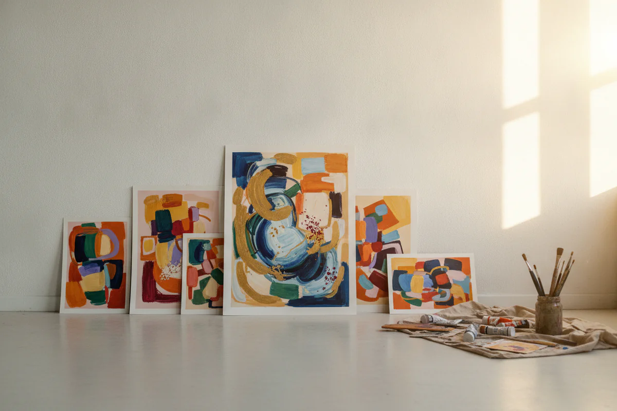
Orange falls somewhere between red and yellow in arousal terms and doesn't carry red's associations with danger. In decor it tends to be used in earthy, muted forms - terracotta, rust, amber - where it feels grounding rather than stimulating. A warm abstract print in these tones can anchor a living room without pushing the energy too high.
Green: the one the research is actually warmest on
Of all the color-mood claims, the green-and-nature connection has the most consistent backing. "Biophilia" - the idea that humans respond positively to natural environments - is a real and well-replicated phenomenon, and green is central to it. Studies on attention restoration consistently find that exposure to natural scenes, even in photograph form, reduces mental fatigue. Green doesn't need to mean a plant painting; forest scenes, botanical prints, any imagery with substantial green and organic forms seems to carry some of the effect.
It's also one of the more forgiving colors to actually live with. Unlike red or saturated yellow, green in its mid-range values doesn't push arousal up or down dramatically. That makes it a reasonable choice for rooms where you want a neutral-but-pleasant baseline: a living room, a study, a kitchen.
Purple, grey, and the neutrals
Purple is interesting because its effects seem to split by value. Deep, dark purples - think eggplant, aubergine - are consistently described as heavy and luxurious, and they do seem to increase a sense of enclosure, which some people find cozy and some find oppressive. Lighter lavenders trend toward the blue end of things in terms of perceived calmness. The decor advice to "use purple in small doses as an accent" is actually sound, not because purple is inherently wrong in large quantities, but because the range of reactions to it is wider than most colors.
Grey is worth addressing because it's dominated interior trends for about fifteen years. From a strict arousal standpoint, grey is close to neutral - it doesn't push much in either direction. The mood risk with grey is more about associations with overcast weather and low light than about the hue itself. Grey wall art in a well-lit room with warm accents reads as sophisticated. In a dim room with cool light, it can contribute to a low, flat feeling that accumulates over days without being easy to identify as a problem.
What this actually means when choosing art
The useful takeaway from color psychology for wall art is not a set of rules but a set of questions. How long do you spend in this room, and in what state? A bedroom calls for low arousal; a home gym probably doesn't. What's the existing light like - warm or cool, abundant or sparse? Cool-toned art in a dim north-facing room is a different bet than the same piece in a sun-filled space. And what are your own associations? Someone who grew up near the sea may find blue genuinely calming; someone who associates it with an institutional childhood setting may not.
The decor folklore isn't always wrong - it just treats as universal what is partly individual and partly contextual. Use the research as a rough orientation, not a prescription. Your reaction to a piece after living with it for two weeks is more data than any generalized study.


