
Why staircase walls are genuinely difficult
Most hanging advice assumes a flat, level wall with a stable eye line. Staircase walls have none of that. The floor drops away as you move along it, the ceiling follows the same diagonal, and anyone looking at your arrangement is either walking up or walking down - never standing still at a fixed distance. So the usual "hang everything at 57 inches from the floor" rule, which works in hallways and living rooms, produces a weird floating cluster on a staircase because the floor that 57-inch measurement references keeps changing under your feet.
The result is that most people either give up and hang one large piece at the midpoint landing, or they attempt a grid and quietly hate it for years.
The diagonal-line trick, explained properly
The approach that actually works is treating the stair pitch itself as your invisible guide rail. Instead of measuring from the floor, you draw - literally, with a pencil and a long level, or a chalk line - a reference line that runs parallel to the angle of the stairs. Then you hang the center of each piece along that line, or stagger pieces above and below it in a way that's consistent.
To find your pitch angle: hold a long spirit level against the handrail or the top of the skirting board and trace that slope lightly onto the wall. Most staircases sit somewhere between 30 and 45 degrees. That diagonal becomes your spine.
From there you have two options:
- Single-line hang: Every frame's center sits on the diagonal line. Works well with identically-sized frames and gives a very clean, intentional look. The frames themselves remain level (horizontal) - only their center points follow the slope.
- Staggered hang: Alternate pieces above and below the line, keeping the vertical distance from the line consistent (say, 4 inches above or below). This suits a mix of sizes and feels less regimented.
Either way, the frames stay parallel to the floor. Tilting frames to match the staircase angle is a fairly common instinct and it almost always looks wrong - it just makes everything feel seasick.
Spacing rules for a long run of stairs
Spacing is where most staircase gallery walls fall apart, especially on a long staircase with 12 or more steps. The tendency is to spread pieces out too much because the wall feels big. Then you end up with a sparse row of frames that look like they're avoiding each other.
A practical rule: keep horizontal gaps between frames between 3 and 6 inches. Less than 3 and the frames start to feel cramped; more than 6 on a staircase wall and the arrangement loses cohesion because the eye has too much plain wall to skip across before finding the next piece. On a staircase specifically, that skipping motion is amplified by the fact that you're moving while you look at it.
Vertical variation matters too. If you're doing the staggered approach, keep the vertical offset modest - 4 to 8 inches from your center line in either direction is usually enough. Push it further and the arrangement starts to look like pieces fell off the wall at random intervals.
One more thing worth knowing: the bottom step's eye level and the top step's eye level can differ by 4 or 5 feet on a typical residential staircase. So it's genuinely impossible to optimize for both. Aim for the midpoint of the staircase as your primary viewing position - that's where people pause, and where the arrangement should look best.
Why symmetric grids fail on diagonal walls
A symmetric grid - three rows of four frames, all the same size, evenly spaced - looks good on a flat wall because symmetry and the horizontal floor line reinforce each other. On a staircase, the diagonal cuts across any grid you impose. The top-left corner of your grid ends up at a different height relative to the stairs than the bottom-right corner, and the whole thing reads as slightly off, even if you can't immediately articulate why.
It's a bit like trying to hang a grid on a wall that's been built at a slight angle. The grid is geometrically correct but contextually wrong.
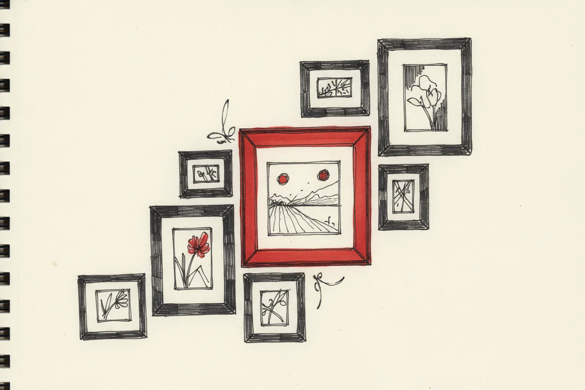
What works better than a grid is a loose constellation - varied frame sizes, consistent spacing, and that diagonal center line doing the structural work invisibly. The arrangement looks organic but it doesn't look accidental, which is what you're after. And honestly, a mix of portrait and landscape orientations helps too, because the varying shapes give the eye something to move through rather than just counting identical boxes.
Practical stuff before you start hammering
A few things that save time and nail holes:
- Cut paper templates of every frame and tape them to the wall first. Step back, walk the stairs, live with it for a day. The arrangement that looks good when you're standing on a step 8 feet away often looks different from the bottom of the stairs.
- Use a laser level if you have one - projecting a straight diagonal line across the wall for 30 seconds is much easier than a chalk line, which you then have to erase.
- On plasterboard walls, try to hit studs for anything heavier than about 3kg. Staircase walls sometimes have unusual stud placement because of the structural requirements around the staircase itself, so it's worth checking before you commit.
- Start hanging from the middle of your arrangement outward, not from one end. If you start from the bottom step and work up, any small cumulative error gets worse as you go.
Choosing the actual art
Size matters more on staircase walls than most people realize. A frame that looks perfectly proportioned on a bedroom wall can look toy-like on a tall staircase wall, especially if the ceiling above the stairs is high. As a rough guide, nothing smaller than 16x12 inches for a standard residential staircase, and anchor pieces - the ones you hang near the landing or at the visual midpoint - should probably be 24x18 or larger.
Subject matter is worth thinking about too. Staircase walls get a lot of glancing traffic rather than sustained attention, so high-contrast images and prints with clear focal points tend to read better than busy or very detailed compositions. Botanical prints, architectural photography, and simple typographic pieces all work well. Abstract work can work but it benefits from being larger so the shapes register quickly.
If you're still figuring out what to put up there, browsing wall art prints by room and style is a reasonable starting point - it's easier to think about scale and composition when you can see the actual piece rather than imagining it.
The staircase wall is one of the few places in a house where people experience art in motion. They're walking, their angle changes, the light shifts as they move. Getting the arrangement right takes more planning than a living room gallery wall, but when it works it's one of the most satisfying things to get right in a home - because it rewards people every single time they use the stairs.


