
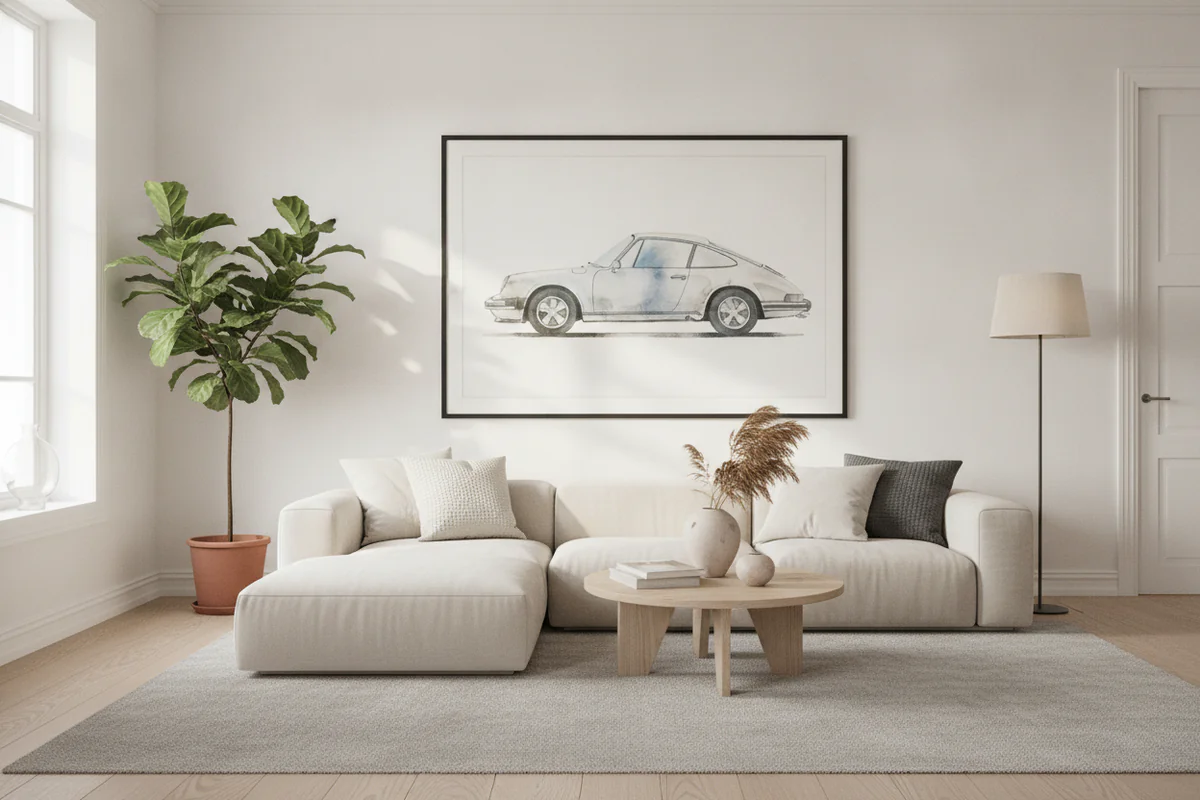
Car-themed decor living room setups have a reputation problem. You've seen the version that goes wrong: a dozen pieces fighting for attention, a neon sign, a novelty license plate strip along the baseboard, maybe a clock shaped like a steering wheel. It reads less "I have good taste" and more "I haven't changed anything since 2003." The problem isn't the subject matter. It's all the decisions made around it.
Cars are genuinely beautiful objects - the curves on a 1960s Ferrari, the brutal geometry of a Group B rally car, the graphic simplicity of a Le Mans poster from the early seventies. That stuff can absolutely hold its own on a living room wall. The question is how you frame it, literally and figuratively.
The volume problem
The most common mistake is treating the wall like a collection display rather than a designed space. Someone buys five prints, then a canvas, then finds a cool vintage poster at a market, and suddenly the entire wall is automotive. Each piece might be fine on its own. Together they cancel each other out - the eye doesn't know where to go, so it just moves on.
One strong piece in the right spot does more work than six scattered ones. A large format print of a classic racing livery, hung at eye level with breathing room around it, commands the room. People notice it. They say something about it. That's the goal.
I'd say the sweet spot for most living rooms is one anchor piece - something 24x18 or larger - and then genuinely nothing else car-related on the same wall. Let it be the thing. If you have other automotive pieces you love, put them somewhere else in the house. A hallway, a home office, a reading corner. Spread them out so each one gets its moment rather than all of them competing at once.
Why mismatched styles kill the effect
This one's subtler but just as damaging. A vintage-style hand-lettered race poster next to a high-gloss photograph of a modern supercar next to a cartoonish illustration of a Route 66 Mustang - they share a theme but they don't share a visual language. The mix reads as random rather than considered.
If you're drawn to the archival aesthetic - muted palettes, retro typography, old race circuits - stay in that lane. If you want something graphic and contemporary, look for pieces that share that tone. The consistency doesn't have to be rigid, but there should be a reason the pieces feel like they belong in the same house.
The same applies to framing. A thin black metal frame, a chunky barnwood frame, and an unframed canvas on the same wall are three different conversations happening at once. Pick a framing approach and use it. Black frames with a small mat work in almost any room and they don't compete with the image. That's usually enough.
Scale matters more than you'd think
Small car prints tend to read as hobby rather than decor. A 12x16 photo of a car, hung on a large wall, looks like it wandered in from a teenager's bedroom. The same image at 30x20 or 40x30 looks intentional - it has the scale to anchor furniture, to hold its own against a sofa or a console table.
The general rule for living room wall art applies here too: most people hang things too small and too high. Bigger than you think, lower than feels natural. Center the piece around 57 inches from the floor to the middle of the image, which is roughly museum hanging height and works well for most rooms.
If a large canvas feels like a commitment - and it is one, which is fine - a framed poster at the same size gives you the same visual weight with slightly more flexibility. Car art prints in larger formats tend to be the better call for living rooms specifically, because the subject has enough graphic detail to reward the extra size rather than looking stretched or thin.
The surface and setting question
Where the piece lives in the room changes everything. A car print hung above a sleek modern console with a single lamp and a small plant looks curated. The same print hung above a cluttered entertainment unit stacked with cable boxes and random objects looks like an afterthought.
This sounds obvious but it's worth saying: the wall art is only part of what people see. The surface below it, the lighting near it, the stuff around it - all of that is in the frame too, visually. If you want the art to do its job, clear the space around it a bit. Give it room to land.
Natural light can work for or against you depending on the piece. High-contrast black and white photography tends to look better in rooms with cooler, more even light. Warmer vintage-style prints often look great in rooms with amber light in the evening. It's not something to overthink, but if a print isn't landing the way you expected, sometimes it's the light, not the print.
What actually makes it look intentional
The pieces that work best in living rooms tend to have a few things in common: they're specific rather than generic (a particular car at a particular race, not just "a red car"), they have a strong graphic quality that reads from across the room, and they connect to something real - a memory, a marque you actually care about, a race you remember watching.
That specificity is what separates decor that has a point of view from decor that's just filling space. A framed print of the 1966 Le Mans start grid says something different than a generic supercar collage. The person who chose it clearly had a reason, and that comes through.
Anyway - restraint is the thing most people resist because it feels like giving something up. But picking one piece you genuinely love and giving it proper space and scale will look better every time than a wall full of things you kind of like. Buy less, spend more on what you do buy, frame it consistently, hang it at the right size. That's the whole formula. It works for car decor the same way it works for anything else.


