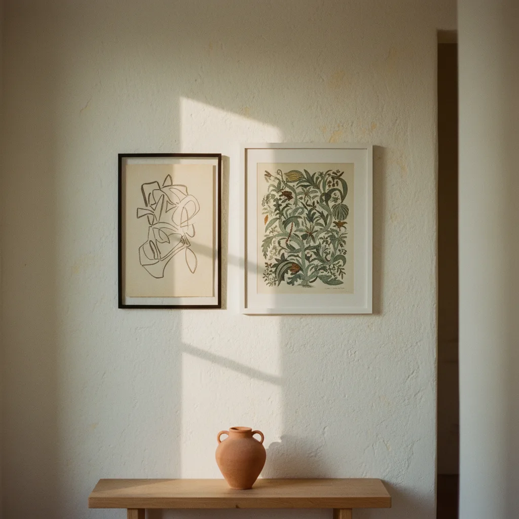
Knowing how to mix wall art styles is one of those things that sounds complicated until you see it done well - then it looks obvious. The problem is most advice either tells you to match everything (boring, and honestly a waste of a wall) or just says "trust your instincts" with zero follow-up. This is the practical version.
Why matching everything is the wrong goal
A wall where every print is the same size, same frame color, same general vibe reads as a package deal. It looks like someone bought a set. That is fine if you want zero risk, but it is also forgettable. The rooms people actually remember - the ones you photograph at a friend's place or screenshot from an interior account - almost always have some tension in them. A bold automotive print next to something quieter. A graphic abstract beside a photo. The contrast is the point.
That said, "anything goes" is not real advice either. There are a couple of things that have to hold the wall together, or it does fall apart.
The one thing that actually unifies a mixed wall
Pick one shared element and be deliberate about it. That element can be frame color, dominant palette, or scale - but you need at least one thread. If your frames are all black, you can mix a bold abstract canvas with a moody car print with a nature photo and it still reads as a considered wall. The frames are doing the organizing work so the images do not have to.
Color palette works the same way. Two prints that share even a single recurring tone - a dusty blue, a warm terracotta - will sit next to each other without fighting. They do not need to be the same style at all. A cyberpunk cityscape and a line-drawing portrait can coexist if they both pull from a similar range.
Scale is the one people ignore most. A bunch of small prints next to a huge canvas looks accidental. If you are mixing sizes, anchor the arrangement with one clearly dominant piece and let the smaller ones orbit it. Do not make them compete.
How to mix wall art styles by category without it looking random
Some combinations work reliably. A photorealistic animal print - say a sharp golden retriever portrait - pairs well with something graphic or flat because the contrast in rendering style is interesting rather than clashing. Check the pet prints if you want something with that kind of presence.
Abstract and figurative is another pairing that basically always works. The abstract gives the eye somewhere to rest and wander; the figurative gives it something to land on. You are not looking for harmony so much as a reason to keep looking.
What does not work as well: mixing two styles that are both trying to be the loudest thing in the room. A neon-soaked JDM car print and a heavily saturated abstract fighting for the same wall is a mess. One of them needs to step back - either in size, in saturation, or in complexity.
Frames: the part most people get wrong
Mismatched frames are fine. Mismatched frames with no logic are not. Black and natural wood can coexist. Black and gold can coexist. Black, natural wood, white, and gold in a four-print arrangement probably cannot, unless you are very intentional about which pieces get which treatment and why.
If you are unsure, go all black or all natural wood and stop worrying about it. The art is the interesting part.
Testing before you commit
Cut pieces of paper to the exact print sizes and tape them to the wall. Sounds tedious. It saves you a lot of filling nail holes. You will immediately see whether the balance is off, whether one piece is too dominant, whether the grouping needs to shift left. Do this before you order, not after.
Most people who say mixing styles does not work for them skipped this step and hung things based on how the prints looked on screen individually. A wall is not a screen. The spatial relationship between pieces matters as much as the pieces themselves.
Browse the full wall art catalog if you are still figuring out what combinations to test - filtering by color or style makes it easier to find things that will actually sit together.