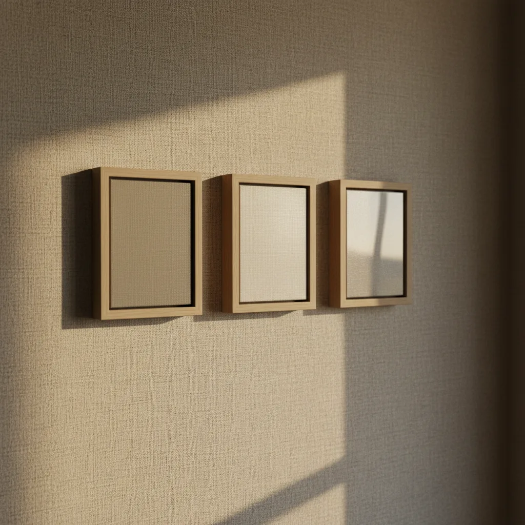
The matte vs glossy canvas print debate comes up constantly, and most answers online are basically useless - "it depends on your style!" Great, thanks. This piece gives you the specific situations where each finish wins and where it fails, so you can stop second-guessing and order the right thing.
What the finishes actually are
Matte canvas has a flat, light-absorbing surface. No shine. Glossy canvas has a coating that reflects light, which punches up contrast and makes colors look more saturated. Satin sits between them - a low sheen that picks up a little light without going full mirror. All three start with the same canvas substrate; the finish is just what happens on top of the ink layer.
That's the technical part. Now the part that actually matters.
Matte vs glossy canvas print: the honest breakdown
Glossy wins on color. If you're printing a Porsche in Lava Orange or a neon cyberpunk cityscape, gloss makes those tones pop in a way matte simply can't match. The tradeoff is glare. Put a glossy print opposite a window or under a ceiling spotlight and you'll get a washed-out reflection right across the image. For living rooms with big south-facing windows, that's a real problem, not a hypothetical one.
Matte handles light better than anything. You can hang it anywhere - facing a window, under track lighting, in a hallway with a single bulb - and the image stays readable. The colors won't jump out at you the way glossy does, but they're accurate and consistent from every angle. For photography prints, especially portraits or black-and-white work, matte is the professional default for a reason. It also tends to show fingerprints less, which matters if the print is going somewhere people can reach it.
Bottom line: if the image relies on color intensity, go glossy and control your lighting. If the image relies on detail, tone, or you just can't control where the light hits, go matte.
Where satin actually earns its place
Satin gets dismissed as a compromise, and sometimes that's fair. But there are real cases where it's the right call. Botanical prints, dog portraits, landscape photography - anything with a mix of fine detail and warm color tends to look good on satin. You get a bit of the color lift from the sheen without the glare problem blowing out highlights. It's also more forgiving in mixed lighting, like a room that gets natural light during the day and lamp light at night.
If you genuinely can't decide between matte and glossy and the image doesn't have extreme darks or neon tones, satin is a legitimate answer, not a cop-out.
Room and placement specifics
Bedroom: matte almost always. Softer, easier to live with, no glare from bedside lamps.
Home office or gaming setup: glossy if you've got controlled lighting - a dark room with bias lighting behind the monitors, for instance. The colors on a gaming wall art print will look incredible. Bad idea next to a window you can't cover.
Kitchen or bathroom: satin or matte. Glossy picks up steam and grease reflections in ways that get annoying fast.
Gallery wall with multiple prints: pick one finish and stick to it. Mixing matte and glossy on the same wall looks accidental.
Does the image subject change the answer?
Yes, pretty directly. Car prints - car wall art with metallic paint, chrome, and hard studio lighting - were basically made for gloss. The finish matches the subject. Abstract art with bold blocks of color also tends to benefit from gloss. On the other hand, a golden retriever portrait or a misty mountain landscape reads better on matte or satin. The surface texture suits the mood of the image.
Black and white prints: matte, full stop. Gloss on a black-and-white image just adds glare without any color benefit to show for it.
A quick note on canvas vs other print types
If you're debating finish and you keep landing on "I want maximum color punch with zero glare," it might be worth looking at metal prints instead of canvas. Metal has a natural satin-to-gloss quality baked into the aluminum substrate, and it handles color intensity better than any canvas finish. Different product, but sometimes it's the right one.
For canvas specifically though - matte for detail and flexibility, glossy for color-heavy images in controlled light, satin when you're genuinely in between. That's the real answer.