
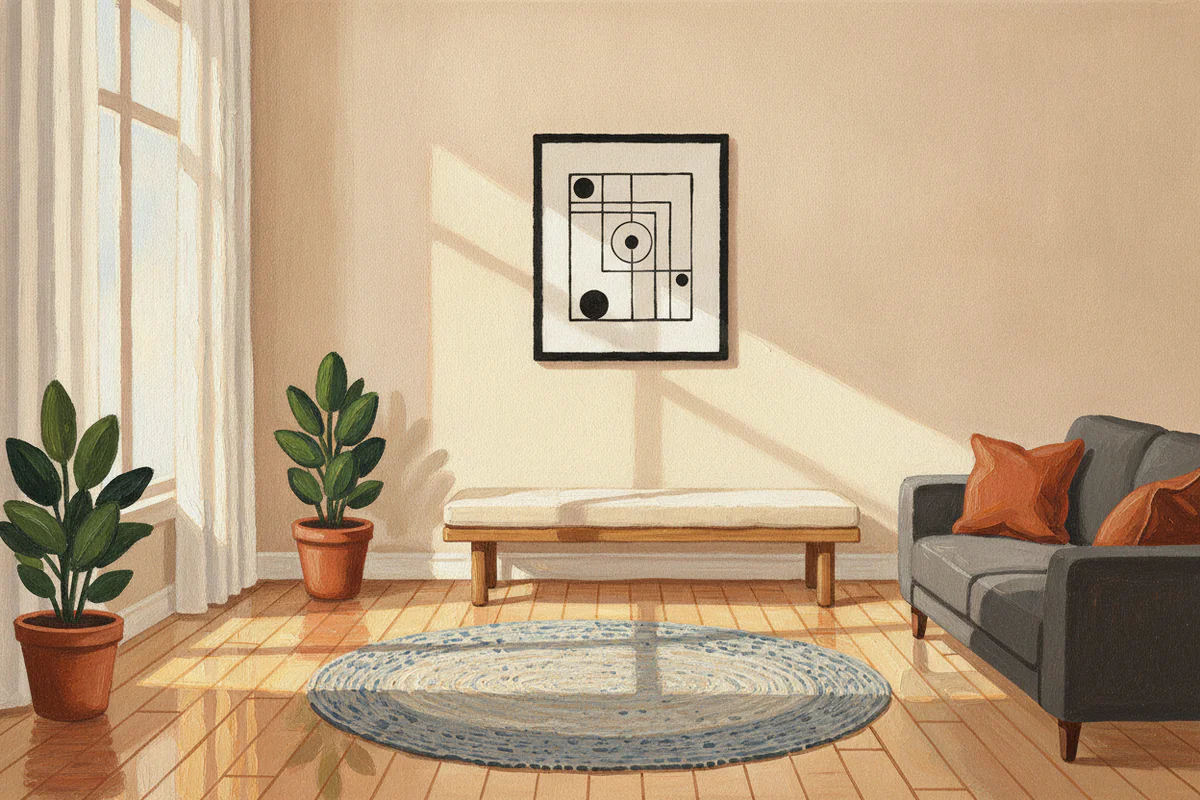
The difference between calm and just... empty
There's a version of minimalism that feels genuinely restful - walls that let the room breathe, a single piece of art that you actually look at rather than stop noticing after three days. And then there's the other version, which is basically a white box with a clock in it. The goal here is the first one.
Getting there is less about buying less and more about choosing better. One specific piece in the right spot does more work than four vaguely coordinating prints clustered together because you couldn't decide. This sounds obvious, but it's the thing most people skip past when they're decorating - the willingness to leave space genuinely empty rather than filling it with something adequate.
Negative space is doing half the work
When people talk about minimalist wall art they usually mean the subject matter - a single line drawing, a clean geometric shape, a landscape with a lot of sky. That matters, but the space around the art matters just as much. A small print crammed onto a large wall looks nervous. The same print on a smaller wall, or matted with a wide border before it's framed, looks considered.
Wide matting is probably the single cheapest upgrade you can make to any piece of art. A 10x8 image sitting inside a 16x12 frame with a thick white or off-white mat reads completely differently than the same image edge-to-edge. The mat creates that breathing room before the wall even gets involved. If you're buying framed prints rather than framing your own, check what the mat proportion looks like - a thin sliver of mat is almost worse than none at all.
And beyond the frame itself: try hanging one piece with more wall on either side than feels comfortable. Give it 40% of the wall width, not 80%. The empty wall on either side isn't wasted space. It's part of the composition.
Palette: fewer colors, not necessarily no color
Minimalist doesn't mean everything has to be black line on white paper, though that's one valid direction. What it actually means, in practice, is restraint - picking a palette and not going outside it. A warm terracotta print against a warm white wall is minimalist. A detailed botanical in dusty greens and soft ochre is minimalist if it's the only piece in the room and the rest of the wall stays quiet.
The thing to avoid is variety for its own sake. Three prints that each bring a different accent color - a blush, a teal, a mustard - will fight each other regardless of how much empty space you put around them. Pick one color story and run with it. If your room already has a dominant warm tone, artwork that brings another warm tone (even a different one) will sit better than something that introduces a contrasting cool.
Monochromatic doesn't mean boring. A photograph printed in warm black and white, or a single-color illustration in deep navy, can hold a wall better than something with five colors trying to do the same job.
One strong piece instead of five mediocre ones
This is the part that feels financially counterintuitive but is usually right. Spending more on one piece you genuinely want - something with real presence, printed or made at a size that suits the wall - gives you something to look at. Five smaller, cheaper prints arranged in a grid give you visual texture, which is a different thing and not really what minimalism is going for.
Size matters more than people expect. A 16x12 print on a large wall is going to look like a postage stamp unless you mat it heavily or cluster it with other things (which you're not doing). For a typical living room or bedroom wall, something in the 24x18 to 40x30 range usually has enough physical presence to hold the space on its own. Go bigger than you think. You can always see how a piece sits before you commit - cut a piece of paper to the size you're considering and tape it to the wall for a day.
If you want somewhere to look at options across different sizes before deciding, EnjoyPoster's minimalist art collection is worth browsing - the range goes up to 40x30 and you can choose between unframed posters, framed, or canvas depending on what the wall needs.
Where to hang it (and where not to)
Above a sofa is the reliable answer, and it works. But "above the sofa" has its own pitfalls - mainly that people hang things too high (eye level when seated, not eye level when standing) or too small relative to the sofa's width. A piece that's less than half the sofa's width reads as an afterthought. Two-thirds is a reasonable minimum.
Stairwalls are underused. A single large piece on a staircase landing - not a gallery wall, just one thing - is the kind of placement that actually surprises people. You see it at a slightly unusual angle, which makes you look at it properly rather than habituating to it.
Bathrooms are worth considering too, as long as you avoid anything that will struggle with humidity. A framed print behind glass handles a bathroom fine. Canvas can be less reliable depending on ventilation.
Bedrooms are where the "one strong piece" rule has the clearest payoff. Above the bed, centered, at a scale that relates to the headboard - this is a solved problem aesthetically. The only mistake is going too small. Anyway, the bedroom is also the room where you'll actually slow down and look at art, so it's worth spending a bit more thought on what that piece actually is rather than defaulting to something generically calming.
When empty really is the right answer
Sometimes a wall genuinely reads better bare. A wall with an interesting architectural feature - exposed brick, a deep window reveal, a textured plaster finish - often doesn't need anything added to it. Putting art on a wall like that competes with the wall itself rather than working with it.
If you've been staring at a wall wondering what it needs and nothing is clicking, it's worth asking whether the answer is nothing. Not every wall in a house needs art. Restraint applied to the whole room means some walls stay empty so that the one with the piece you chose gets its full effect.
That's the edit minimalist wall art is actually asking you to make - not "what goes here" but "does anything go here." Once you're asking that question honestly, the pieces you do choose tend to be better ones.


