
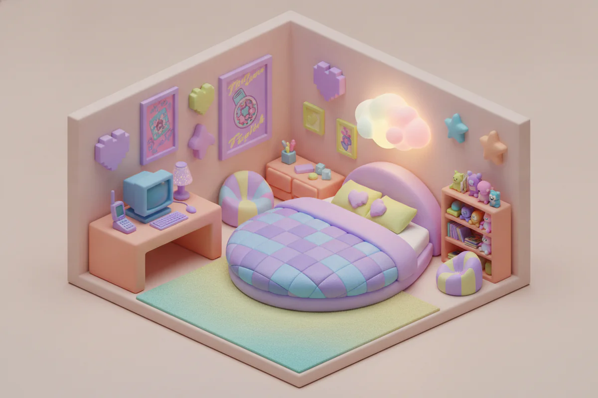
The nostalgia wave finally hit the walls
For a couple of years it was all in the clothes - low-rise jeans came back, butterfly clips reappeared in every drugstore, and Juicy Couture did a relaunch that felt equal parts ironic and completely sincere. Then somewhere around 2024 the same energy started moving into interiors. Frosted lucite, chunky rounded furniture, that specific shade of lilac that was on every iMac G3, silver metallics that somehow look futuristic and dated at the same time. By 2026 the retro Y2K aesthetic decor trend has a proper foothold, and it's worth understanding why it happened when it did rather than, say, five years ago.
The generational timing actually makes sense
Nostalgia in design tends to arrive about 20 to 25 years after the original moment. The people who were 8-14 years old during a cultural era are the ones who hit peak spending and decorating power two decades later. That's the whole engine behind the 1970s revival of the late 1990s, the mid-century modern obsession that peaked around 2010-2015, and now this.
The generation that grew up with The Matrix posters on their walls, Winamp skins, and MSN Messenger profile pictures are in their early-to-mid thirties right now. They're renting their own places or buying for the first time, they have some actual money to spend on how those spaces look, and they're decorating with the visual language they absorbed as children. It's not complicated when you frame it that way - it's just the normal cycle running on schedule.
What's slightly different this time is the internet's role in compressing and amplifying it. TikTok made Y2K fashion visible to teenagers who weren't alive in 2001, which created a secondary wave of people adopting the aesthetic purely as a style choice rather than a memory. That matters for decor too, because it means the market for this stuff is wider than one generation's nostalgia. A 19-year-old can find chrome bubble letters genuinely appealing without any personal history attached to them.
What the aesthetic actually looks like in a room
There's a tendency to describe Y2K decor as maximalist and leave it there, but that's lazy. The real hallmarks are more specific. Translucent or iridescent surfaces. Rounded, inflated shapes - the "blobitecture" furniture that looks like it belongs in a Barbiecore fever dream but with a cooler, more chrome-tinted palette. References to technology that felt like the future in 1999: pixel grids, loading screens, that particular digital green, early CGI textures.
On walls specifically, the prints that fit this moment tend to be bold and graphic rather than soft and painterly. Think high-contrast poster art, geometric patterns with a slight retro-digital feel, or photography from the late 90s and early 2000s that carries the grain and color timing of that era. Film photography from that period has a warmth and softness that's completely unlike either modern digital or the deliberately processed look of mid-century Kodachrome. It's its own thing, and people are recognizing it.
Anime from that period is a big one too - the art style of late-90s and early-2000s anime is distinct enough that a single frame is immediately recognizable as belonging to that decade. Same with certain video game aesthetics. Dreamcast-era game art, in particular, has aged into something that looks genuinely designed rather than just technically limited.
Why print art fits this trend particularly well
Canvas and framed prints are a low-commitment way to test an aesthetic before committing to furniture or a paint color. If you're not sure whether you actually want to live inside a Y2K callback or just thought you did after spending an hour on Pinterest, a couple of prints on the wall will tell you faster and cheaper than a new sofa will. And practically, prints in this style tend to read well at scale - the bold graphics and high contrast that define the Y2K look hold up at 30x40 inches without getting muddy the way some softer illustrative styles do.
Anyway - the format question matters here more than people think. A poster gives you the full graphic impact and costs less, which makes sense if you're experimenting or rotating pieces seasonally. A framed or canvas version commits more seriously to the wall and reads differently in a room, more like an artwork and less like a mood board. Neither is wrong, they're just answering different questions about how you want to use the space.
If you want to browse prints that actually fit this moment rather than just using the word "aesthetic" in their title, our retro and Y2K wall art collection has options across formats and sizes - poster prints start at $29, and most orders over $30 ship free.
The question people are actually asking: is this going to date fast?
Probably the most sensible concern about leaning into a trend-adjacent aesthetic is whether you're going to regret it in three years. Honest answer: some of it will date. The stuff that's purely a reference to the trend - prints that are essentially just signaling "I know what Y2K means" without much else going on - those will feel tired when the cycle moves on. They always do.
But there's a category of this aesthetic that I think has more staying power, and it's the pieces that were genuinely good design at the time and happen to fit the current moment. A Tadao Ando architecture photo from 1998 doesn't belong to the Y2K trend, it's just a photograph - it'll outlast the trend cycle because it was never only about the trend. Same logic applies to well-designed graphic art that borrows from that era's visual language without being entirely reducible to nostalgia bait.
The retro Y2K aesthetic decor trend is real and it's coherent, and the generational explanation for why it landed in 2026 specifically is basically airtight. What you do with that information depends on what you actually want your walls to say - which is, ultimately, the only question that ever mattered.


