
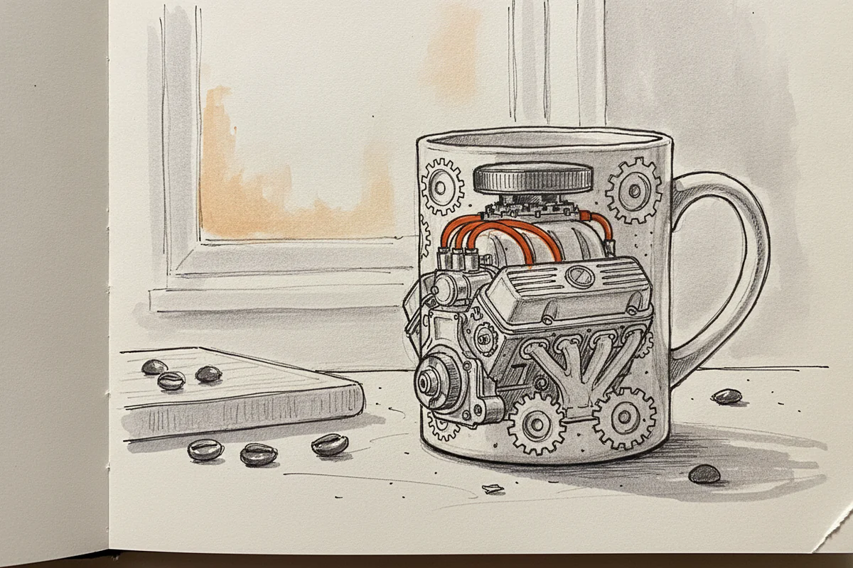
Why most car-themed mugs are hard to look at
Walk through any gift shop or scroll a generic print-on-demand marketplace and you'll find the same thing: a blurry silhouette that could be a Mustang or could be a Camry, slapped on white ceramic next to the words "I'd Rather Be Driving." The design took someone about four minutes. You can tell.
Car people notice. If you've spent time actually knowing cars - knowing the difference between a E30 and an E36 roofline, or the way a 911's haunches sit lower at the rear - you look at that blurry silhouette and feel nothing. Good coffee mug designs for car enthusiasts do the opposite. They make you pick the mug up and look closer.
So what actually makes a car design good? A few specific things.
Linework is doing most of the work
A car is a study in precision curves and intentional angles. The front fascia of a Ferrari 308 GTS is completely different from a Porsche 930's - not just in brand terms but in the character of every single line. Clean linework in a mug design means those distinctions survive the translation from drawing to print. You can read the car.
Generic designs fail here because they flatten everything. The lines are approximate, rounded off, chosen for decoration rather than accuracy. It ends up looking like a car the way a crayon drawing looks like a person - technically recognisable, not actually right.
What to look for: crisp edges that don't blur at the detail points, consistent line weight that varies intentionally (thicker where the body panel is heavy, thinner at highlights), and a silhouette you could identify from ten feet away without reading any text.
Model accuracy matters more than most people admit
This is where a lot of otherwise decent designs fall apart. Someone has drawn a car that is clearly supposed to be a 1969 Dodge Charger, and it's mostly there - but the C-pillar is wrong, the hood scoops are a slightly odd shape, the wheel arch doesn't have that particular muscle-car flare. To someone who doesn't know Chargers, fine. To someone who does, it reads as off in a way that's hard to ignore.
Accuracy is a form of respect, honestly. It says the person who made the design actually looked at the car, spent time with reference photos, understood what made that specific model worth drawing. The difference shows.
And it's not just about correctness for its own sake. An accurate drawing has more life in it. The proportions that made the original designer's work great - those proportions carry through into good art. Distort them and you lose the thing that made the car interesting in the first place.
Colour and background choices
A lot of car mug designs make the mistake of throwing too much colour at the problem. Gradient backgrounds, chrome effects that look muddy on ceramic, five different colours competing for your attention. It tends to age badly and print worse.
The designs that hold up best are usually restrained. A single-colour or two-colour illustration on a clean background - black on white, white on black, occasionally a flat single accent colour for something like brake calipers or headlights. This is partly an aesthetic preference, sure, but it's also practical: simple colour separations print cleanly at small sizes, don't pixelate under the curve of a mug, and read well across different lighting conditions.
There's a reason the best automotive posters from the 1970s and 80s used relatively flat graphics. It wasn't a limitation so much as a discipline.
Scale and composition on the mug itself
A design that works perfectly as a flat image doesn't always work on a cylindrical surface. Some designers don't think about this and just drop their artwork onto a mug template without adjustment. The result is a car that looks stretched, or a design that disappears around the back of the mug, or a composition where the car is crammed into a tiny portion of the available space.
Good mug design accounts for the wrap. The car should feel like it belongs on the object, not like a sticker applied as an afterthought. That usually means leaving breathing room, considering what happens at the handle join, and scaling the illustration so the key details sit where your hand naturally turns the mug.
What actually separates the good ones from the rest
Honestly, it comes down to whether the person who made the design knew the car or just knew the word for it. That sounds harsh but it's true. A designer who has a 911 poster on their own wall draws a 911 differently from someone who Googled "Porsche sports car" and traced a stock photo.
You can feel the familiarity in the result. The weight given to certain details, the angle chosen to show off the thing that makes the model worth caring about, the decision to include or leave out the side mirror depending on what it adds to the composition. These are the choices that only get made by someone who actually gives a damn about the subject.
And that's really the bar. Does this design communicate that someone paid attention? If yes, it's probably worth your shelf. If it looks like it could be any car from any era from any manufacturer - pass.
Where to find better car art
If you want designs that take accuracy seriously, your best bet is to look beyond the mass-market platforms and find artists who specialise in automotive illustration. The work tends to be tighter, more considered, and drawn by people who can tell you exactly which generation of the car they drew and why.
We print that kind of work. Browse our car poster collection and you'll see what clean linework and genuine model accuracy actually look like on print - the same standards that should go into anything carrying a car design, mugs included.
The mug you reach for every morning is a small thing, but you look at it for a few minutes every day. It's worth it to have one that was drawn by someone who actually looked at the car.


