
Two generations, completely different walls
Spend five minutes scrolling through Millennial home accounts from around 2016 to 2021 and you will see a lot of the same room. White walls, a fiddle-leaf fig, some open shelving with evenly spaced ceramics, maybe a raw-edge coffee table. The palette is greige to white. Everything coordinates. Nothing is loud. It photographs beautifully and communicates exactly one thing: this person has taste.
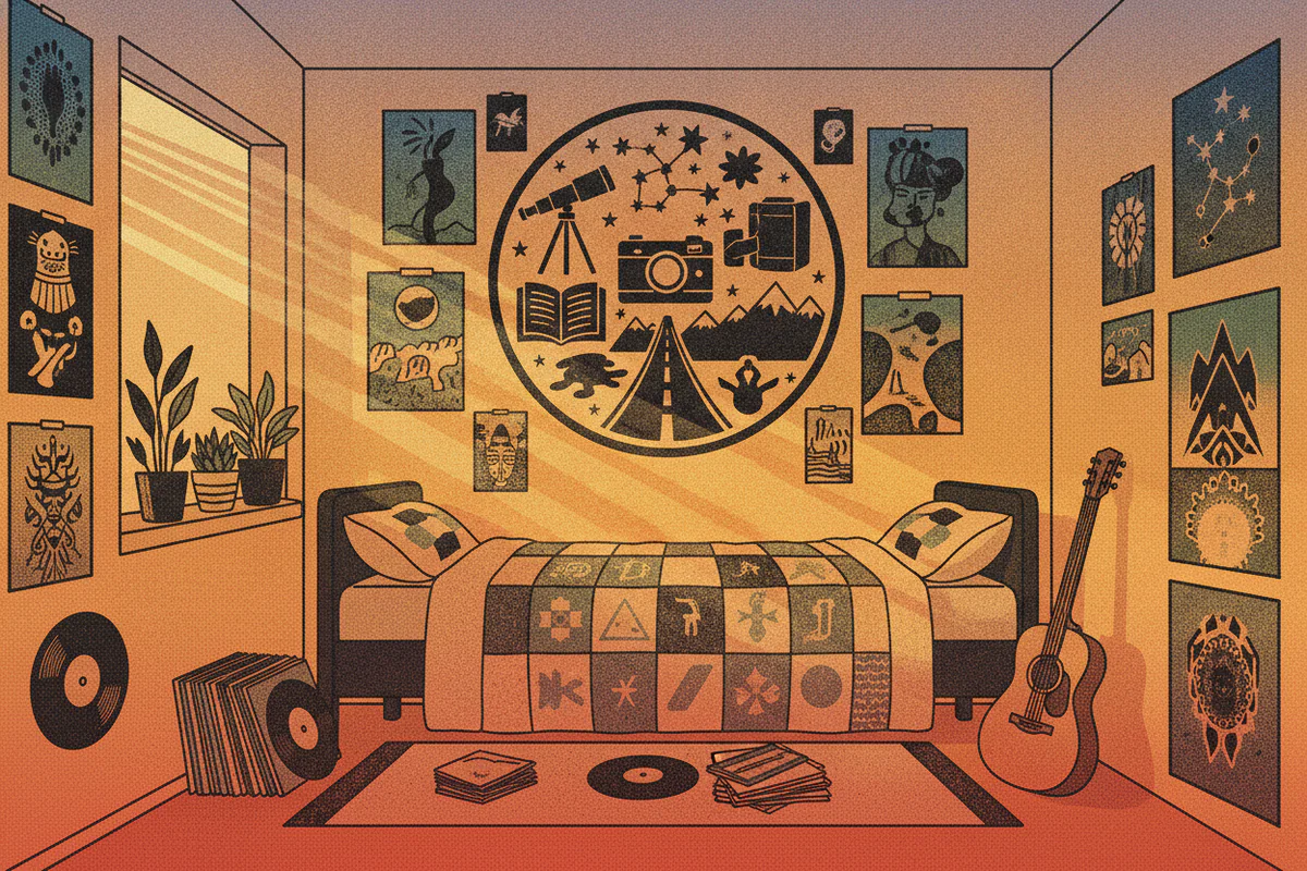
Now look at how a 21-year-old decorates their bedroom in 2024. Band posters next to a framed photo of their grandmother. A shelf of manga beside a vintage anatomy chart. Mismatched frames at slightly crooked angles. A color on the wall that is not a neutral. The room communicates something too, but it's not taste - it's person.
That shift is what people mean when they talk about the gen z identity decor trend, and it's more than an aesthetic preference. It reflects a genuinely different theory of what a home is for.
What Millennial minimalism was actually about
It's worth being fair to it before writing it off. Millennial minimalism arrived out of real circumstances. A generation that came of age during the 2008 financial crash, with delayed homeownership and years of renting, developed a portable, neutral, inoffensive visual language that worked in any apartment and wouldn't clash with anyone's security deposit situation. The aesthetic also coincided with the rise of Instagram as an aspirational platform, which rewarded clean compositions and punished visual chaos.
There was also a genuine philosophical current behind it - the KonMari wave, the "less but better" Dieter Rams revival, the idea that owning fewer, higher-quality objects was an ethical as well as an aesthetic choice. Some of that holds up fine. The problem is that "minimalist" became a brand identity unto itself, and eventually the rooms stopped feeling curated by a particular person and started feeling like they were decorated for a Zillow listing. The human being living there became invisible.
Which is, roughly, the critique Gen Z has of it.
Identity decor as a different starting point
Gen Z decorates from the self outward rather than from some external taste standard inward. The question isn't "does this look good together" but "does this represent something true about me." Those are not the same question and they produce very different rooms.
Practically speaking, this shows up as a willingness to mix things that have no visual business being next to each other - a Jonas Brothers era poster next to a Georgia O'Keeffe print, say - because both things matter to the person and the room is their record, not a coherent design statement. It also shows up as the resurgence of obvious personal photography. Millennials largely banished personal photos from living spaces (too sentimental, too messy) and Gen Z has brought them roaring back, often printed large and framed properly rather than stuck to a corkboard.
Maximalism is part of it but not the whole story. Some Gen Z spaces are actually fairly spare - what makes them distinctly Gen Z is specificity. There's a visible point of view. You could walk into the room and make a reasonable guess about what the person reads, listens to, cares about politically, finds funny. That legibility is the goal.
The influence of digital identity on physical space
Gen Z is the first generation that grew up building explicit self-representation online before they ever had a space of their own. Profile aesthetics, curated feeds, Tumblr pages with color palettes - they learned identity construction as a visual practice before they had walls to hang things on. When they finally did get walls, they applied the same logic. The room is basically a pinned post that happens to be three-dimensional.
There's something interesting in the fact that this generation, supposedly the most digitally native, has pushed back toward physical objects harder than Millennials did. Vinyl records, printed photos, physical books displayed spines-out, art on paper. The wall becomes a kind of offline archive. Anyway - whether that's a reaction to screen fatigue or just a preference is probably impossible to untangle, but the result is spaces full of actual stuff with actual meaning attached to it.
Which approach ages better
Here's my real opinion: Millennial minimalism photographs better at age 30, and identity decor photographs better at age 70.
The neutral minimalist room is hard to find fault with in the moment. It's calm. It's coherent. Show it to anyone and they'll say it looks nice. But go back and look at a perfectly executed 2018 Millennial living room now and it reads less like a person's home and more like a stage set for a demographic. The aesthetic has an expiration date because it was always trend-adjacent, even when it was dressing itself up as timeless.
The maximalist, identity-forward room will look chaotic to some people at age 25 and will look earned at age 55. The person who has a wall covered in things they've actually collected, lived with, and cared about ends up with something that accumulates meaning over time rather than depreciating into blandness. Think of anyone whose home you've walked into and immediately understood - a novelist, an obsessive record collector, a person who has traveled for forty years and bought one small object in every city. Those rooms are full. They communicate a life. Very few of them are minimalist.
The counterargument is that some Gen Z identity decor is identity performance rather than actual identity - trend-chasing just dressed in the language of individuality. A room full of "alt aesthetic" objects sourced from the same five online shops is its own kind of conformity, and there's plenty of that around too. Real identity decor takes time to develop. You can't curate yourself in a weekend.
What this means for how people buy and display art
One concrete change is how younger decorators think about wall art. Millennial decorating orthodoxy held that you should buy one large, neutral, professionally framed piece and build around it. Gen Z is more likely to layer multiple pieces at different sizes, mix framed and unframed, and choose images for personal resonance rather than palette coordination. A film still from a movie that wrecked them at 17 gets the same wall space as a botanical print. The hierarchy is emotional, not visual.
Practically, that also means scale matters more than it used to. A small print lost in a gallery wall reads as background noise. Something larger - a poster or canvas print at a size where it actually commands attention - carries enough visual weight to hold its own next to the surrounding noise. The proportions change when everything on the wall is competing for significance rather than quietly harmonizing.
Whether Millennial minimalism makes a full comeback is genuinely unclear. Some of it already is, cycling back as "clean girl" aesthetics and quiet luxury. But the generation that comes after Gen Z will grow up in rooms full of intentional objects and visible personality, and that becomes the baseline they react against. Design always moves in the direction of whatever felt dishonest about the thing before it.
Right now, for a lot of people, a blank white wall feels dishonest.


