
Where the rule actually comes from
The rule of three wall art principle shows up in interior design, photography composition, flower arranging, and writing - sometimes it feels like someone decided odd numbers were universally superior and the memo went everywhere. But there is a real perceptual reason it keeps getting recommended, and it has to do with how the brain handles symmetry.
When you look at two objects, your eye immediately treats them as a pair and tries to find the axis between them. The visual work is done in about a second. Four objects form two pairs, or a square, and again the brain files it away quickly as "balanced, resolved." There is nothing wrong with resolved, but resolved is not the same as interesting. An even grouping tends to feel stable in a way that reads as slightly static on a wall.
Three objects resist that easy resolution. The brain starts sorting - which two are more similar? which one is the anchor? - and that micro-process of sorting is what creates a sense of visual weight and intention. The grouping demands a little more from the viewer, and that tiny demand is what makes it feel deliberate rather than accidental.
Gestalt psychology, which is the study of how people perceive groups of things as wholes rather than collections of parts, calls this effect "dynamic asymmetry." You can achieve the same sense of tension and resolution with five objects, or seven - any odd number introduces at least one element that cannot be neatly paired off, and that leftover element becomes a kind of visual anchor without dominating everything else.
What "works" actually means in practice
Saying a grouping "works" is vague enough to be nearly useless, so to be specific: a well-grouped arrangement on a wall produces a single focal zone that reads as one composition rather than separate pieces that happen to be near each other. You can tell the difference from across the room. A grouping that is working pulls the eye in and then lets it move around inside the composition. A grouping that is not working just looks like the art landed there by accident.
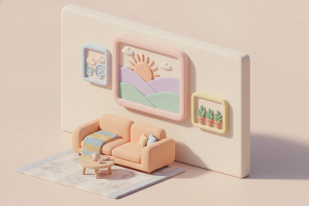
For three pieces, the classic approach is to arrange them so they form an implied triangle - not a literal equilateral triangle with ruler-precise spacing, but a triangular visual path where your eye travels from one piece to another and naturally returns to the start. The triangle does not have to be symmetrical. In fact it probably should not be. A slightly off-kilter arrangement, where one piece is higher or lower than you might expect, reads as more considered than a perfectly centered row.
Size variation matters more than most people expect. Three identically sized frames in a row read as a pattern, which is a different effect from a composition. A composition has hierarchy - a primary piece, a secondary piece, and a tertiary detail. If you have a large print anchoring the left, a medium piece at the upper right, and something smaller below it, the eye has a clear path through all three. That path is what the rule of three is really producing: a legible route for the viewer's attention.
Spacing is doing more work than the frames are
Tighter spacing (roughly two to four inches between frames) reads as an intentional cluster - a single composed unit. Wider spacing starts to separate the pieces into individuals, and at some point they become three separate artworks on a wall rather than a grouped installation. Neither is wrong, but they are communicating different things. If your goal is a composed grouping in the rule-of-three sense, keep the spacing close enough that someone standing back would describe the arrangement as "a group" before they would describe it as "three pictures."
The caveat: two pieces can absolutely work
Somewhere along the way, the rule of three became so dominant in interior design advice that pairing two pieces got treated as a beginner mistake. That is an overcorrection.
Two pieces work when each piece is strong enough to anchor its own side of the wall and the relationship between them is doing something - complementary colors, mirrored subject matter, a similar palette with contrasting composition. A pair of botanical prints in matching frames either side of a bed headboard is not a failure of rule-of-three thinking; it is a different strategy that creates calm bilateral symmetry, which is exactly what most people want in a bedroom.
Two pieces also work when the negative space between them is treated as part of the composition. This is where a lot of pairings fail - the gap is just a gap, not a considered interval. If you position two large-format pieces so that the space between them frames whatever is in front of the wall (a lamp, a console table, a plant), the negative space becomes a third element and the arrangement starts working as a trio anyway, just not literally.
The honest version of the advice is this: odd-numbered groupings are more forgiving, because the asymmetry does some of the compositional work for you. Even-numbered groupings can work beautifully, but they require the individual pieces to be stronger and the relationship between them to be more clearly defined. If you are arranging art and you are not sure why it looks off, adding or swapping to an odd number is a good first diagnostic step - not a permanent law.
A few arrangements worth trying
If you want to experiment with rule of three wall art groupings without committing to nails in drywall, the standard advice is paper templates on the floor first, then tape them to the wall. Slightly tedious, genuinely useful. Beyond that, a few specific arrangements that tend to hold up:
- Large center piece flanked by two smaller pieces at slightly different heights - creates hierarchy without being rigid
- A vertical stack of three in a narrow space (a hallway, between two doors) where horizontal spread is not available
- A loose triangle with the apex piece slightly above eye level, so the composition has upward movement
- Three pieces of the same subject in different scales, horizontally staggered - works well with photography or botanical prints
For anyone starting to figure out sizes before they buy, EnjoyPoster's size guide is a practical tool - it maps out how different print dimensions actually look on a wall, which is harder to judge than it sounds when you are staring at a listing.
Why the rule keeps surviving
Design rules that stick around usually do so because they describe something real about perception, not because they are arbitrary. The rule of three survives because dynamic asymmetry genuinely is easier to achieve with an odd number of elements, and because most people decorating walls are working without a formal design background - the rule gives them a reliable starting point that produces a reasonable result without requiring them to understand Gestalt theory.
But any rule that gets applied mechanically eventually produces mediocrity at scale, which is why you see so many gallery walls that technically follow every guideline and still feel like a mood board rather than a room. The rule is a scaffold, not a blueprint. The goal is a wall that looks like someone made choices, not like someone followed instructions - and those are not always the same thing.


