
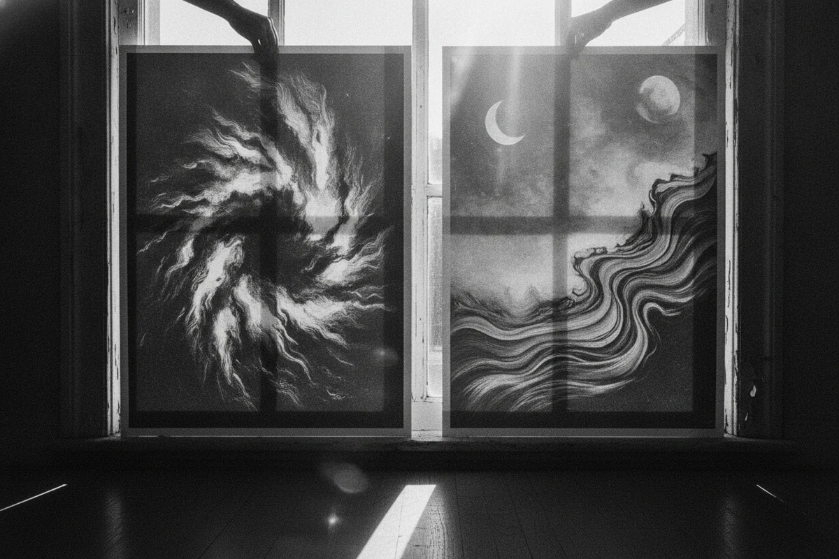
The same print can look completely different depending on where you hang it
You've probably noticed this without having a name for it - a print that looked rich and warm on a website feels a bit cold and flat once it's on the wall, or a photograph that seemed neutral online now has a distinctly yellow cast in your living room. The print didn't change. The light around it did.
Warm vs cool tone wall art is one of those things most people don't think about until something looks off, and then they can't quite work out why. Understanding a few basics about natural light - specifically which direction your room faces - makes the difference between art that settles into a room and art that just sits there awkwardly.
What "warm" and "cool" actually mean in a print
Warm-toned art leans toward reds, oranges, yellows, and earthy browns. Think botanical prints with ochre backgrounds, landscapes at golden hour, abstract work with terracotta or rust. Cool-toned art goes the other way - blues, blue-greens, greys, and desaturated neutrals. Coastal photography, monochrome cityscapes, misty forest scenes.
A lot of prints land somewhere in the middle, which sounds like it would make this whole question irrelevant. It doesn't, because even a nominally "neutral" print will shift depending on the colour temperature of the light hitting it.
North-facing rooms: the cool light problem
North-facing rooms in the northern hemisphere get indirect light all day. There's no point where the sun actually comes through - you get reflected sky light instead, which has a noticeably blue-cool cast. Photographers love north-facing studios for exactly this reason. For decorating, it means a few things.
Cool-toned prints in a north-facing room can tip into feeling cold or flat, especially in the afternoon when the light is at its most blue. A grey abstract that looks sophisticated in the shop might feel a little bleak on your north wall come November. Warm-toned prints, on the other hand, tend to hold up much better - the cool ambient light doesn't wash them out, and they add some of the warmth the room is already lacking. An ochre-heavy landscape or a print with red-brown earth tones can actually make a north-facing room feel more alive without any extra effort.
That said, there are north-facing rooms where cooler art works fine - if you've got warm wood floors, warm-coloured furniture, and a lot of lamplight in the evenings, the room itself is doing the heavy lifting, and a cool print reads as a deliberate contrast rather than a mistake.
South-facing rooms: the warm light problem (it's a nicer problem)
South-facing rooms get direct sun for most of the day. The light is warmer, stronger, and shifts a lot between morning and afternoon. In the afternoon especially, the light can have a significant golden cast.
In these rooms, warm-toned prints can oversaturate - a print with a lot of yellow or orange can start to feel overwhelming when the afternoon sun is hitting it directly. It's not always bad, but it's worth knowing. Cool-toned work tends to do well here because the warm ambient light counteracts the coolness of the print and the two meet somewhere pleasant in the middle. A blue-grey coastal photograph that might feel bleak in a north-facing room can look genuinely beautiful in a sun-drenched south-facing one.
East and west-facing rooms are more complex because the light temperature changes dramatically throughout the day - cool and soft in the morning for east-facing rooms, then losing the direct light by midday, and the reverse for west-facing. Worth thinking about when you actually use the room most.
The test that actually works
Before buying any print, do this: get a digital version of it on your phone or laptop, and hold the screen up against your wall at the time of day you use the room most. Not just any time - the specific time. If your bedroom is a morning room, do it at 8am. If your living room is where you spend evenings, do it at 8pm under your lamps.
This sounds almost too simple but it works because you're seeing the print competing with actual ambient light rather than imagining it. If the image looks washed out, greyed down, or weirdly yellow on your screen in that light, the real print will read similarly. If it looks right, it probably will be.
If you've already ordered a print and you're second-guessing it before hanging - same idea. Hold it up (unframed or in the frame, doesn't matter) against the wall at your usual time of day, step back a few feet, and give yourself thirty seconds before making a call. Most people make hanging decisions in the morning when they're putting things together, but the room they're decorating is mostly used in the evening. That disconnect is responsible for a lot of art that seems slightly wrong but nobody can explain why.
Anyway - once you've done the test a couple of times, you start to develop an instinct for it without needing to do it consciously.
Artificial light matters too, possibly more
Bulb temperature is measured in Kelvin. Bulbs around 2700K are warm (the old incandescent look). Bulbs at 4000K and above are cool-white or daylight. Most homes have warm bulbs, which means evening light is much warmer than daytime light regardless of which direction the room faces.
If you're putting art in a room that's mainly used in the evening, your bulb temperature probably has more influence on how the print looks than anything else. A cool-toned print under warm 2700K bulbs shifts toward neutral. A warm-toned print under those same bulbs can go very orange very quickly - sometimes nicely, sometimes not.
Spotlights or picture lights aimed at a specific print amplify this further. A picture light with a warm bulb on a warm-toned print is often too much. On a cooler print, it adds depth and brings out details.
A few pairings that reliably work
- North-facing room, cool daylight, warm bulbs in the evening: botanical prints with earthy yellows, abstract work with ochre or rust, landscape photography with warm skies
- South-facing room, warm afternoon sun, any bulb temperature: blue-toned photography, grey abstracts, desaturated black and white work
- East-facing room used mainly in the morning: either works, but cool tones handle the bright morning light better without feeling harsh
- West-facing room used in the evening: warm tones in the print tend to fight with the warm sunset light - cooler, more neutral work often lands better
None of this is absolute. A south-facing room with heavy curtains is a different situation from one with floor-to-ceiling glazing. A warm bulb at 40 watts does less than a warm bulb at 100 watts. Context matters, and your own eye is the last word.
Before you order
If you want to browse with this in mind, EnjoyPoster's full print collection spans everything from warm-heavy botanicals and earth-toned landscapes to cooler coastal and architectural photography - useful if you're trying to compare tone options without jumping between sites. Prints start at $29 unframed, and the boxed (not tubed) shipping means they actually arrive flat, which matters when you're trying to assess colour and finish accurately before you hang.
The main thing to take away from all of this: trust what the print looks like on your actual wall in your actual light, not on a screen in a brightly lit room at noon. That small shift in how you evaluate art before buying it will save you a lot of rehanging.


