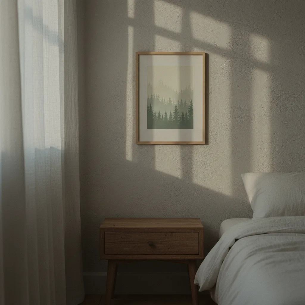
Most people spend maybe five minutes thinking about bedroom wall art - they grab something they like, hang it, done. But the stuff you look at right before sleep and first thing in the morning genuinely affects how your nervous system winds down, or doesn't. Calming bedroom wall art is a real category with real logic behind it, not just a marketing phrase for muted colors.
Why bedroom art hits different than art in other rooms
Your living room can handle a bold Mustang print or something loud and geometric. The bedroom is different. It's the last visual input your brain processes before sleep, and the first one after. Studies on sleep environment consistently point to the same thing: visual stimulation at night delays the shift into a relaxed state. High-contrast images, busy compositions, aggressive color - all of it keeps the brain in alert mode a little longer than you'd want.
So it's not about whether the art is good. It's about timing and context. A print that looks incredible in a studio would be the wrong call above a bed.
What calming bedroom wall art actually looks like
There are a few things that consistently work. Soft nature scenes - water, fog, open fields, overcast skies - pull the eye without demanding anything back. The brain reads "nothing to respond to here" and starts to settle. Muted abstract prints do something similar, especially ones with flowing shapes rather than sharp angles. Cool tones (slate, dusty blue, sage, warm grey) outperform reds and oranges in a sleep-adjacent context, basically every time.
That doesn't mean everything has to be pale and boring. A single dark mountain range on a near-white background can be striking and still calm. The test is whether the image creates tension or releases it. Tension is fine in a gym. Not here.
Our nature wall art section has a lot that fits this - forest paths, ocean horizons, minimalist botanical stuff. Worth browsing if you want something with low visual noise.
Prints to avoid in the bedroom
Anything with faces looking directly at you. It sounds odd but a portrait where the subject makes eye contact tends to stay active in peripheral awareness - your brain registers a social presence even when you're not consciously looking at it. Same goes for imagery with strong narrative tension: dramatic action shots, animals mid-hunt, cars at full tilt. Great in other rooms, wrong for this one.
Very bright or highly saturated prints are the other obvious problem. A neon-toned abstract that looks electric in a well-lit hallway will feel oppressive in low bedroom light. Colors shift at night, and what looked sophisticated at noon can feel anxious by 10pm.
Size and placement matter more than people admit
A print that's too small above the bed looks apologetic and somehow makes the room feel more cluttered, not less. As a rough rule: the art should span at least half the width of the headboard. Wider is usually fine. One large print tends to read calmer than three small ones fighting for space.
Height matters too. Center the piece somewhere between 6 and 8 inches above the headboard. If it's the only wall art in the room, centering it on the wall (not just the furniture) often looks more settled.
Canvas vs. poster for a sleep space
Canvas prints win in bedrooms, honestly. No glass means no glare from lamps or phones in the dark, and the texture softens the image slightly - which works in your favor here. A matte poster is fine too, but avoid anything framed under glossy glass if you have any light source that bounces off walls at night.
Metal prints are stunning in the right room, but the reflectivity makes them a poor fit directly opposite a window or bedside lamp. Save those for a hallway or office.
If you want to start somewhere practical, the wall art section lets you filter by style and category. Go for nature or soft abstract, pick something without strong diagonals or high contrast, and put it on canvas. That's basically the whole formula.