
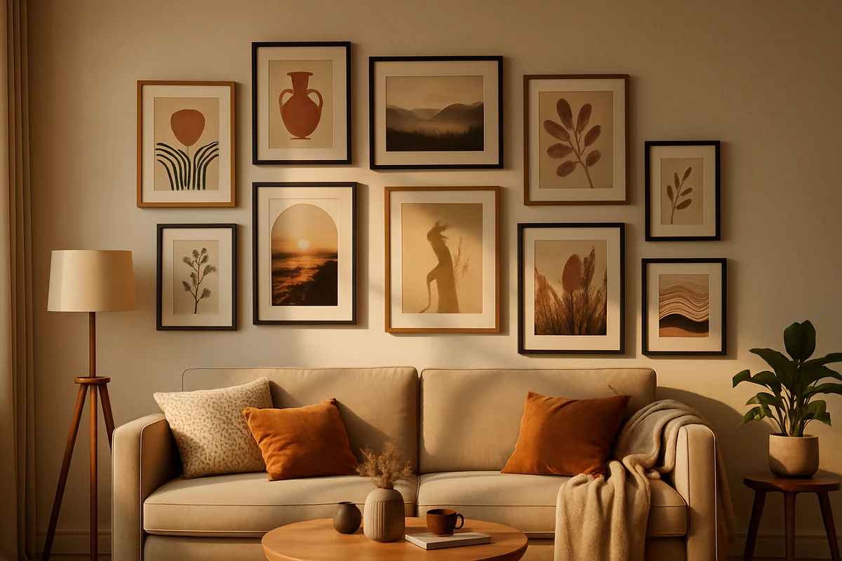
Most gallery walls fail before the first nail goes in. Not because the art is wrong, but because the arrangement wasn't thought through - frames end up scattered at random heights, gaps look accidental rather than intentional, and the whole thing reads as clutter instead of composition. The good news is that a handful of reliable layouts take the guesswork out almost entirely.
Below are twelve arrangements that work in real rooms, plus the spacing and planning rules that make any of them look deliberate.
Before you touch the wall
Lay everything on the floor first. Seriously - spend twenty minutes shuffling frames around on the carpet before you commit to anything. You'll catch problems (two very similar frames sitting next to each other, a gap that's too wide to feel connected) that would cost you a lot of filled nail holes to fix later. Take a photo from above with your phone once you're happy. That's your reference when you move to the wall.
On spacing: 2 to 3 inches between frames is the standard that works across almost all styles. Tighter than 2 inches starts to feel cramped unless you're doing a very deliberate grid. Looser than 3 or 4 inches and the pieces start to read as separate objects rather than a grouped arrangement. The exception is salon-style hanging, where you're actively playing with varied gaps - but even there, consistency within sections keeps it from looking like you gave up.
The classic grid
Same-size frames, even spacing, perfectly aligned rows and columns. It sounds boring but it's one of the cleanest options for a modern or minimal room, and it's genuinely forgiving if your walls aren't perfectly level (a slight tilt reads as a mistake on a lone print but tends to disappear in a grid). Four frames in a 2x2, or six in a 2x3, are the most manageable starting points. Matching frames obviously help, but matched sizes with varied frame styles can work too.
Salon-style scatter
The floor-planning rule matters most here. Salon hanging - lots of frames at different heights and sizes, overlapping visual weight - looks effortless when it's planned and genuinely chaotic when it isn't. The trick is to find your largest piece and anchor it slightly left or right of center, then build outward. Resist the urge to perfectly balance left and right sides; a little asymmetry is what makes it feel collected rather than manufactured.
The staircase diagonal
Designed for, well, staircases, but also works on any long wall where you want to suggest movement. Frames ascend diagonally, usually three to five pieces, with the center of each frame following the angle of the stairs or an imaginary diagonal line. Consistent spacing between frames is what holds it together. If the sizes vary slightly, keep the visual "center" of each frame on that diagonal - not the top edge.
Horizontal row above a sofa
One of the most useful layouts and one of the most frequently botched. The mistake: hanging the row at eye height for a standing person, which puts it somewhere around 57-60 inches from the floor. In a seated room, that reads as a strip floating near the ceiling. The center of a row above a sofa should sit roughly 8 to 10 inches above the sofa back, which typically lands the center around 48 to 50 inches from the floor - lower than feels natural when you're standing there with a measuring tape, but correct once you sit down and look at it.
Three to five frames work well for a standard sofa. More than five and you need to either widen the frames or accept that the ends will extend past the sofa, which isn't always a problem but is worth checking on the floor first.
The asymmetric cluster
A cluster of five to nine pieces that groups tightly in one area rather than spreading across the wall. Works especially well in corners, beside a doorway, or flanking a window. The key is choosing a dominant piece - usually the largest - and treating everything else as supporting it rather than competing. Vary orientation (portrait and landscape mixed) and let sizes differ more than you think you need to. Sameness within a cluster makes it look tentative.
Vertical column
Three or four frames stacked in a single column, usually portrait orientation, often used in narrow spaces like a hallway or the wall beside a door. Matching frames make this feel architectural; mismatched frames make it feel more personal. Either way, keep the spacing consistent - 2 inches between each frame is about right for a column that reads as intentional.
The triptych (and its variations)
Three pieces treated as one image, or three related pieces hung in a row with tight, equal spacing. Works best when the pieces share a color palette or a visual theme even if they're not literally one image split three ways. A variation that people underuse: a horizontal triptych above a bed, with the center frame 1 to 2 inches taller or larger than the flanking two - gives the arrangement a focal point without feeling rigid.
Mixed media wall
Prints combined with objects - a small shelf, a ceramic, a mirror, a wall-mounted plant. The objects should count as "frames" when you're doing your floor plan, obviously using tape or cut cardboard to mock their size. The risk here is that it tips into a crowded shelf look rather than a cohesive wall arrangement. A clear background color - meaning the wall is one strong tone or bright white - helps keep mixed elements reading as a group.
The oversized anchor with satellites
One large print - 24x18 or bigger - hung first, then three or four smaller pieces arranged around it. The large piece does the compositional work; the smaller ones add texture. This is a good approach when you have one piece you really love and want to feature rather than blend in. Browse prints by size if you're trying to find a statement piece that can genuinely hold center position.
Two rows, varied sizes
A top row and a bottom row, not necessarily the same number of frames in each, with the bottoms of the top row and the tops of the bottom row creating a rough horizon line. The horizon line is what unifies it - frames above and below can vary in height as long as that middle zone stays consistent. This layout works well for a dining room wall or any wider wall where a single row would look thin.
The L-shape and the U-shape
Less common but useful when you're working around a corner or want to frame a piece of furniture from two sides. The L wraps one horizontal run into a vertical drop. The U adds a second vertical on the other side. These need more floor planning than most, but they're worth considering when a straight arrangement would leave too much dead wall space on one side.
The single-row stagger
A row of frames where alternating pieces are nudged slightly up or down from the center line, creating a gentle zigzag. More dynamic than a straight row without the full commitment of salon hanging. Works better with an odd number of frames and a small stagger - about an inch to two inches off center - rather than a dramatic up-down pattern that can read as misaligned rather than intentional.
The eye-height rule one more time
57 to 60 inches from the floor to the center of the frame is the gallery standard - fine for a room you walk through, wrong for a room you sit in. If the art is going above seating, come down 8 to 10 inches from wherever your instinct says. You'll feel like it's too low until you sit down.
And honestly, the floor plan matters more than which layout you pick. Almost any of the twelve above can look good in the right room if the arrangement was tested flat before anything went on the wall. It's the one step most people skip because it feels unnecessary - and it's the step that makes the difference between a wall that looks considered and one that looks like it's still in progress.


