Putting black and white wall art in a colorful room is one of those decisions that looks either incredibly considered or like a mistake, and the difference usually comes down to a single thing: whether the print has enough visual weight to hold its own against the color around it. Get that right and the whole room settles. Get it wrong and the print just disappears.
The one rule: mass beats out color every time
Color is loud. A wall painted deep teal or a sofa in burnt orange will pull attention without trying. A small black and white print hung nearby doesn't stand a chance - it reads as an afterthought, not a choice. The fix isn't to remove the color. It's to go bigger with the print, or go denser, or both.
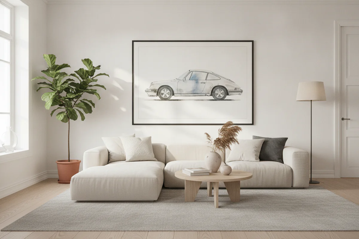
A large-format black and white canvas - something that runs 24 inches wide or more - generates enough contrast against a colorful wall that your eye treats it as an anchor point, not a decoration. The room now has two competing forces, and that tension is exactly what makes it interesting. A 5x7 print in the same spot just looks lost.
Why black and white wall art actually works better in colorful rooms than in neutral ones
This surprises people. Monochrome prints on white or grey walls can disappear almost as badly as on color - the contrast just isn't there. But against a saturated background, black and white pops hard. The separation is immediate. You don't have to work to read the image.
A bold automotive print - a Porsche in high contrast black and white, say - hung on a deep green wall is going to look sharper than the same print on off-white. The color does the work of framing it. You're basically using your wall color as a mat.
Frame choice matters more than people admit
If you're going frameless canvas, fine. But if you're framing a print, the frame color is where a lot of people lose the plot. In a colorful room, a thin black frame keeps the print contained and doesn't try to bridge to the wall color. A natural wood frame will pull warm tones from the room and soften the contrast you're trying to create - sometimes that's the right call, but go in knowing that's what it does.
Avoid ornate gold or silver frames with monochrome prints in saturated rooms. That combination tends to look accidental rather than deliberate.
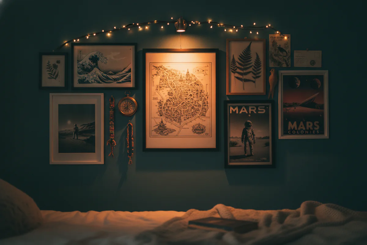
Grouping prints vs. one statement piece
Gallery walls of black and white prints work in colorful rooms when the prints are densely hung and treated as a single mass. Spread out with gaps, they fragment. The eye bounces between them and the color in between, and nothing wins.
If you want a gallery wall, push the prints closer together than feels comfortable - maybe 2 inches between frames instead of 5. Let the collection act as one large object. Then the logic from the first rule applies again: the combined mass is big enough to compete.
One large statement print is honestly easier and usually more effective. Browse the wall art catalog by size if you want to see what's available at the scale that actually works in this context.
Subject matter isn't neutral
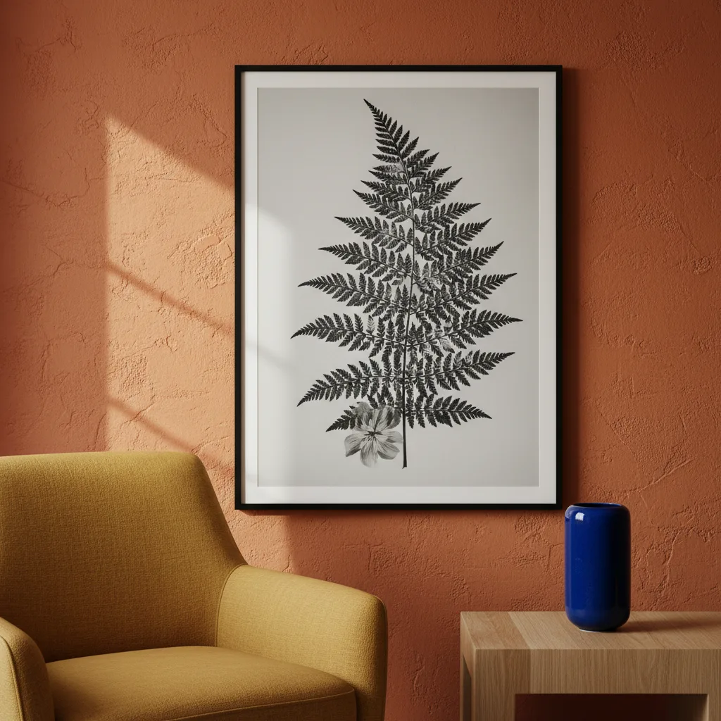
A soft botanical in black and white reads totally differently from a high-contrast graphic print or a detailed car photograph. In a colorful room, you want subject matter that carries its own energy - abstract shapes, strong architectural lines, bold portrait work, or something with texture that reads clearly even when the color around it is competing. Soft, low-contrast imagery gets swallowed.
If your room runs warm and saturated, a black and white print from the cars category or something with hard geometric edges will hold better than a misty landscape that needs quiet around it to land.
One thing to skip
Matching the print to the room's accent color by adding a colored mat or tinted frame. It's a common instinct and it almost always weakens the effect. The whole point of black and white wall art in a colorful room is the contrast. The moment you try to bridge the gap, you lose what made it work.
Keep the print clean, go bigger than you think you need to, and let the room's color do the framing. That's the rule.