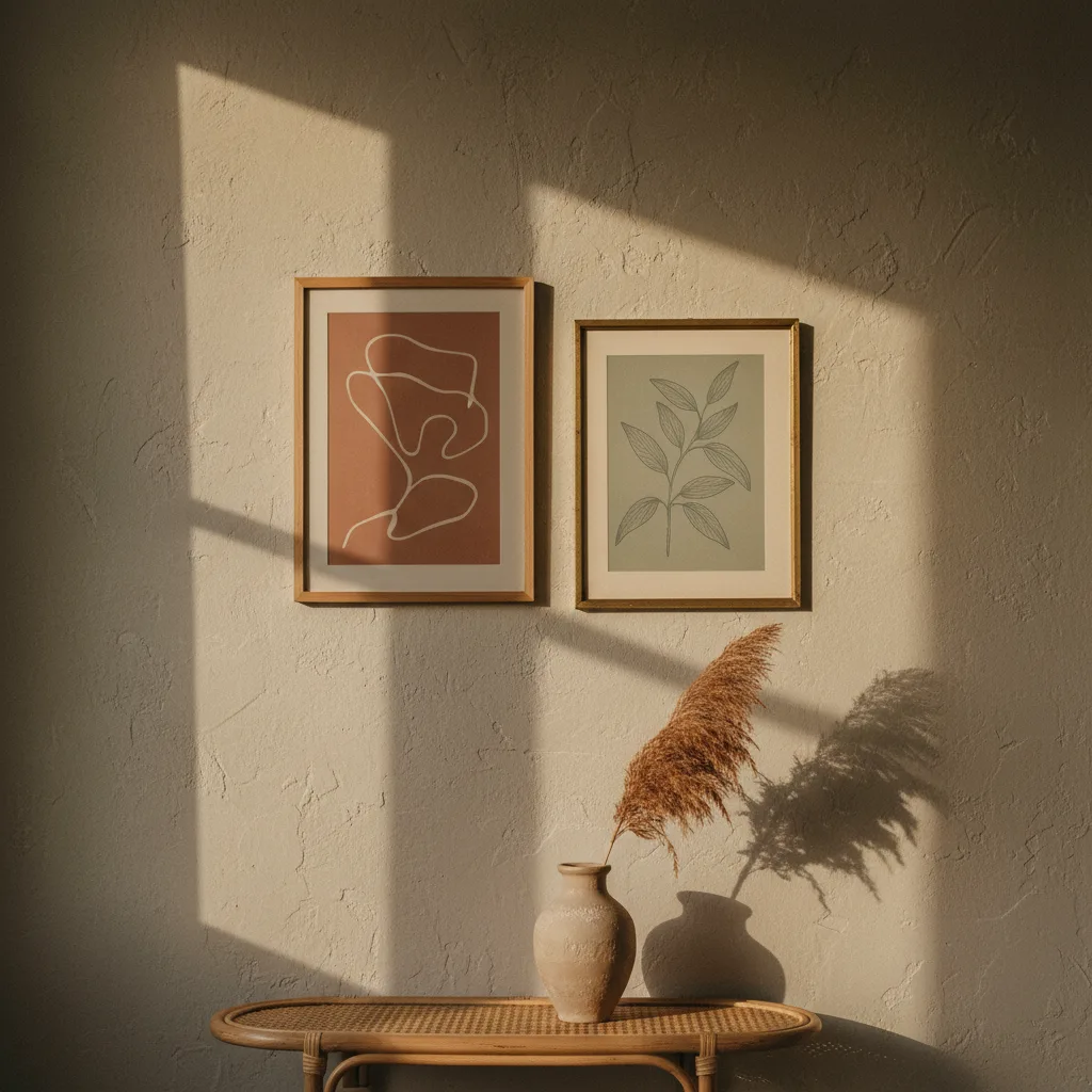
Boho wall art ideas are not in short supply - the problem is that about 80% of them lead you to the same beige macrame circle, the same watercolor feather, and the same hand-lettered "wild and free" quote. If you've scrolled Pinterest for more than ten minutes looking for this stuff, you know exactly what I mean. The good news is that the actual bohemian aesthetic - layered, a little chaotic, pulled from different sources - is genuinely flexible. You just have to stop letting the algorithm decide what it looks like.
What boho wall art actually means (before you buy anything)
The original bohemian look came from people who collected things - prints they picked up traveling, art from cultures they found interesting, a mix of periods and textures that had no business working together but somehow did. It was personal and slightly accidental. The Pinterest version stripped all of that out and replaced it with a color palette (rust, terracotta, cream) and two or three props. So if you want boho wall art that doesn't look like a set, start by thinking about collection rather than theme. You're not decorating a mood board. You're building a wall that looks like someone actually lives there.
The specific boho wall art ideas worth trying
Black and white botanical prints are underrated here. A large-format print of tropical leaves or dried botanicals in monochrome reads bohemian without screaming it - partly because the subject matter fits and partly because the lack of color forces you to think about shape and composition instead of just matching a palette. Pair one with something warm-toned nearby and the contrast does the work for you.
Abstract art in earth tones is another one that actually holds up. Not the generic swirls-on-canvas kind, but prints with real texture suggestion - something that looks like it could be a close-up of clay or stone or cracked paint. Abstract prints in ochre, burnt sienna, or deep olive land in boho territory without relying on any of the tired symbols.
Animal portraits, especially dogs and cats, work better in this context than most people expect. A slightly painterly golden retriever print in a warm color treatment fits the layered, collected feel way better than another feather illustration. If you have a pet, this is also just a better use of wall space. Check the wall art collection - there's a lot more range than people assume when they're searching specifically for "boho."
Sizing and arrangement - this matters more than the prints themselves
A single small print on a large wall is always going to look timid, and timid is the opposite of bohemian. Go bigger than feels comfortable, or go with a cluster of different sizes. The asymmetric gallery wall - a large anchor piece, two or three smaller ones off to the side at different heights - is a cliche too, but it's a cliche because it works. The trick is not making every frame match. Different frame colors, different orientations, a mix of canvas and flat print. That inconsistency is actually the point.
What to skip
The dreamcatcher print. The word art. Anything that has a moon phase diagram on it unless you genuinely care about moon phases, in which case fine. The problem with these isn't that they're ugly - some of them are fine - it's that they're signals now instead of choices. They say "I saw this in a boho room" rather than "I wanted this specific thing." That's the whole difference between a room that looks collected and a room that looks decorated.
Also, terracotta as a color is not going away, but it is getting tired as a commitment. One terracotta-toned print in a mix is fine. An entire wall planned around terracotta is going to date badly.
Formats that work beyond the standard poster
Canvas prints add actual texture to a wall, which matters in a style that's supposed to feel layered and tactile. Metal prints go in the opposite direction - very flat, slightly reflective - but in the right space with the right image (think botanical line art or a moody nature shot) they look less cold than you'd expect. And if you want to carry the aesthetic further, the same prints that work on walls translate reasonably well to postcards for styling a desk or shelf without committing to another frame.
The short version: pick things you'd actually want to look at every day, buy them bigger than feels safe, and stop trying to match a reference image someone else made.