The debate between cohesive and eclectic gallery wall ideas has a real answer - it just depends on the room, not your personality type. Most design advice dances around this and tells you both are equally valid. They're not. One will look intentional in a given space. The other will look like a mistake you haven't fixed yet.
What "cohesive" actually means here
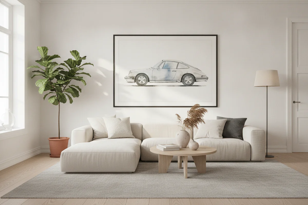
A cohesive gallery wall isn't about matching frames or sticking to one color. It means the pieces share something - a palette, a subject, a mood. Six black-and-white car prints from our car wall art collection hung in two rows: cohesive. Three different frame finishes, two sizes, same grayscale tone: still cohesive. The eye finds a thread and follows it. That's the whole job.
Where cohesive works best: dining rooms, home offices, hallways. Anywhere people pass through or sit in for a while. A focused wall reads faster and holds attention longer. You don't need to stare at it to understand it.
Gallery wall ideas eclectic - what makes them work (and fail)
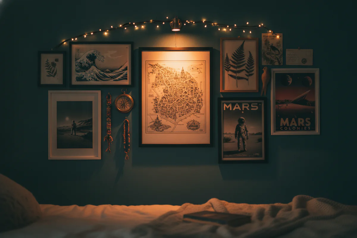
Eclectic gets a bad reputation because most people mistake "mixed" for "random." A vintage car poster next to a golden retriever photo next to a cyberpunk cityscape next to a motivational quote in Comic Sans - that's not eclectic, that's a storage problem. Real eclectic gallery walls have a hidden logic. The chaos is controlled.
What holds an eclectic wall together is usually one of three things: consistent frame color (even if the art varies wildly), a limited palette that runs through every piece, or a size anchor - one large print that everything else orbits. Without at least one of those, the wall just looks restless.
Where eclectic works best: living rooms, creative studios, kids' rooms, any space where you actually spend time looking at the wall rather than walking past it. You want layers to discover. That takes time, and it works better when someone is sitting down with a coffee than when they're rushing through a corridor.
The room shapes the decision more than you do
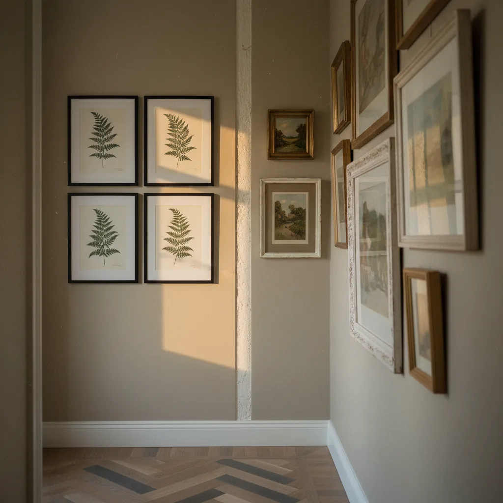
Long narrow hallway? Go cohesive. A consistent series - same subject, similar format - turns dead corridor space into something with direction. Eclectic in a hallway reads as cluttered before anyone even stops to look.
Big living room wall with furniture in front of it? Now eclectic has room to breathe. You can mix a large canvas print with smaller posters, vary the frames, throw in something unexpected. The scale of the wall absorbs the variation instead of being overwhelmed by it.
Low ceilings compress everything. If your ceiling is under about 2.7 meters, cohesive is safer - fewer visual interruptions, less noise. High ceilings forgive a lot of eclecticism because there's vertical space to distribute the energy.
Mixing both in one space
You don't have to choose globally. A cohesive cluster above a sofa, a looser eclectic arrangement on the adjacent wall - that works fine as long as there's physical separation between them. What kills it is blending the two approaches on the same wall. Pick a lane per wall, not per room.
One thing that bridges both styles: consistent frame finish. Matte black frames will unify almost anything. You can run totally different subjects and sizes and the wall still reads as considered rather than accidental. It's a cheap trick but it's a real one.
Where to start if you don't know yet
Start with the anchor. For cohesive, it's your strongest single piece - usually the largest one. For eclectic, it's still your largest piece, but it sets the permission level for how much chaos the wall can handle. A moody dark abstract print as the anchor gives you a lot of range. A bright pastel anchor limits what can sit next to it without clashing.
Then build outward. Print sizes on paper and tape them to the wall before you drill anything. This sounds tedious. It saves you about four patched holes.
If you're still unsure after all that, go cohesive for the first pass. You can always add contrast later. You can't un-drill a wall full of mismatched frames and expect to feel good about it on a Tuesday morning.