Color theory for wall art is one of those topics that gets explained badly almost every time. You get the classic 60-30-10 rule - 60% dominant color, 30% secondary, 10% accent - which was written for furniture and paint, not for a canvas print that has fifteen colors in it. Applying it to art selection directly is like using a bread recipe to bake a cake. The logic is adjacent, not transferable.
What the 60-30-10 rule actually means for art
The rule was meant to describe a finished room, not tell you what to hang on the wall. Your dominant color (60%) is your walls, your largest sofa, your floor. Secondary (30%) is accent furniture, curtains, rugs. The 10% accent is where the art usually lives - which means the print does not need to match everything, it needs to complete the last 10%.
That reframe changes everything. You are not hunting for a poster that contains the exact beige of your sofa. You are looking for something that drops the one color the room is missing, or punches the accent color you already have somewhere small - a throw pillow, a lamp base, the binding of three books on a shelf.
The real color theory for wall art: dominant, bridge, and pop
Forget the percentages for a second. When I look at a print and try to figure out whether it will work in a specific room, I use three questions instead.
Dominant: What is the heaviest color in this print? Does it fight the wall or sit next to it? Dark navy art on a slate-gray wall disappears. Same value, similar hue - they merge. You need at least one full stop of contrast between your wall color and the print's dominant color.
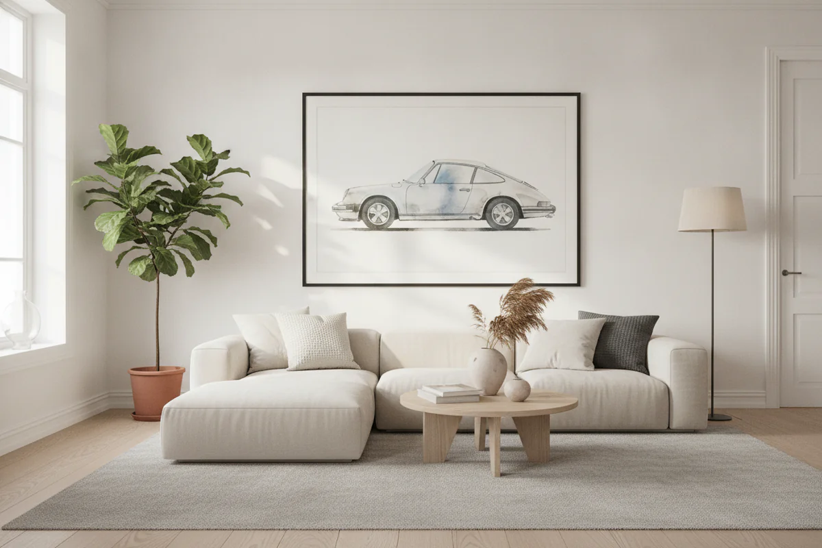
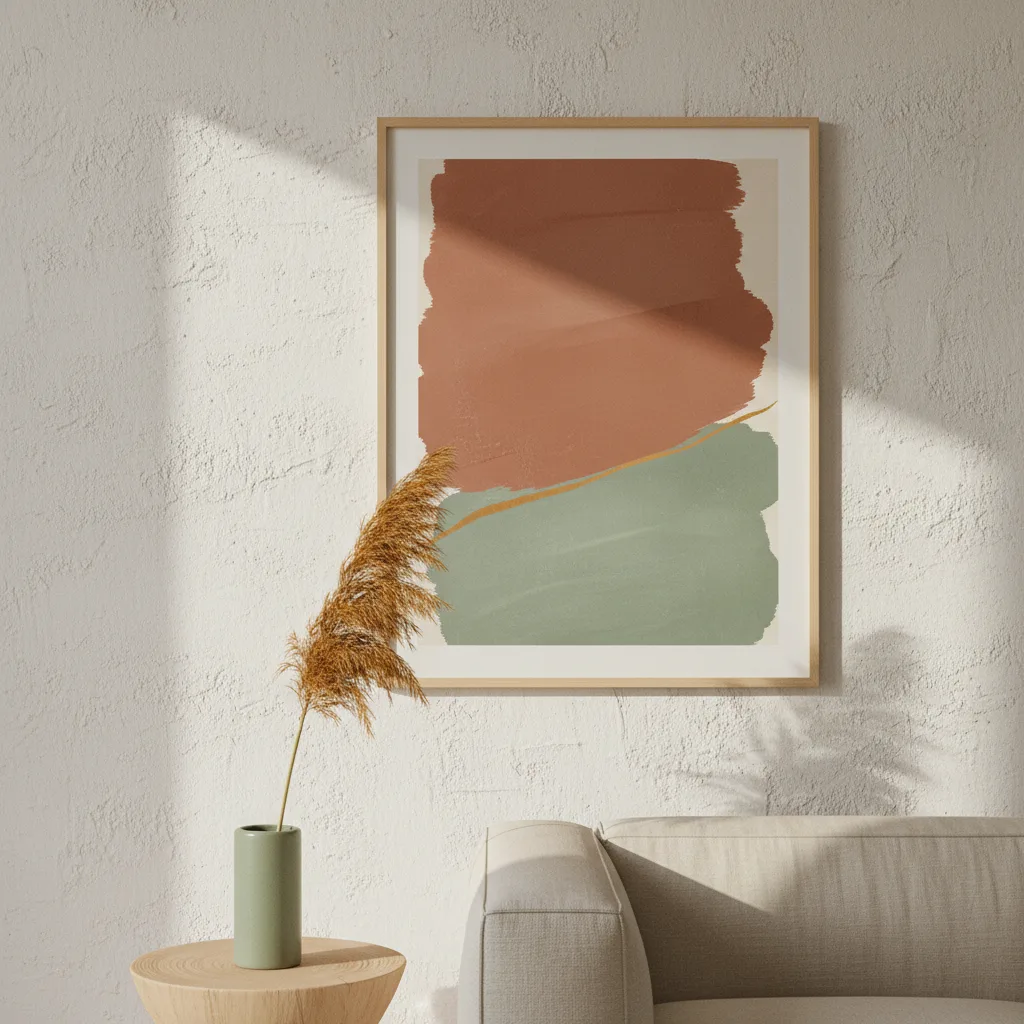
Bridge: Is there a color in the print that echoes something already in the room? This is the thing that makes a print feel like it belongs rather than like you just bought it on a whim. It does not have to be an exact match. A warm amber in a Porsche poster picking up the honey tone of a wood floor - that is a bridge. Close enough counts.
Pop: Does the print introduce one color that is not in the room at all? This is actually good, not a problem to avoid. That new color is what makes the art feel intentional rather than decorative filler. A single unexpected teal in an otherwise warm room is interesting. Three unexpected colors is chaos.
Warm rooms versus cool rooms
This one people get wrong constantly. If your room runs warm - wood tones, cream walls, amber lighting - slapping a cool-toned print on the wall does not "balance" it. It just creates a fight. The better move is to go warmer still, let the room commit to its own direction, and use the print to deepen that. A golden retriever portrait, a desert landscape, a copper-toned car print - those lands. A cold steel-blue abstract does not.
Cool rooms (gray walls, white trim, chrome fixtures) are more forgiving because cool-neutral reads as a background rather than a statement. You can introduce warmer art without it looking wrong. But a room that is already cold plus cold art just feels clinical.
Size changes how color reads
A small swatch of orange on a paint chip looks nothing like that same orange blown up to 40x60 on canvas. Colors scale. A print that looks balanced in a thumbnail can feel aggressive at full size because the eye has nowhere to rest. If you are going large - anything over 24 inches on the short side - mentally double the visual weight of the dominant color when you are deciding whether it works.
This is especially relevant for canvas prints with high-contrast subjects: black and white photography, cyberpunk neon, high-saturation nature shots. They can be brilliant. They can also eat a room. Know which one you are going for before you order.
One cheat that works almost every time
Pull one color from the art and repeat it somewhere small in the room - a candle, a single cushion, a small ceramic. It tricks the eye into reading the print as part of the space rather than decoration added after the fact. Designers do this and then charge a lot of money to explain it. Now you know.
Browse the full wall art catalog with this in mind and you will stop second-guessing yourself halfway through checkout.