Dark academia wall art is one of those things people get badly wrong, mostly because they grab whatever looks vaguely antique and call it done. The aesthetic has a real logic to it - muted tones, intellectual weight, a sense that the person living there has read things and thought about them - and random sepia photographs of Paris do not cut it. If you are trying to build a room that actually feels the part, the art on the walls is doing more work than almost anything else.
What dark academia wall art actually means
The short version: it should feel like a Victorian scholar's study crossed with a liberal arts college dormitory at 11pm. Think oil-painting palettes - deep greens, ochres, near-blacks, brown-grays. Subjects that carry some intellectual or symbolic weight. Architectural drawings. Botanical illustrations with latin labels. Astronomical charts. Classical figure studies. Skulls, but treated seriously, not ironically. Ravens. Old maps.
What it does not mean: Edison bulb photography, millennial grey minimalism, or anything described as "rustic farmhouse." Those are different aesthetics wearing a trench coat.
The formats that work best
Canvas prints are the obvious choice and honestly the right one for this look. The texture reads as painterly even on a photographic print, and that matters here - glossy photo paper looks cheap against aged wood furniture and dark walls. A large single canvas of something like a classical architectural study or a detailed nature illustration carries more weight than a grid of smaller frames, though a mismatched gallery wall with prints of varying sizes can work if you commit to it being slightly chaotic rather than careful.
Posters work too, but only if you frame them. An unframed poster on a dark academia wall is like wearing trainers with a suit - you can do it intentionally, but you have to mean it. Dark wood frames or ornate gold ones. Not thin black IKEA frames.
Browse the full wall art range if you want to see what's available in canvas and poster formats before narrowing down.
Subjects worth looking for
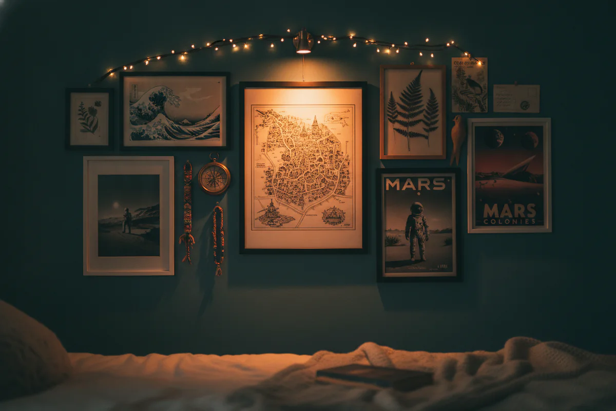
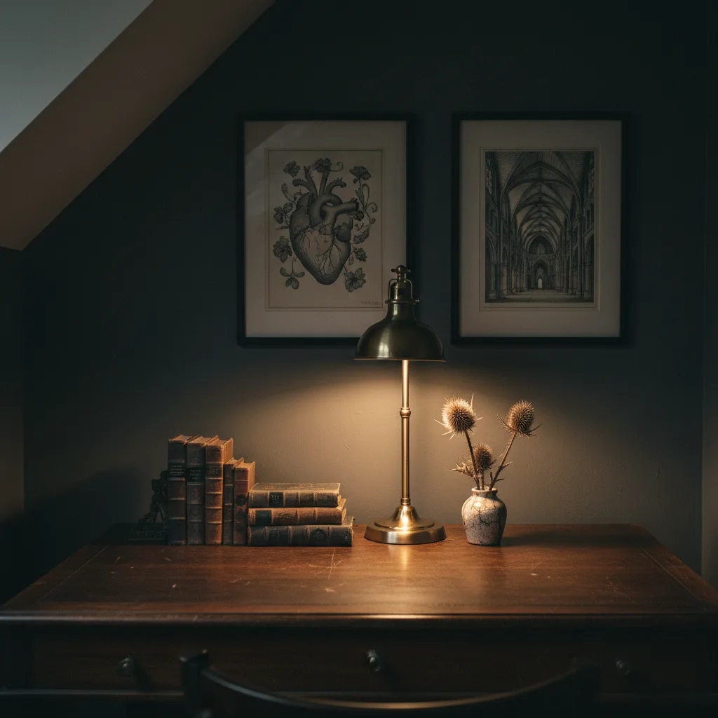
Botanical prints are probably the most versatile option in this category. A detailed illustration of a plant species, printed large, framed in dark wood - it fits almost any dark academia room without trying too hard. Skull studies and anatomical diagrams work in the same way, though they read a bit more theatrical, which is fine if that is the direction you are going.
Abstract prints can fit, but only the right kind - think geometry that feels like it came from a mathematics textbook, or ink-wash work that looks like someone made it with an actual brush. Bright color-block abstracts do not belong here at all.
Nature prints more broadly - ravens, moths, wolves in forest settings - tend to land well because they carry that combination of natural world and slightly ominous that the aesthetic runs on. The nature prints collection has options worth digging through for exactly this.
Size and placement
Go bigger than you think. A small print on a large dark wall disappears, and dark academia rooms tend toward dark walls. One dominant piece above a desk or a reading chair anchors the room better than several small ones scattered around. If you do want multiple prints together, cluster them tightly - gaps between frames dilute the effect.
Height matters more than people admit. Eye level is the standard advice, but slightly higher than eye level, the way old portraits were hung in actual libraries, gives a room more of that institutional quality the look is going for.
What to pair the wall art with
This is the part people skip, then wonder why the room feels off. A good dark academia print on a white IKEA bookshelf wall is fighting the furniture. The art needs company - stacked books, a globe if you can find one, dried botanicals, a lamp that throws warm light. The print does not do the whole job alone, but it signals the intent of the room to anyone walking in.
If you want to carry the aesthetic further, the same prints and illustrations that work on canvas translate well to other formats. A notebook with a botanical or architectural cover, or a mug with something from the same visual family, keeps the look consistent without being precious about it.
The mistake most people make
Buying too many different things from too many different visual registers and hoping they cohere. They won't. Pick a narrow palette - two or three subjects that share a tone and a color range - and repeat them. Dark academia as an aesthetic is actually pretty restrained once you understand it. The drama comes from depth and texture, not from quantity.