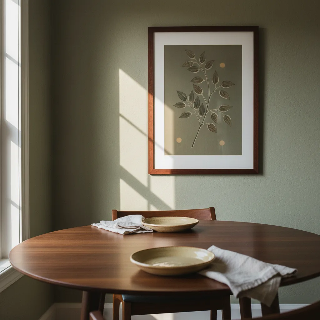
Dining room wall art gets overthought in some ways and completely ignored in others. People obsess over color matching and forget that a print half the size it should be will always look cheap, no matter how good the image is. Scale kills more dining room walls than bad taste does. Start there.
The scale problem with dining room wall art
The most common mistake is hanging something too small. A single 12x16 print above a six-seat table looks like a postage stamp. The art ends up reading as an afterthought rather than a choice. As a rough starting point, whatever you hang above the table should be at least two-thirds the width of the table itself - wider is usually better. A 60-inch table wants a piece, or a grouping, that runs 40 inches or more across.
If you are going with a single large canvas, something in the 36x48 or 40x60 range actually fills the wall. Anything smaller and you are just decorating around the furniture rather than working with it.
Height matters more than most guides admit
Hang it too high and the art floats off into the ceiling. Too low and it competes with the furniture. The standard rule - center the piece at 57 inches from the floor - works fine for a living room with standing traffic, but in a dining room where people are mostly seated, you can go a little lower. Somewhere between 54 and 60 inches to center is usually right. When you are sitting down, the art should feel like it is in your eyeline, not above your head.
Above a buffet or sideboard rather than empty wall, drop the bottom of the frame to about 6-8 inches above the furniture surface. That connection between art and furniture is what makes it look intentional.
What mood actually works in a dining room
This depends on how you actually use the room. A formal dining room that sees mostly dinner parties can carry something bold - a large abstract in deep blues and charcoals, or a dramatic nature print. Rooms like that have a bit of theater to them already, so the art should match.
But if your dining room is where the kids do homework and you eat tacos on Tuesday nights, something that intense will feel exhausting. Go warmer. Botanical prints, landscapes, food-adjacent art if you like that kind of thing. The mood of the room when it is empty at 2pm should feel comfortable, not like a restaurant trying too hard.
Abstract prints work in almost any dining room because they do not compete with whatever is on the table - food, candles, a mess of schoolbooks. Check out the full wall art collection at EnjoyPoster if you want to see the range before committing to a direction.
Gallery walls in the dining room - when they work and when they don't
A gallery wall can work really well in a dining room, but only if the wall is long enough to let it breathe. Cramming five small frames onto a 4-foot wall does not read as a gallery wall. It reads as clutter. You need at least 6-8 feet of horizontal space for a grid arrangement to feel intentional.
If you are doing a gallery wall, commit to a consistent frame finish - all black, all natural wood, all white. Mixing frame materials in a dining room usually looks accidental rather than collected. The art itself can vary. The frames should not.
What to avoid above the dining table specifically
Anything too busy or visually loud. The dining table is already a lot - food, people, light, movement. Art that demands constant attention competes with everything else happening in the room. Portraits of strangers staring down at you while you eat are also genuinely weird, and worth mentioning because a lot of people buy them anyway.
Reflective surfaces like metal prints can look great in a dining room if the lighting is right - the way they catch candlelight is actually pretty good. See what the wall art options look like across different formats before deciding on material. Canvas tends to be the safest bet for dining rooms because it reads warm and does not throw glare.
One last thing on color
You do not have to match the art to your walls or your chairs. You really don't. What matters more is that the art shares at least one color with something else in the room - a rug, the wood tone of the table, the upholstery. One point of contact is enough. That is what makes it feel chosen rather than dropped in.