If you've ever ordered a print, put it up, and immediately felt like something was wrong - too small, wrong wall, competing with the furniture - you've had empty wall syndrome. The fix isn't buying more stuff. It's learning how to plan a wall art layout before anything goes in the cart.
Start with the wall, not the art
This sounds obvious but almost nobody does it. Most people see a print they like and buy it, then figure out where it goes. That's backwards. The wall is the constraint. Measure it. Write it down. Note what's already around it - a sofa, a window, a doorframe, a light switch you keep forgetting about. The art has to work with all of that, not in spite of it.
A single wall over a couch reads completely differently from a long hallway or the space above a bed. Each one has its own logic. Don't treat them the same.
The size mistake almost everyone makes
People consistently buy prints that are too small. A 12x16 poster that looked bold on a screen looks like a sticky note once it's on a wall with eight feet of empty space around it. The general rule is that your art should cover roughly 60-75% of the wall width it's anchoring - so if your sofa is 84 inches wide, you want something in the 50-60 inch range, or a grouping that adds up to that.
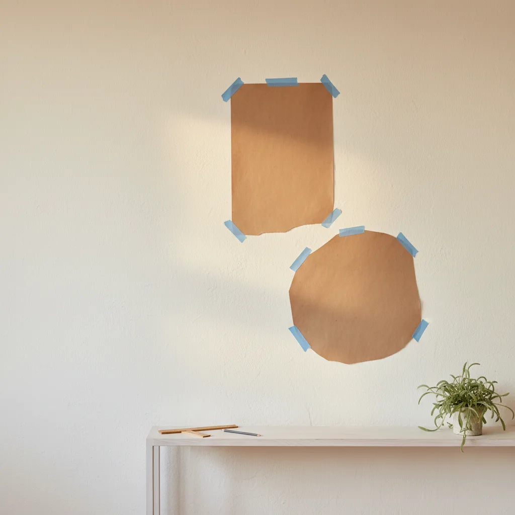
Use painter's tape on the wall before you order anything. Tape out the exact dimensions. Live with it for a day. You'll immediately know if it's wrong.
How to plan a wall art layout that actually holds together
The biggest layout mistake is treating each piece as independent. If you're doing a gallery wall, pick a visual anchor first - usually the largest piece - and build around it. Everything should relate back to that anchor either by color, subject, or framing style. Mixing black-and-white photography with neon cyberpunk prints and a motivational quote poster is a mess. Pick a direction and commit.
Some options that actually work:
- One large print centered over a piece of furniture - clean, hard to get wrong
- A horizontal pair at the same height, small gap between them - works well in hallways
- An asymmetric cluster of 4-6 pieces where the largest sits slightly off-center - more interesting, higher risk if you rush it
Map it out on paper first, or take a photo of the wall and mock it up. The wall art section at EnjoyPoster has enough variety that you can actually find pieces that belong together rather than just coexist.
Spacing and height - the two things that date amateur installs
Standard advice says hang art so the center of the piece is at eye level, roughly 57-60 inches from the floor. That's a good baseline. Where people go wrong is spacing: too much gap between grouped pieces (makes them look unrelated) or not enough (looks crammed). 2-3 inches between pieces in a cluster is the sweet spot. More than 5 inches and you've got separate pieces pretending to be a group.
Also - hang art relative to what's below it, not just to the floor. A print over a desk should sit 6-8 inches above the desk surface. Over a sofa, 6-10 inches above the back. Ignore that and the whole thing floats.
When a single strong print beats a gallery wall
Gallery walls are work. If you don't want to spend a Saturday with a level and a handful of nails, one large-format print does the job with less stress and often more impact. A big canvas from the cars collection or a wide-format nature print can anchor a room completely on its own. Simpler is underrated.
If you want something beyond the walls, the same thinking applies - a consistent visual theme across a mug or a few printed pieces keeps a space feeling intentional rather than random.
One last thing
Don't buy art because it was on sale or because you needed to fill something. Blank wall is genuinely better than the wrong print. Take the time, measure twice, mock it up - then buy the thing you actually want in the size it needs to be.