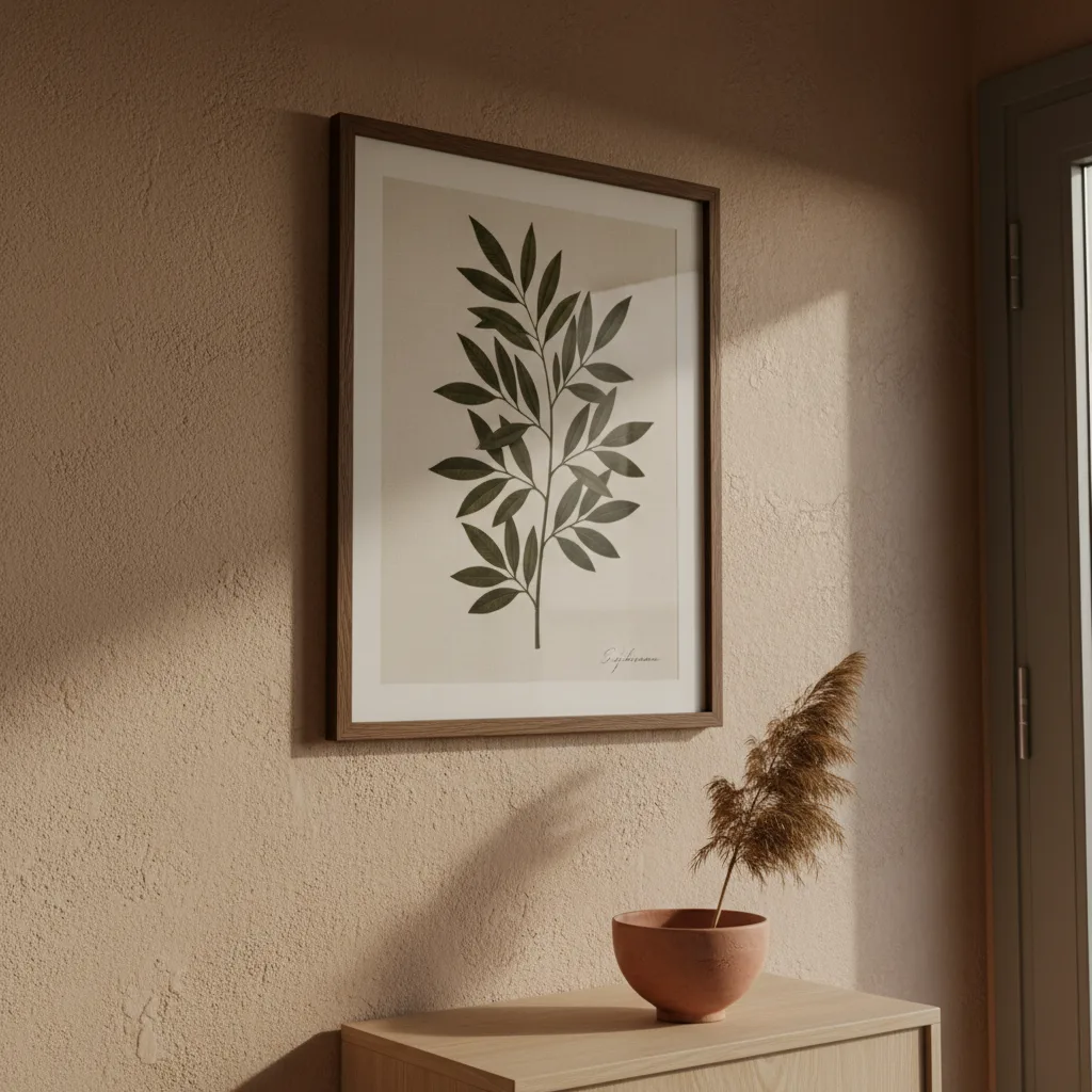
The entryway gets ignored more than any other room, which is a shame because it sets the tone for everything past it. Good entryway wall art ideas don't need to be complicated - they just need to do a job in a small amount of wall space, usually with bad lighting and a coat rack competing for attention.
Why the entryway wall actually matters
Walk into a house where nothing is on the entryway wall. It feels like a waiting room. Now walk into one where someone made a deliberate choice - even just a single large print - and the whole house reads differently before you've seen a single other room. That's not interior design theory, that's just what happens.
The problem is that most people treat the entryway as leftover space. They hang a mirror, a key hook, maybe a family photo from 2014 that never got moved. The wall gets whatever didn't fit anywhere else.
The best entryway wall art ideas by space size
Small entryway - and most of them are small - means one strong piece, not a gallery wall. A gallery wall in a narrow hallway just creates visual noise when you're trying to get your shoes off. Pick a single print, go bigger than feels comfortable, hang it at eye level. Done.
If you have a proper foyer with a decent stretch of wall, a two or three-piece arrangement works, but keep the subject consistent. Don't mix a botanical print with a car photo and a landscape. Pick a direction.
For really tight spaces, something vertical - a portrait-oriented print - draws the eye up and makes the ceiling feel higher. It's a cheap trick but it works every time.
What to actually hang there
Abstract prints hold up well in entryways because they don't need context. You don't have to stop and look at them - they just register as intentional and move on. Bold geometry, a strong color, something with contrast against your wall color. Abstract wall art is probably the safest category for an entryway if you're unsure.
Nature prints work too - a clean landscape, a single tree, coastal photography. They're calming, which is actually useful in the one room where people arrive stressed from the outside world.
Cars, gaming, or anything niche-specific: fine if that's genuinely your house and not a rental you're staging. A Porsche print in a dark wood entryway looks intentional. A Porsche print taped to a beige wall next to a "Live Laugh Love" sign does not.
Skip anything too personal for a shared space - very specific inside jokes, dense text prints, anything that requires explanation. The entryway is not the place for art that needs a caption.
Canvas vs. poster vs. metal for entryways
Entryways get humidity and temperature swings from the door opening and closing. Canvas handles that better than paper. Metal prints are even more durable and look sharp in modern or industrial interiors - the reflective surface picks up whatever light you do have.
If you like the poster look, get it framed. An unframed poster in a hallway looks temporary even when it isn't. A frame signals that you meant to do it.
You can browse the full range of wall art options - canvas, metal, poster - and filter by size, which is the first thing to figure out before you fall in love with a print that's the wrong dimensions for your wall.
A note on color
Match to the wall or contrast against it, but don't do neither. A grey print on a grey wall disappears. A light print on a dark wall pops. A dark print on a white wall is classic for a reason. The entryway is not the room to be subtle about this - it's the room to make a call.
If your entryway has no natural light, lean toward prints with lighter backgrounds or strong contrast. Dark, moody art in a dark hallway just becomes a rectangle of shadow.
One more thing
Hang it before you second-guess yourself. Most people spend more time deciding than the decision actually warrants. Get the size right, pick something you'd stop and look at in a shop, and put it up. The entryway is not a permanent installation - if it's wrong after a month, you move it. But an empty wall is always wrong, every single day you look at it.