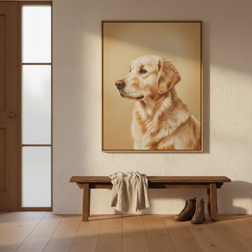
Golden retriever wall art is, by a decent margin, the most consistently popular pet print category we carry - and it's not because golden retrievers are the most common dog in the country. It's because something about this breed translates to print in a way that most others don't.
Why golden retriever wall art keeps outselling other dog breeds
Part of it is color. That warm, honey-toned coat catches light in a way that looks good against almost any wall - white, grey, warm white, even dark paint. You don't have to think hard about whether it'll clash. A black lab print is handsome, but it can disappear on certain backgrounds. A golden just sits there and glows a little.
The other part is expression. Goldens have faces that photographers and illustrators love because the breed reads as emotionally open. Ears soft, eyes wide, mouth relaxed - they look like they're listening to you. That translates into prints that feel less like decoration and more like company. People hang them in living rooms, home offices, kids' rooms. A rotweiller portrait usually ends up in one place in the house. A golden can go anywhere.
The difference between a good print and a forgettable one
Most golden retriever prints look the same. Dog centered, slightly soft focus, golden hour light, the same half-dozen poses. If you've browsed around at all you've seen this template fifty times. It's not bad exactly - it's just not interesting.
What actually works on a wall is either a really specific moment (a wet dog shaking off water, a dog mid-sprint with ears flying, a puppy that's clearly just made a bad decision) or a style that commits to something - graphic, painterly, or full watercolor. The photo-realistic centrist portrait is the hardest to get right because it lives or dies on the quality of the original image and the print resolution. When it's good it's really good. When it's slightly off it just looks like a framed phone pic.
If you're shopping, look for prints where the background is doing something - color, texture, a loose abstract wash behind the dog. That's usually a sign that someone actually designed it rather than just dropped a stock photo into a template.
Canvas versus poster for this subject
Canvas wins here, and not by a little. The texture softens the image in a way that works with fur - photo paper can look clinical on animal subjects, especially close-up portraits. If you want something more graphic or illustrative, a poster is fine. But if the print has any realism to it, canvas is the better call. You can browse the full pet wall art section and filter by format if you want to compare directly.
Size and placement - the part people get wrong
People undersize pet prints. A 12x16 golden retriever print on a large wall looks like an afterthought. This breed has a big personality in real life and the print should reflect that. 24x36 is a reasonable minimum for a main wall. If you're doing a gallery arrangement you can go smaller, but anchor it with at least one large piece or the whole thing reads as tentative.
Above a couch or a bed works. So does a home office wall if you actually like your dog more than you like motivational quotes, which, fair. What doesn't work as well is a narrow hallway - the print needs space around it to breathe.
Other formats worth considering
Prints get most of the attention but the same design library extends to other products. A golden retriever on a mug is an obvious gift - almost insultingly obvious, but people love them because they use them every day. Phone cases work too, especially the watercolor styles which hold detail at small sizes better than photo prints. Notebooks with a dog portrait on the cover are a thing, a genuinely good thing, and you can find them in the notebooks section if that's your angle.
The catalog is big enough now that you can basically outfit a golden retriever owner's whole apartment without repeating a print style. Whether that's the goal or not is up to you.
What this all comes down to
Golden retriever wall art works because the breed is photogenic in a specific, useful way - warm tones, expressive face, versatile enough to suit any room. The prints that actually earn wall space are the ones that go past the stock-photo template and commit to a real aesthetic. If a print looks like it could have been generated in thirty seconds, it probably was, and it'll feel that way in your living room too. Find one with a point of view and it'll stay on the wall for years. The full wall art catalog has enough range that you shouldn't have to settle for the generic version.