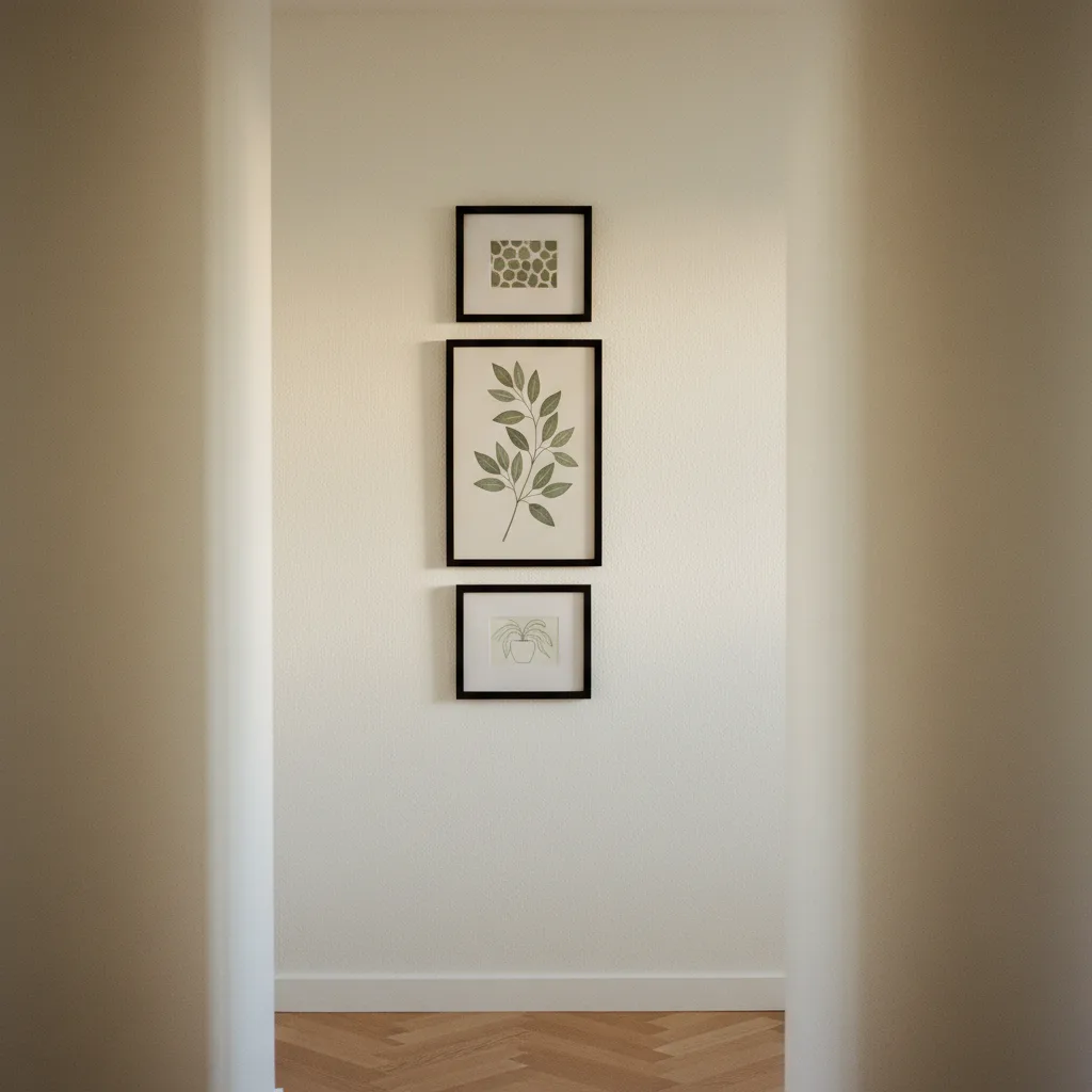
Hallway gallery wall ideas sound simple until you're standing in a 90cm-wide corridor holding a hammer and three prints that don't belong together. The hallway is the most unforgiving wall in a home - too narrow for visual noise, too long to leave completely bare, and lit badly in most houses. Get it right and it's the first thing guests actually notice. Get it wrong and it just looks like you ran out of wall space in the living room.
Why hallways are harder than they look
Most gallery wall advice is written for wide living room walls where you can spread out, step back five meters, and adjust. In a hallway you're basically right on top of whatever you hang. People pass through it quickly, usually in one direction, so the art gets read like a sentence - left to right, in sequence - rather than as a composition you stand and study. That changes everything about how you should lay it out.
The other problem is width. A standard interior hallway runs between 90cm and 120cm. Once you account for the fact that you need at least 15cm of clear wall on each side before something starts looking cramped, your actual usable width is maybe 60-90cm. That rules out anything very wide, and it rules out horizontal layouts that work beautifully on a dining room wall.
The best hallway gallery wall ideas use a vertical spine
Instead of trying to go wide, go vertical. Stack two or three prints in a column, or build a narrow asymmetric cluster that runs taller than it runs wide. A column of three portraits - say 30x40cm each, spaced about 6cm apart - reads cleanly at walking pace. You don't need to stop to take it in. That's the right kind of art for a hallway.
If you want more than one column, keep them close together and at slightly different heights. Not aggressively staggered - just offset by about half a print's height so the eye moves diagonally rather than jumping in two completely separate directions. Honestly, two narrow columns beat one wide sprawling arrangement in almost every hallway I've seen.
Check the wall art section for prints in portrait orientation - those are what you actually want here. Most landscape prints are going to fight the space.
Sizes and spacing - be more specific than 'medium'
People say things like "use a mix of sizes" without actually saying what that means. For a narrow hallway: anchor with one 40x60cm print, then add one or two 20x30cm prints around it. That's it. Three prints, two sizes, done. You don't need six pieces to make it feel like a gallery wall - that's a myth that comes from living rooms where scale is a different problem.
Spacing between frames: 5-8cm is the sweet spot. Closer than 5cm and it looks like the frames are touching. Further than 8cm and the grouping falls apart and starts looking like individual pictures that happened to end up near each other. This matters more in a hallway than anywhere else because the viewing distance is so short.
What kind of prints work - and what doesn't
Bold, high-contrast images with a clear subject. A car shot. A single animal portrait. Something graphic and abstract with strong lines. These read fast, which is what you need when someone's walking past at normal speed.
What doesn't work: busy landscape photography, anything with a lot of fine text, and prints where the main subject is small in the frame. Those require you to stand still and look, and nobody does that in a hallway. Save the moody forest panoramic for the bedroom.
If your hallway connects to a specific room - say, the living room has a car theme going - carry one print from that vocabulary into the hallway. It creates a thread between spaces without you having to consciously design it.
Browse the cars wall art or abstract prints if you want something that reads cleanly at a glance - both categories have enough high-contrast options to anchor a narrow wall properly.
One mistake worth avoiding
Don't mix too many frame styles. In a wide room you can get away with a collected, eclectic look - thin black frames next to thick wood next to frameless canvas. In a hallway it just looks messy because everything is so close together. Pick one frame style, maybe two if they're closely related, and stick to it. The art provides the variety. The frames hold it together.
Nail placement tip: use painter's tape to mock up the layout on the wall before you put a single hole in it. Take a photo. Live with the photo for a day. You'll spot the problems before they're permanent.