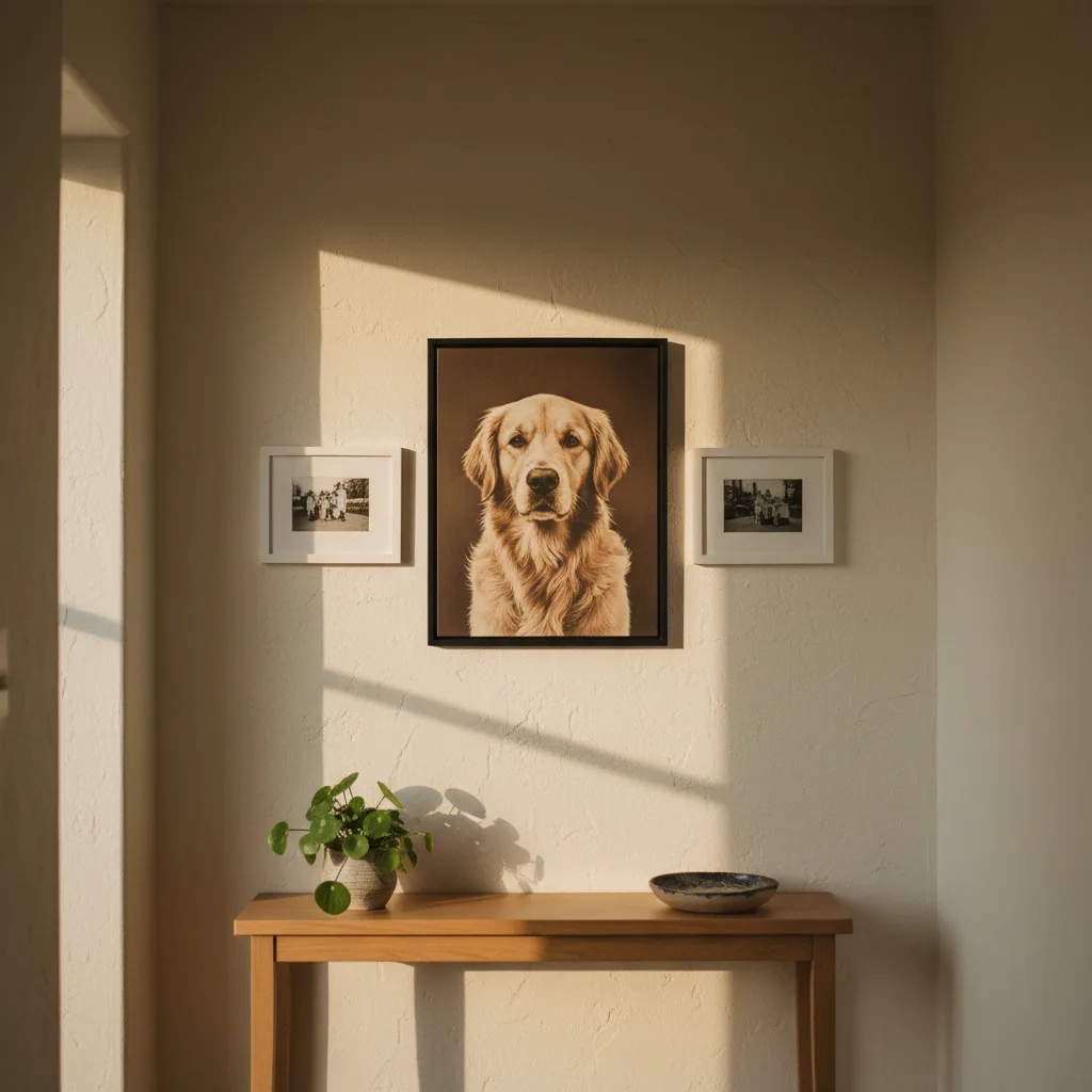
A pet portrait gallery wall is one of those ideas that sounds great until you actually hang it and the dog photo looks like a ransom note taped next to a wedding portrait. The problem is almost never the pet photo itself - it's the decisions around it. Frame mismatch, wrong scale, bad placement. Fix those three things and nobody's going to walk into your hallway and think the arrangement is strange.
Why pet portraits go wrong on gallery walls
Most people treat the pet photo as a bonus, something added after the "real" family photos are already arranged. That's backwards. If you hang four human portraits and then squeeze a cat photo into a gap, the cat photo will always look like an afterthought - because it is. The eye reads hierarchy. Whatever you hang last, in the leftover space, reads as lesser. Plan the pet portrait into the arrangement from the start, same as anyone else in the family. Because, honestly, it is.
Framing - the fastest way to make everything look intentional
This is where most gallery walls fall apart. You've got a glossy black frame for the graduation shot, a rustic wood frame for the beach holiday, a thin gold frame for the wedding photo, and then a random white frame for the golden retriever. It looks chaotic. Not the good kind.
Pick one frame style and use it across every print in the arrangement - black, white, or natural wood are the easiest to keep consistent. The subject inside doesn't matter once the frames match. A portrait of your labrador in the same slim black frame as the portrait of your kid reads as part of the same family. Which it is.
If you already have mixed frames, at minimum match the pet portrait's frame to the one directly adjacent to it. That single connection is enough to pull it in.
Scale matters more than placement
People spend a lot of energy agonising over where to put the pet portrait - centre, edge, top, bottom. That's the wrong thing to agonise over. Scale is what actually controls whether it looks deliberate.
A 5x7 pet photo next to a 16x20 family photo looks like a thumbnail. Either print the pet portrait at a size that holds its own - 11x14 at minimum for a mixed arrangement - or go big and make it the anchor piece. An oversized canvas print of your dog as the centrepiece, with smaller human photos radiating out from it, works completely. That arrangement has a clear logic. What doesn't have logic is a tiny pet photo wedged in like it's apologising for being there.
You can find canvas sizes that work for this kind of layout in the pets wall art section - worth looking at even if you're printing your own photo, just to calibrate what size actually reads well on a wall.
The pet portrait gallery wall works best with a common thread
Beyond frames, the arrangement needs something else tying it together - colour palette, print style, or both. Black and white photos mix easily because the format itself is the common thread. A black and white portrait of your cat sits next to a black and white portrait of your grandmother and nobody blinks.
If you're working with colour photos, look for tonal overlap. A warm-toned pet portrait against cool-toned family photos will always feel slightly off, even if you can't immediately name why. Either edit for consistency or lean into a stylised print treatment - illustrated pet portraits, for instance, carry their own visual logic that doesn't need to match a candid family snapshot.
Where to actually put it in the arrangement
Not the corner. Not the bottom edge. If the pet portrait is a real member of this household - and you clearly think it is, or you wouldn't be reading this - give it a middle position. Not necessarily dead centre, but somewhere that gets read early when the eye moves across the wall. Corner placement is what you do with a photo you're not sure about. Be sure about it.
One strong arrangement: three photos in a horizontal row at eye level, pet portrait in the centre, two family photos flanking it. Simple, symmetrical, and nobody has to explain anything to anyone. The full wall art range has print options that hold up at that kind of scale if you want something with more visual weight than a standard photo print.
One thing that almost always helps
Get the pet portrait printed properly. Phone photos printed at poster size on cheap paper look like phone photos printed at poster size on cheap paper. A canvas print or a quality fine-art poster with good contrast makes the photo look like it was always meant to be on a wall. That alone closes half the gap between "this looks off" and "this looks great." Treat the pet portrait the same way you'd treat any other photo you care about - because you do.