Most layered wall decor ideas you find online show you the finished photo and skip the part where someone had to make fifteen decisions to get there. This isn't that. Here's what actually works when you're mixing prints, shelves, plants, and light in the same wall zone - and what tends to go wrong.
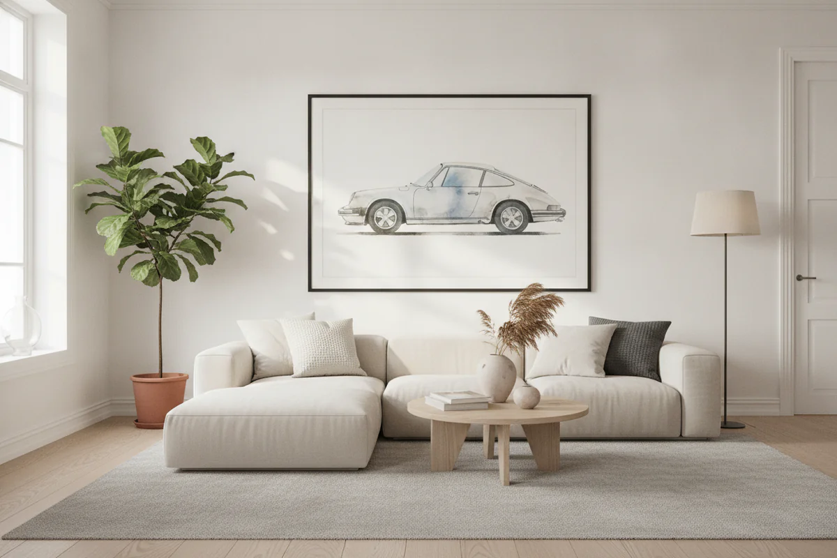
Start with the print, not the shelf
Almost everyone does this backwards. They hang the shelf first, then go looking for art to fill the gaps around it. That's why so many layered walls feel random - the art is reacting to the furniture instead of the other way around.
Pick your anchor print first. Something with enough visual weight to hold the whole arrangement. A large canvas print works well here - something in the 24x36 range, bold enough that it reads from across the room. Once that's up, you're not decorating anymore, you're supporting. Everything else just needs to not fight it.
Where shelves actually fit in layered wall decor ideas
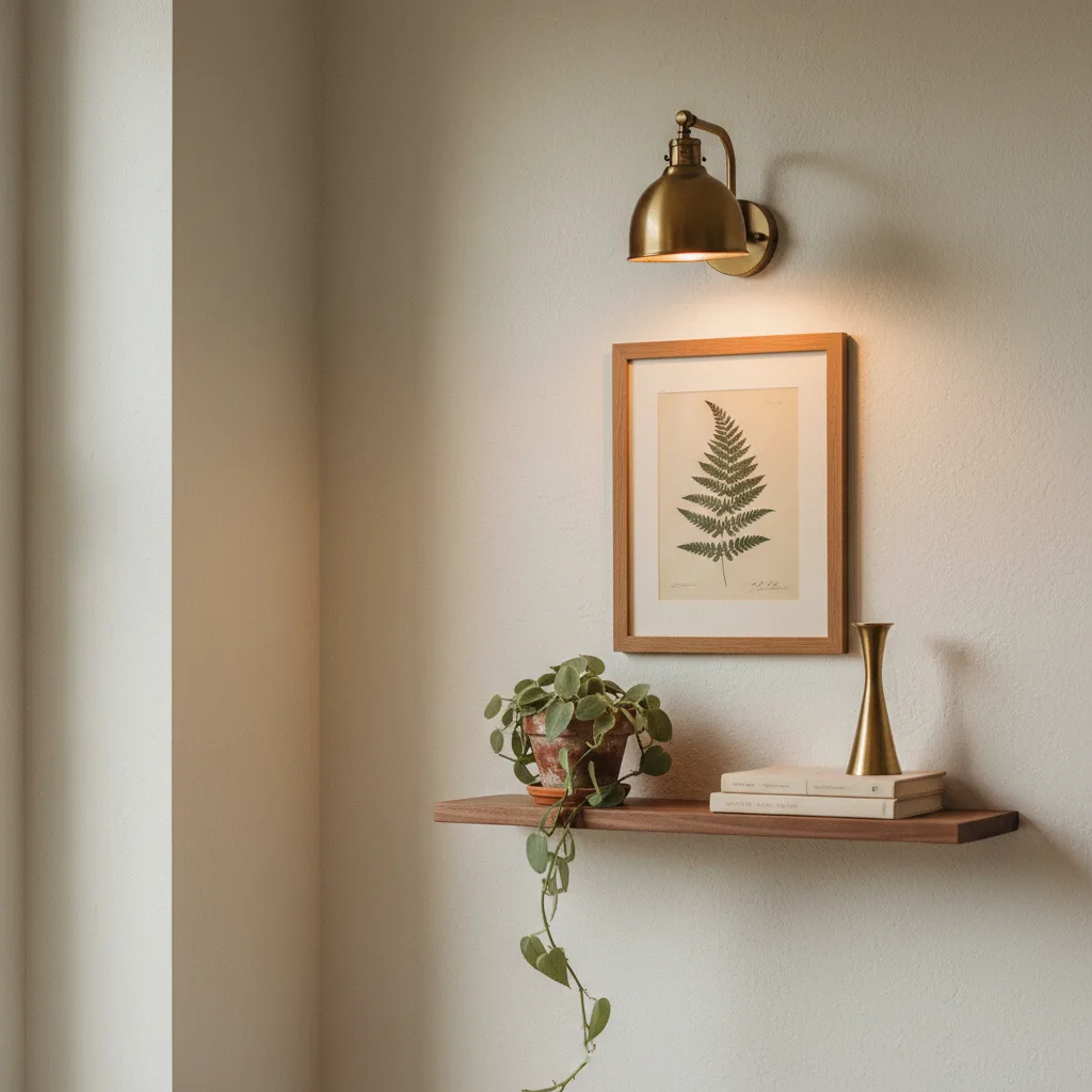
Shelves work best when they're slightly off to one side of the main print, not directly underneath it like a caption. Directly below feels formal and a little corporate. Off to the right or left at roughly two-thirds height - that's where a floating shelf starts to look like it belongs.
One shelf is usually enough. Two shelves stacked on top of each other next to a large print is competing. One shelf with three or four objects - a small plant, a candle, a mug, maybe one tiny framed photo - gives you variation in height without noise. Keep the shelf shallow if you can, around 4-5 inches. Deeper shelves start looking like storage.
Plants: which ones, where
Trailing plants are better than upright ones in most wall arrangements. A pothos or a string of pearls draped over a shelf edge pulls the eye downward and softens the whole thing. An upright succulent or a cactus just sits there and competes with the art.
Height matters more than species. You want at least one element that breaks the straight horizontal line of the shelf. A trailing plant does that naturally. If you're going with something upright, choose a small one and put it at the far edge rather than the center.
Real plants are obviously better, but if you've killed three pothos in a year, a good quality artificial trailing plant on a high shelf is basically undetectable and saves you the guilt.
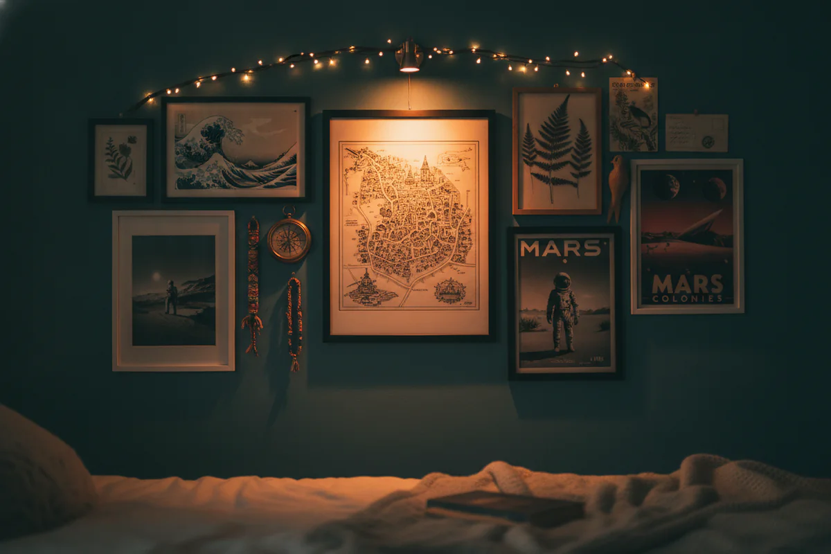
Lighting changes everything
This is the part people skip and then wonder why their arrangement looks flat in photos. A picture light mounted above the main print, or a small plug-in spotlight angled at the wall from a nearby surface, adds depth that no amount of rearranging will give you otherwise.
Warm white bulbs only. Cool white (anything above 4000K) kills the warmth in photography, illustration, and most abstract prints. It makes colors look slightly wrong and the whole wall feel clinical. Warm light at around 2700K is almost always the right call.
If hardwiring a picture light isn't an option, battery-powered tap lights are genuinely good now. Hide them behind the shelf or above the top edge of the canvas. You'll see the effect, not the fixture.
The ratio problem
There's a version of this that goes wrong where every element is roughly the same size. Medium print, medium shelf, medium plant, medium candle. Everything is equivalent and nothing stands out. You need a clear size hierarchy: one large thing, one or two medium things, one small thing. That's it. The large print, a mid-height plant, a small candle or mug. Done.
A ceramic mug on a shelf sounds like a weird choice but it actually reads well - familiar, human-scale, and it introduces a different material texture next to the frame and the plant. Doesn't have to be precious about it.
Color: one thread is enough
You don't need to perfectly match the shelf, the pot, the frame, and the print. That looks like a staged hotel room. What you need is one repeated color that shows up in at least two places. If the print has rust tones, a terracotta pot. If it runs cool with blues and grays, a pale stone candle holder. One thread, not a full palette.
If you're browsing for the right print anchor for all this, the abstract prints category tends to carry the most useful mid-tones - things that are interesting enough to anchor a wall without dictating everything else around them.