Getting wall art above a sectional sofa right is one of those things that looks easy until you're standing in your living room with a hammer, second-guessing everything. Most people hang something too small, or they pick three matching prints from the same store in the same frame and end up with a wall that looks like a hotel lobby. Neither is great. The good news is there are a few concrete rules that fix most of this - and once you know them, the decisions get a lot easier.
Size is where most people get it wrong
The single most common mistake: the art is too small. A sectional is a big piece of furniture. It dominates the room. If you hang a 16x20 print centered above it, that print is going to look like a sticky note on a refrigerator.
A general rule that actually works - your art (or your arrangement of art) should cover roughly two-thirds of the sofa's width. So if your sectional runs eight feet along the main wall, you're looking for something in the range of five to six feet wide. That could be one large canvas print, or a grouping of smaller pieces arranged to fill that span. Either works. The key is that the art has visual weight that matches the furniture below it.
Check out the wall art section at EnjoyPoster - there are large-format canvas prints that are actually built for walls like this, not just decorative thumbnails blown up to 24 inches.
Height matters more than people think
Hang it too high and the art floats, disconnected from the sofa entirely. Hang it too low and people bump their heads sitting up. The standard advice is to keep the bottom edge of the frame roughly 6 to 8 inches above the sofa back. That's it. That gap is the bridge between the furniture and the art - close enough that they read as a unit, far enough that nothing feels cramped.
If you're doing a gallery wall above the sectional, treat the whole grouping as one object. The bottom edge of the lowest frame should sit at that same 6-8 inch mark. The top of the arrangement can go as high as feels right for your ceiling, but don't spread things so far apart that the grouping falls apart visually.
One strong piece usually beats a gallery grid
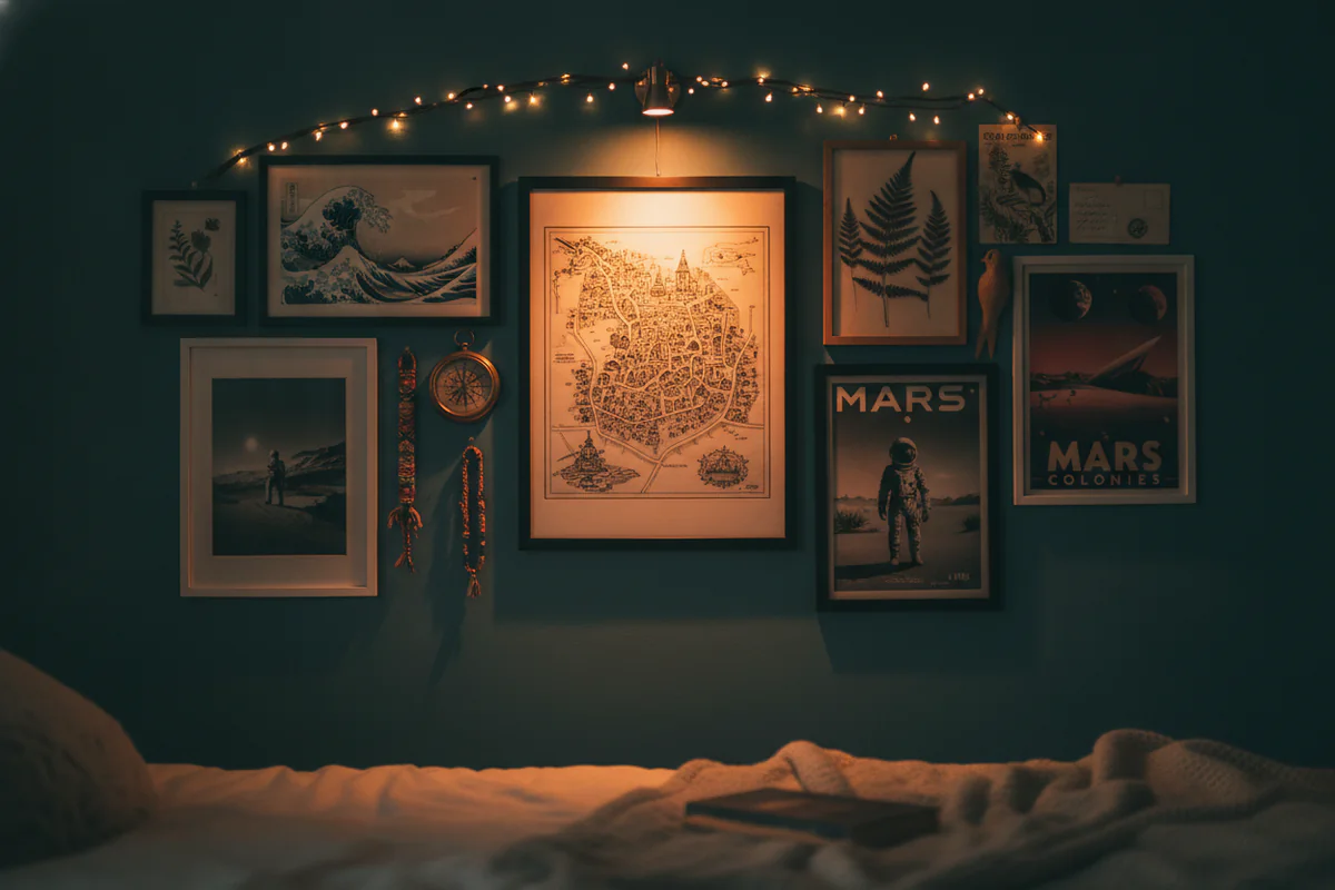
Gallery walls are everywhere right now and honestly, a lot of them look exhausting. Nine frames in a perfect 3x3 grid, every print the same size, all matted in white - it's tidy but it's also kind of lifeless. If your room already has a lot going on, one large statement piece tends to land better.
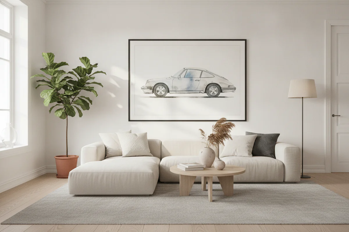
A single oversized canvas - something abstract, or a bold automotive print, or a nature photograph with real depth - pulls the eye and holds it. It's confident. A wall of small matching frames reads as indecisive, like you couldn't pick one thing so you picked everything.
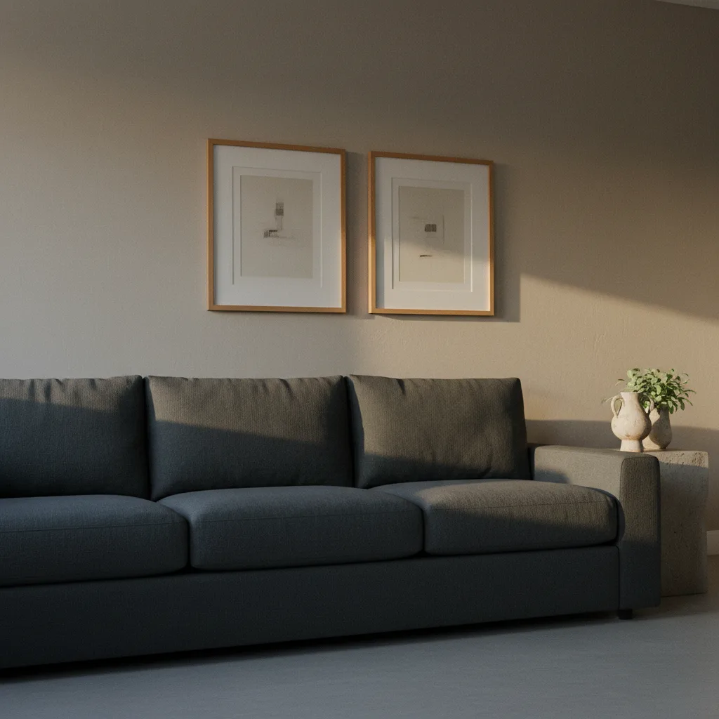
That said, if you genuinely want a grouping, make it uneven. Two bigger pieces and one smaller one. Or five prints at different sizes. Asymmetry looks intentional in a way that a grid often doesn't.
Matching the art to the sofa's shape
Sectionals have an L or U shape, which means you usually have one main wall and then a side wall or a floating end. Don't try to wrap art around the corner - it rarely works and usually just makes both walls look awkward. Pick the dominant wall, the one that faces you when you walk into the room, and treat that as your canvas.
If the sectional's long side runs along one wall and the short side juts into the room, center your art above the long side. The short side doesn't need anything. Leaving it bare is fine. Better than cluttering it.
What actually looks good above a sectional sofa
Bold abstract prints work well because they add visual complexity without competing with furniture patterns. Large nature prints - forests, mountain ranges, ocean shots - give the room a sense of depth. Automotive and JDM prints work surprisingly well in more casual living rooms where the vibe is more personal than curated. Whatever direction you go, pick something with contrast. A light print on a light wall above a light sofa is going to disappear.
If you want to browse by mood, the abstract prints and nature wall art categories at EnjoyPoster have large-format options that are actually scaled for living room walls, not just desk frames.
One last thing - don't match the art color directly to the sofa color. Pulling one accent color from the room and repeating it in the art is fine. But if your sofa is gray and you hang a gray print above it, everything just blurs together. You want contrast, not camouflage.