If you've been googling "wall art to make small room look bigger" and landing on articles that tell you to "keep it minimal" and "choose light colors" without explaining anything - this is the piece you were actually looking for. There are real techniques here, most of them cheap to test, and a few things that people get completely wrong.
Why the right wall art to make a small room look bigger actually works
Your brain reads visual depth cues constantly, even when you're not thinking about it. Art that creates a sense of recession - a long road, a horizon line, a forest path disappearing into distance - genuinely tricks your eye into feeling like the wall is further away than it is. It's not magic. It's just how peripheral vision and focal points interact. A flat geometric print in four colors does nothing for perceived depth. A wide landscape print does a lot.
That's the core of it. Everything else follows from there.
Go wider, not taller
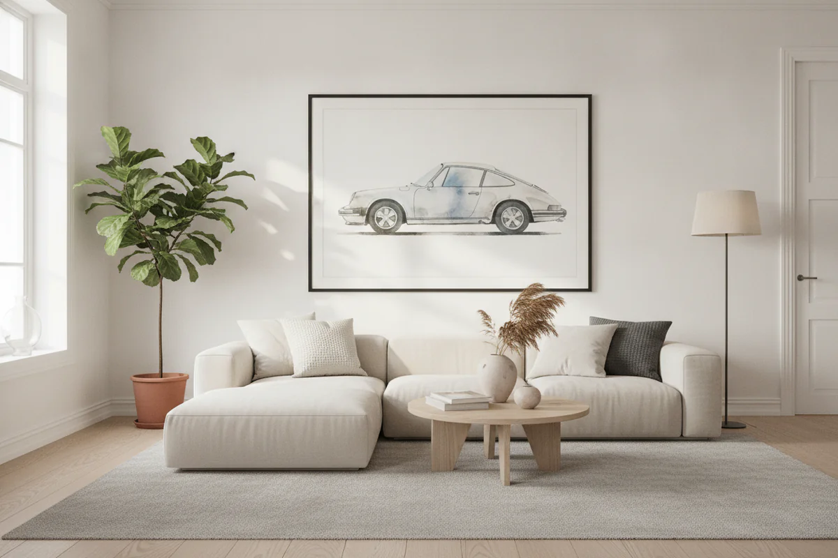
Vertical prints make ceilings feel higher, which is useful in some rooms. But in a small room that feels boxy and tight, horizontal prints - wide panoramas, landscape orientations - push the walls outward perceptually. A single wide canvas print hung at eye level across a short wall will do more for the feeling of space than three tall narrow prints stacked or clustered.
The specific size matters too. People buy prints that are too small. A 12x18 poster on a wall that's eight feet wide looks lost and actually makes the room feel smaller because it emphasizes how much empty wall exists around it. Go bigger than feels comfortable. A 24x36 or larger on most walls. If the room is genuinely tiny, one big print usually beats several small ones.
Depth in the image, not just in the frame
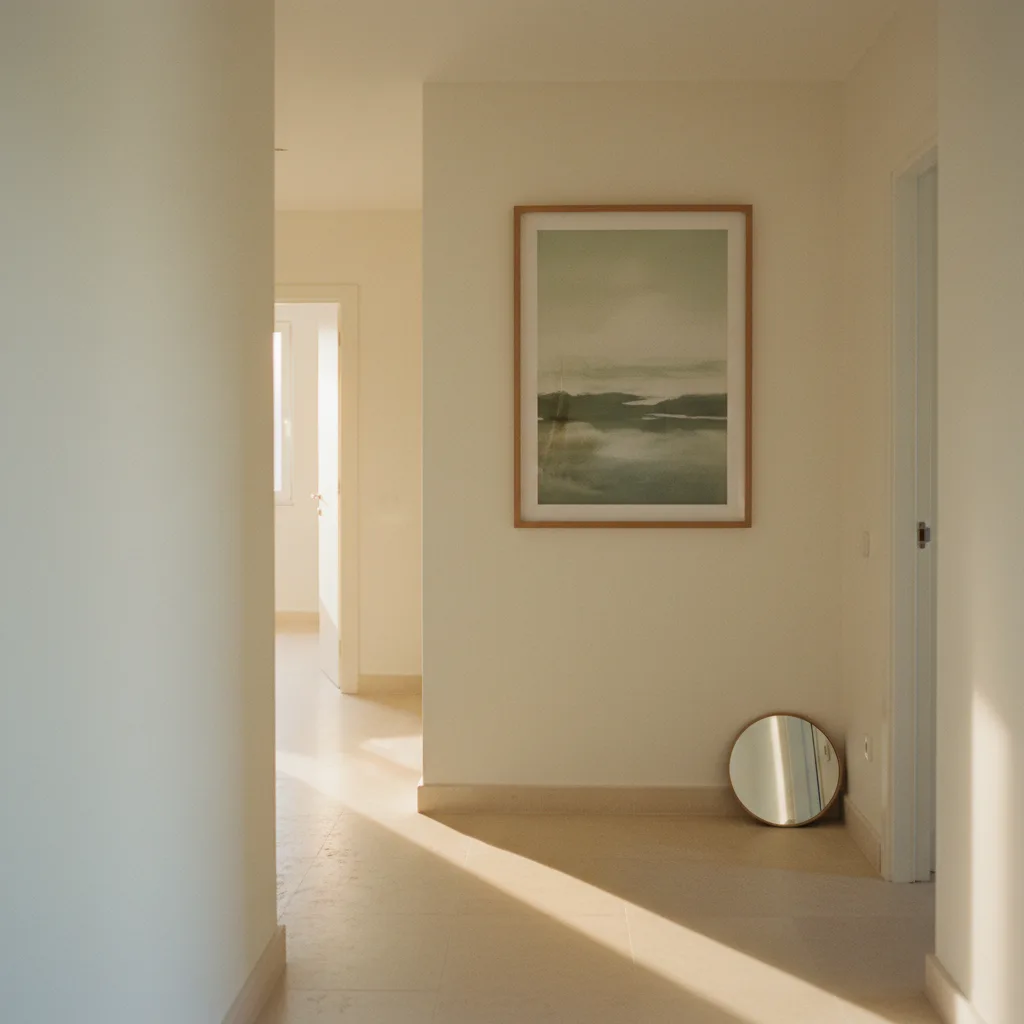
This is where subject matter does real work. Prints that have natural depth - a road stretching to a vanishing point, an ocean with a visible horizon, a mountain range with atmospheric haze in the distance - read as a window more than a decoration. And a window, even a fake one, opens a room up psychologically.
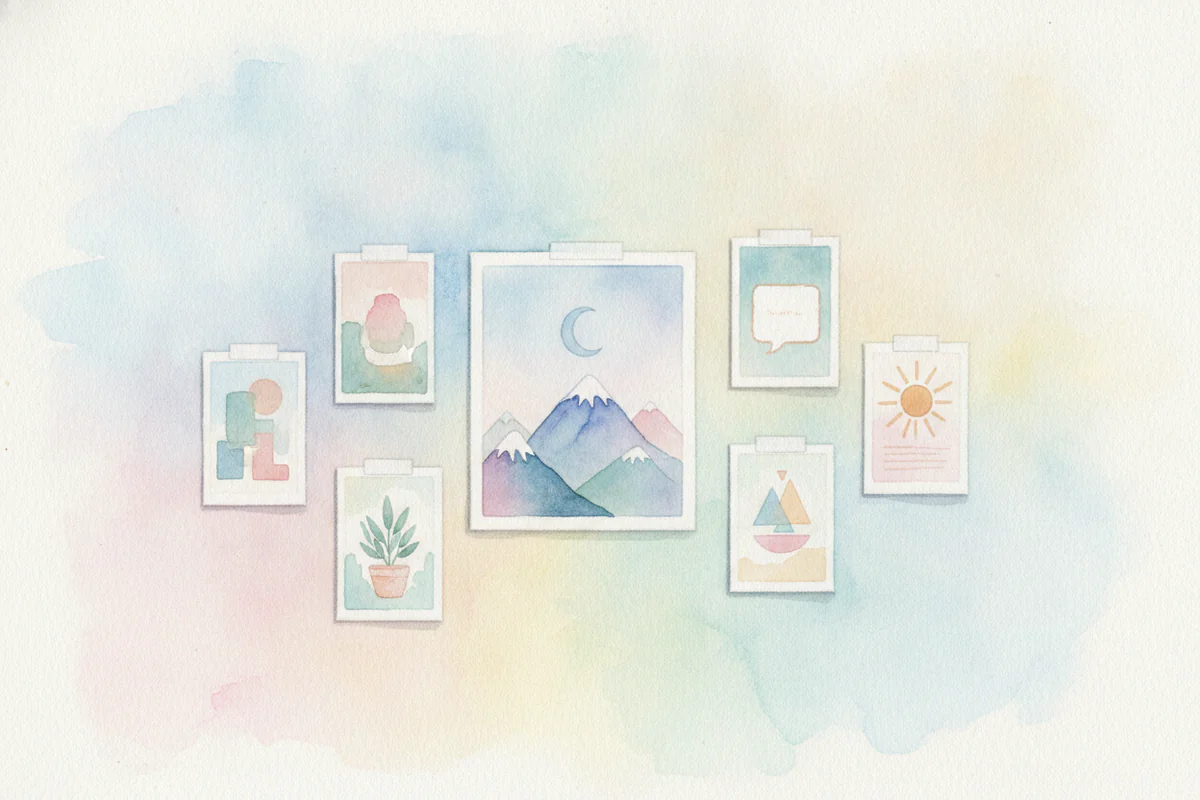
Abstract prints can work too, but you need ones with a strong sense of layering or movement, not flat color blocks. Something with implied space in it. Browse the abstract wall art section and look for pieces where your eye wants to travel into the image rather than just across it.
Nature prints are honestly one of the best calls for small rooms. A wide forest scene or a coastal view at dusk on a canvas hung in a cramped bedroom genuinely changes how the room reads. Check the full wall art catalog if you want to see the range.
Color: lighter backgrounds, not necessarily light colors
The common advice is "light colors make rooms feel bigger" and it's not wrong, but it's incomplete. What you actually want is high contrast between the subject and a light or open background. Dark subject, light background - the image feels airy. Dark subject on a dark background, even if it's beautiful, closes the wall in.
A black and white architectural print on a light background will open a room up. A dark moody forest with almost no sky? Probably not the move for a 9x10 bedroom, even if it looks incredible on someone's Pinterest board.
Placement matters more than people think
Hang art slightly higher than standard museum height (which is 57 inches to center). In a small room, pulling art up toward the ceiling draws the eye upward and makes the ceiling feel taller - which in turn makes the whole room feel less compressed. Not dramatically higher, maybe 4-6 inches above standard. But it makes a difference.
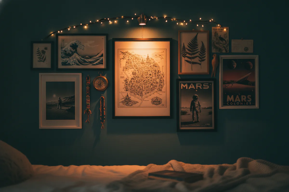
Also: one strong focal wall beats art scattered across every surface. Pick the wall your eye goes to first when you enter the room - usually the one directly across from the door - and put your main piece there. Leave the side walls relatively bare or use something small and simple. Spreading art evenly around a small room makes it feel busy and smaller, not gallery-like.
What to skip
Mirrored art is not the same as a mirror. It won't do what you're hoping. Heavily textured 3D canvas pieces add visual mass and make walls feel closer. And anything with a very busy, all-over pattern - think dense maximalist designs with no open negative space - compresses a room faster than almost anything else you could hang on it.
Stick to pieces with breathing room in the image itself. That's the whole thing, really.