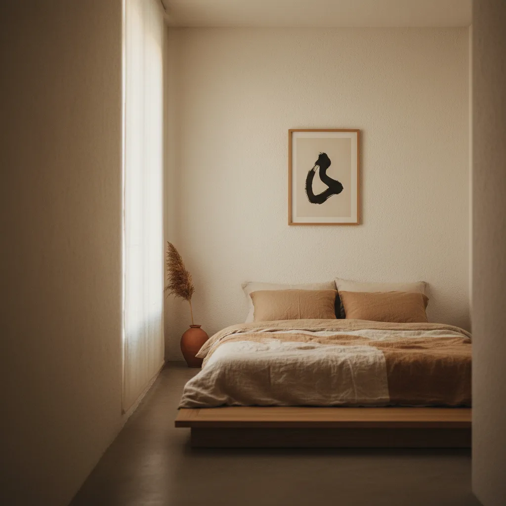
If you've been searching for japandi wall art ideas and keep landing on the same beige-blob abstracts and bamboo illustrations, you're not alone - and most of them are wrong for the style anyway. Japandi is specific. It has rules, even if those rules look casual. Get the art wrong and the whole room reads like a mood board that never got finished.
What japandi actually is (and what people get wrong)
The short version: Japanese minimalism crossed with Scandinavian warmth. The Japanese side brings negative space, asymmetry, and a kind of deliberate restraint. The Scandinavian side brings natural materials, soft neutrals, and the sense that a room should feel lived in. Together they produce interiors that are quiet without being cold.
What people get wrong is thinking any neutral print will do. Japandi isn't just beige. It's specific about texture, about empty space, about the weight a single object carries. A maximalist botanical print in muted tones is still maximalist. It doesn't belong here.
The best japandi wall art ideas by print type
Nature is the obvious category, but you need to be selective. A lone branch. A single stone. A horizon line with nothing else in the frame. Prints where most of the image is empty space are almost always right. Prints where the whole frame is filled with leaves and stems are usually wrong, no matter the color palette.
Abstract works well if it leans geometric and restrained - think ink wash, soft gradients, or simple shapes with a lot of breathing room. A single brushstroke on a pale background is a classic for a reason. What doesn't work is abstract art that reads as busy or energetic, even in neutral tones.
Black and white photography is underrated here. A misty forest shot, a close-up of weathered wood grain, a still-water landscape with minimal contrast - these fit the japandi register well and bring a bit of reality into what can otherwise feel like a very constructed aesthetic.
Check out the nature wall art and abstract wall art categories if you want to browse with this in mind.
Color: what the palette actually allows
Warm neutrals are the core - cream, warm white, sand, soft taupe, muted sage. Earthy tones like terracotta work in small doses. Deep charcoal and ink black work as accent colors, not dominant ones. Cold grays tend to push the room toward pure Scandi and lose the Japanese warmth.
One thing that trips people up: japandi isn't opposed to color, it's opposed to loud color. A muted dusty blue or a faded olive green can work perfectly. Bright yellow, saturated red, neon anything - no.
Size and placement matter more than people think
In a japandi room, one large print almost always beats a gallery wall. The style values the weight of a single object and the empty space around it. A gallery wall creates visual noise, even with cohesive prints. One 60x80cm piece of ink wash art on a pale wall does more work than four smaller ones arranged in a grid.
If you do want more than one piece, keep them the same size or close to it, leave real space between them, and make sure they share a tonal family. Two prints that fight each other in a japandi room will bother you every time you walk in.
What to avoid
Motivational quotes. Script typography. Anything with the word "hygge" on it. Heavily textured digital art that tries to look like oil painting. Busy botanicals. Anything that would also fit in a maximalist bohemian room - that's a sign the print doesn't actually belong here.
Also skip the literal interpretations - the "Japan-themed" prints with torii gates and cherry blossoms rendered in a tourist-poster style. That's not what the aesthetic is reaching for. The Japanese influence in japandi is philosophical, not decorative in that obvious sense.
A practical starting point
Pick one wall. Put one print on it. Make it large enough to hold the space without crowding it. Stick to the warm neutral palette, go for negative space over density, and resist the urge to add more once it's up. Give it a week. If the room still feels like something's missing, you probably need better furniture, not more art.
Browse wall art prints by category and filter toward nature and abstract - that's where the japandi-compatible options tend to live.