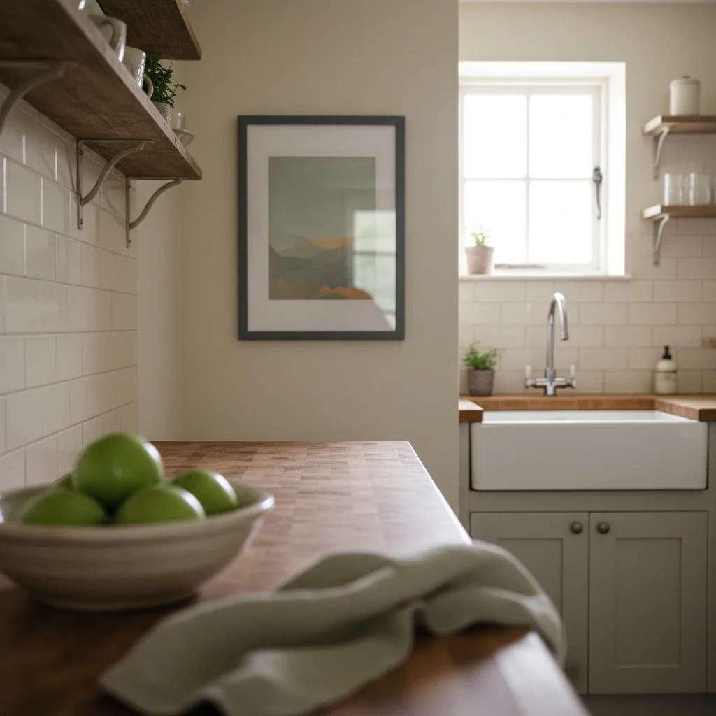
If you've been hunting for kitchen wall art ideas that don't turn grey and greasy inside six months, the honest answer is that most prints weren't designed for that room. Steam from boiling pasta, the low-grade smoke that comes off a pan of bacon, cooking oil that basically becomes airborne - your kitchen is a slow-motion hostile environment for paper and canvas. That doesn't mean you can't hang anything worth looking at. It means you need to think about material and placement before you order.
The real problem with kitchen wall art ideas nobody mentions
People pick art for the kitchen the same way they pick it for the living room - based on how it looks on a screen. Then they hang it two feet from the hob and wonder why the edges are curling by January. The culprit is almost always humidity plus heat cycling. Paper-based prints expand slightly when damp and contract when dry. Do that five hundred times and you get warping, color fade along the edges, and that specific sadness of peeling corners.
Grease is the other one. It settles on everything - you just can't see it accumulating. On a matte poster surface it's basically permanent. You can't wipe it without wrecking the finish.
Metal prints are the right call for high-heat zones
If you're hanging anything within two or three metres of actual cooking activity - above the counter, near the stove, on the wall next to the extractor - metal prints are the only format that makes real sense. The image is infused directly into a coated aluminum sheet. There's no paper, no canvas weave, no surface coating that grease can grip. A damp cloth gets it clean. They're also genuinely better looking than most people expect - sharper than canvas, with a slight depth to the image that works well with food photography, botanical prints, or anything with strong contrast.
Check out the full wall art range if you want to filter by format - metal is worth sorting for specifically if the kitchen is your target room.
Where canvas actually works in a kitchen
Canvas isn't useless, it just belongs in the right spot. A dining area that's physically separated from the cooking zone is fine. A breakfast nook with no direct line to steam. A hallway that leads into the kitchen but doesn't catch the splatter. The rule of thumb: if you wouldn't leave a piece of bread out on that surface and expect it to stay fresh for a week, don't hang canvas there.
Stretched canvas with a proper gesso ground does handle a bit of humidity better than a flat paper poster, but it's not waterproof and it's not grease-proof. Don't frame it with glass in a humid spot either - condensation builds up between the glass and the print and you get mold, which is a worse outcome than a warped corner.
What subject matter actually works on a kitchen wall
This is where people overthink it. Dark, moody botanical prints work. Strong graphic food photography works - a close-up of espresso, a well-shot lemon, that kind of thing. Abstract geometric pieces in earth tones work because they don't fight the warm palette most kitchens end up with. What doesn't work as well: anything with a lot of pale negative space, because grease makes it look dingy faster. Anything overly precious or delicate-looking - the visual context of a kitchen works against it.
For botanical and nature prints that translate well to the format, the nature wall art section has a decent selection that fits kitchen scale without looking like a restaurant chain chose it.
Size and placement - quick version
Most kitchen walls are interrupted by cabinets, shelves, or windows, so you're often working with a narrower vertical space than you think. A single medium print - around 40x50cm - tends to read better than a grid arrangement that competes with cabinet hardware. If you have a longer blank wall in a dining area, a horizontal diptych works and doesn't require the two pieces to be perfectly level with each other. A centimetre off is fine. Perfect symmetry looks staged.
Height matters more in a kitchen than most rooms because eye-line changes depending on whether you're sitting at a table or standing at a counter. Hang art you want to enjoy while sitting at about 145-150cm to centre. For a print you'll see while cooking, go a bit higher - around 160cm to centre - or it'll feel like it's at your feet.
One thing worth skipping
Inspirational text prints. "Good food, good mood" or whatever the current version is. They look dated fast, and a kitchen doesn't need to announce its own purpose. A strong image does more work and ages better. If you want text somewhere in the house, a notebook or postcard on the fridge gets the job done without committing wall space to it - postcards are cheap enough to swap out seasonally anyway.