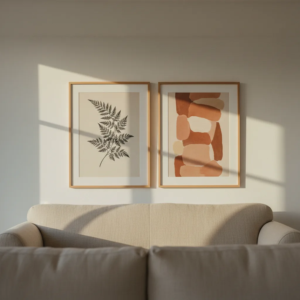
Wall art above a sofa is the most common decorating decision people overthink, then get wrong anyway. Too small, too high, slightly off-center, or just one lonely print floating in a sea of white wall. There's a formula that fixes all of this - and it's not complicated once you see it written out plainly.
The sizing rule nobody tells you upfront
Your art should cover roughly two-thirds of the sofa's width. That's it. That's the rule. If your sofa is 84 inches wide, you're looking for something in the 56-inch range - either one big piece or a grouping that fills that visual width. Go narrower than that and the art looks like a Post-it note on a wall. People do this constantly. They buy a 20x24 canvas for a three-seat sofa and wonder why the room feels off.
If you're going with a single large print - a canvas or metal print works well here - size up before you size down. You can almost never go too wide above a sofa. Too small is a permanent problem.
How high to hang wall art above a sofa
Bottom edge of the art sits 6 to 8 inches above the sofa back. Not 18 inches. Not eye level from across the room. Six to eight inches. That gap is what connects the art to the furniture and makes it read as one composition instead of two separate things happening on the same wall.
The instinct to hang things higher comes from a good place - people want the art to be visible - but it backfires. When you leave 14 inches between the sofa and the frame, the whole wall looks like it needs more furniture underneath the art. Trust the 6-8 rule, especially with anything over 20 inches tall.
Single large piece vs. gallery wall
Both work. Neither is objectively better. But they suit different situations.
One large print is lower effort and often higher impact. A single 40x60 abstract or a wide panoramic landscape above a sofa reads immediately. No arrangement decisions, no fussing with spacing. If you want something in that scale, the abstract prints tend to hold up well at large sizes - patterns and color fields don't get pixelated the way some photography does when you blow it up.
A gallery wall is better when you actually have 3 to 6 pieces you care about and want to display together. The mistake is treating it as a filler strategy - grabbing mismatched frames and random prints just to cover space. If you don't have a real reason for each piece in the group, go with one large print instead. Seriously.
What to hang there (and what to avoid)
Horizontal compositions work best above sofas. Wide landscape prints, horizontal abstract work, panoramic photography. Tall portrait-oriented prints can work as part of a grouped arrangement but they fight the horizontal line of the sofa when used solo.
Subject matter is mostly taste, but scale matters more than subject. A sharp, simple design at the right size will look better than a technically beautiful print that's too small. The nature category has a lot of wide-format options that suit this spot - mountain ranges, coastlines, forest shots.
Avoid anything with a lot of visual noise in a small format. Intricate detail work needs size to read properly. If it looks busy at 12x16, it will look chaotic at 24x32 in the wrong room.
Frames, canvas, or metal - does it matter?
For above-sofa placement, canvas prints without a frame are the most forgiving. They're lighter, easier to hang solo, and the wrapped edge gives you a clean look without needing to match a frame to your trim or furniture. Metal prints have a sharper, slightly harder feel - great for modern or industrial rooms, a bit out of place in warm traditional spaces.
If you go framed prints, keep the frame depth consistent across the wall. Mixed depths in a gallery arrangement look accidental, not curated.
The one thing that makes or breaks it
Level. Get it perfectly level. Not approximately level. A slightly tilted frame above a sofa catches the eye every single time someone sits down. Use a proper level, not the bubble level on your phone - those are off by more than you think. Measure twice from the sofa back before you put the nail in. Everything else in this formula can tolerate a small error. This one can't.