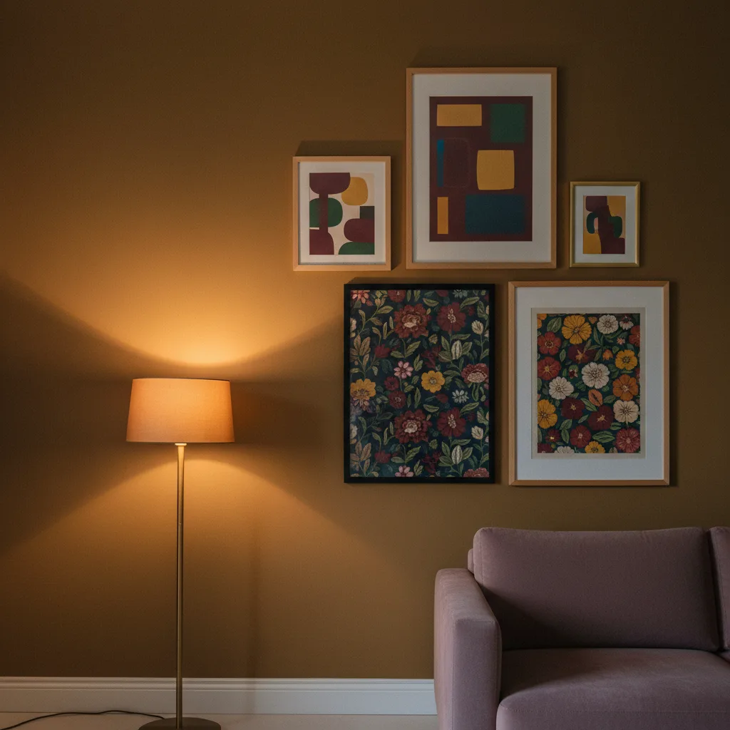
Maximalist home trends 2026 are not subtle and they were never meant to be. If you've been watching the Valentino and Versace runways for the past couple of years, you already saw this coming - clashing prints, heavy color blocking, zero apology for taking up space. That energy is now moving off the body and onto walls, and honestly it's about time. Minimalism had a good ten-year run but it started to feel like living inside a password reset page.
What maximalist home trends 2026 actually look like
The runway version is useful as a starting point but it's not a blueprint. Nobody is suggesting you hang seventeen pieces of art in a 9-square-foot bathroom. What the runway is actually telling you is this: stop treating your walls like they need to earn their keep by staying quiet. Color is load-bearing now. Pattern is allowed to be the main character. One enormous canvas of a black Porsche silhouette against a rust-orange background does more than three identically-sized frames of beige linen textures ever could.
The other thing the runway keeps showing - and this one is genuinely useful - is the idea of thematic confidence. Prada doesn't mix a little bit of everything and hope for the best. There's a point of view. Your wall should have one too.
The color story: what's actually moving in 2026
Deep jewel tones with black. That's the short version. Cobalt, oxblood, forest green - all of them paired with black rather than white, which changes the whole register from "pretty" to something with a bit more weight. Emerald green has been building since late 2024 and it's not slowing down. Pair it with a graphic print that has some darkness in it and you're ahead of where most rooms are right now.
Warm metallics are also threading through - not the chrome-and-glass thing from 2018, but gold and bronze used sparingly, almost like an accent that shows up once and then stops. A metal print in a warm finish can do this well. The wall art catalog at EnjoyPoster has options in that direction if you want to see what that looks like at actual print scale.
Layering without making it look like a storage unit
The failure mode of maximalism is just accumulation. More stuff, louder, closer together - that's not maximalism, that's procrastination about editing. The runway does maximalism by having a hierarchy. There's a focal print, then supporting elements, then texture. Your wall needs the same thing.
Pick one piece that makes the call on color and scale. Everything else responds to it. If the anchor is a large abstract canvas in deep blue and black, the secondary pieces can be smaller, can have more white space, can even be quieter - they're not competing, they're supporting. This is why abstract wall art works so well as an anchor in a maximalist scheme: it can carry strong color without being as directional as, say, a portrait.
What the runway gets wrong for home use
Two things, mainly. First, runway maximalism relies on the body moving through space - the garment changes as you walk, the proportions shift. A wall doesn't move. So the static version needs to be a bit more resolved, a bit less chaotic, or it just reads as busy rather than bold.
Second, fashion maximalism mixes historical references on purpose - 70s silhouette, 80s color, 00s hardware on the same look. That works because the viewer reads it as commentary. On a wall it mostly reads as indecision. Pick an era or a visual language and stay in it. Cyberpunk works. JDM car culture works. Automotive wall prints are having a real moment right now partly because they have a coherent visual identity - they're not trying to be five things.
The piece that actually does the work
Large format. That's it. Not ten medium prints. One large one, maybe two, and then you build around it. The runway equivalent is the statement coat - everything else is in service of that one garment. A 24x36 canvas print with real presence will do more for a maximalist room than a carefully arranged grid of smaller pieces. The grid approach is still minimalist thinking dressed up in louder clothes.
Buy the large thing first. Then decide what else the wall needs. Most of the time, the answer is less than you thought.