Mid century modern wall art gets misunderstood more than almost any other decorating category. People see a teak credenza and think any vaguely retro print will work. It won't. The style has a specific visual logic - organic shapes, flat color fields, a kind of deliberate optimism about geometry - and most generic prints fight against it instead of working with it.
What mid century modern wall art actually looks like
The era ran roughly 1945 to 1969, and the art that came out of it was reacting against two things: the heaviness of Victorian decoration and the austerity of wartime. So you get bold, clean, almost playful work. Think Alexander Calder's mobiles, Eames graphics, Danish poster art. Flat shapes. A limited palette - ochre, burnt orange, olive, teal, warm white. Lines that curve without being baroque about it.
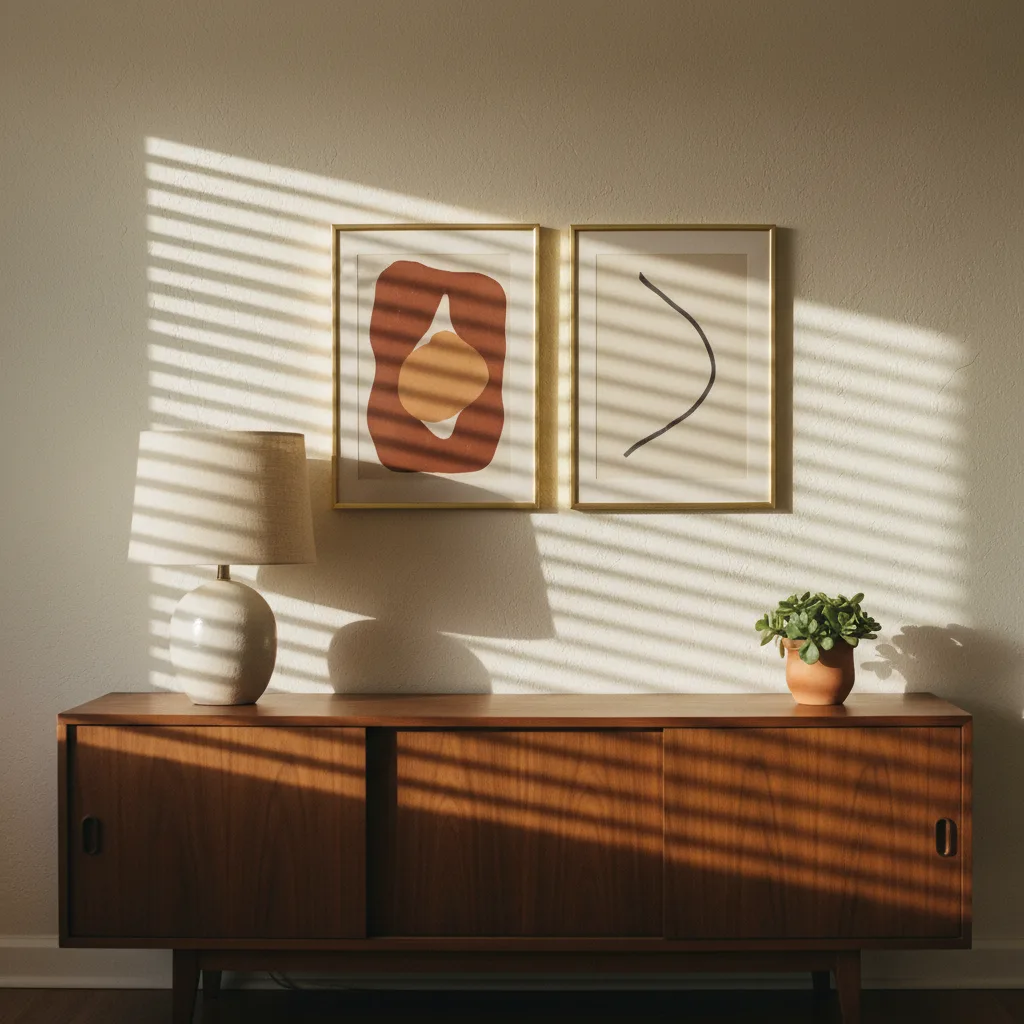
Abstract prints fit this look better than almost anything else. Not chaotic abstract - structured abstract. Shapes that suggest leaves, atoms, molecules, or just satisfying geometric arrangements. If the print looks like it could have been a textile pattern on a 1957 sofa, you're probably in the right territory.
Colors that work and colors that don't
Warm earth tones are the backbone. Terracotta, mustard, olive green, walnut brown, dusty teal. Cool grays and crisp whites work as neutrals but shouldn't dominate. What kills the look fast: neon anything, high-contrast black-and-white photography, or that washed-out beige palette that's all over modern farmhouse decor. Those aren't wrong in other contexts, they're just wrong here.
A two-color print with a cream background and a single bold shape in burnt orange will do more for a MCM room than a busy full-color photograph. Restraint is doing a lot of the work in this aesthetic.
Subject matter that fits (and what to skip)
Botanical prints work, especially stylized ones - not photorealistic, but illustrated. Geometric patterns with rounded corners. Retro travel posters, particularly anything with that flat-ink look from pre-digital printing. Animals work if they're rendered simply, almost like a logo. Abstract nature: sunbursts, leaf forms, bird silhouettes.
What doesn't fit: photographic landscapes, hyperrealistic portraits, anything with a lot of visual noise or fine detail. The style is about clarity. A print that asks you to stand close and study it is working against the room, not with it.
If you're browsing abstract wall art, filter toward the geometric and organic-shape end of the category. You'll find things that slot in naturally.
Scale and placement
MCM interiors tend toward one larger statement piece rather than a gallery wall packed with small frames. That's not a hard rule, but the style leans into negative space - a single 24x36 print above a credenza reads correctly in a way that seven small prints crammed together doesn't.
If you do want multiple pieces, keep them related. Same color family, same illustrative style, consistent framing. Three prints that feel like they came from the same designer's sketchbook work. Three prints that each do their own thing is just noise.
Frames and materials
Natural wood frames - light oak, walnut - fit the period. Thin black metal frames are fine and period-adjacent. Heavy ornate frames are the enemy. On material, canvas prints work well because the texture is warm. Metal prints are a harder call - they look more contemporary than retro, which can work if your room leans toward the late-MCM / early Space Age end of things, but they can also look out of place against warm wood furniture.
Browse the full wall art catalog and use the abstract and nature categories as your starting point. Filter by color if the tool lets you, and aim for prints with three colors or fewer. That constraint alone will keep you out of trouble.
One thing most guides won't tell you
A print from the actual era - a reproduction of a real 1950s poster or graphic - will almost always outperform a modern print trying to imitate the style. The proportions are right, the color relationships are right, the thing was made by someone who was living in that visual culture. If you can find reproductions of genuine mid century work, prioritize those over anything described as "MCM-inspired." Inspired means the designer got close but didn't quite get there.