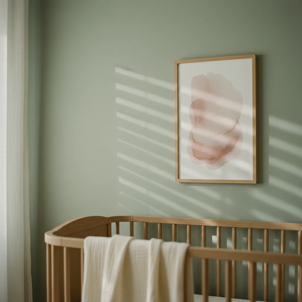
If you're hunting for nursery wall art ideas and keep landing on the same roundups of pastel bunnies and generic moon prints, you're not missing much - most of that content skips the part that actually matters: color. Not aesthetics. Not matching the crib. Color as something that works on a developing nervous system, which is a real thing pediatricians and developmental researchers have studied for decades, even if nobody in the home-decor space wants to talk about it in plain terms.
Why color in a nursery isn't just a style choice
Newborns can't process color the way adults do for the first few months - their vision is limited, contrast matters more than hue. But from around 4-6 months, color starts to register properly, and some palettes measurably increase arousal while others decrease it. High-saturation reds and oranges push cortisol up. Soft blues, muted greens, and warm neutrals do the opposite. This isn't design opinion, it's basic psychophysiology. A room with screaming-bright walls and maximalist prints isn't a stimulating environment, it's a stressful one.
Pediatricians don't usually hand out paint swatches at well-child visits, but if you ask them directly, most will say they prefer muted over saturated for sleep rooms. Muted wins.
The best nursery wall art ideas start with these color families
Soft sage green is probably the single most defensible choice for nursery art right now. It reads as calm without being cold, it's easy to pair with natural wood tones, and it has enough warmth to not feel clinical. Dusty blue is close behind - not the electric primary-school blue, the kind that leans slightly gray. Both sit in a visual register that doesn't fight for attention, which is exactly what you want when a baby is trying to settle.
Warm neutrals - think sandy beige, pale terracotta, off-white with a yellow undertone - work really well for art pieces that you want to feel present without dominating. A nature print in these tones, something with soft botanicals or a simple animal illustration, does more good than a bold character print in three saturated colors.
What to avoid: anything with strong contrast patterns used in large scale. Graphic black-and-white checks, high-contrast geometric repeats. Those are actually fine as developmental stimulation tools in small doses during awake time, but on a wall they don't turn off, which is the problem.
Format matters as much as color
A single larger print at low-to-mid height (where a baby lying in a crib can actually see it) does more than a gallery wall stuffed with eight small frames. Babies can't scan a whole wall the way you can. One focused point, not a panorama. If you want to do multiple pieces, keep them in a tight cluster rather than spread across the whole room, and make sure they share the same palette. Tonal consistency is doing real work here.
Canvas prints work well in nurseries because there's no glass to worry about and they don't produce harsh reflections under nightlights. Wall art printed on canvas also tends to sit flush and feel softer in a room than a framed poster - less clinical somehow, even when the print itself is identical.
Nature themes hold up better than character themes
Character prints from licensed media are a trap. The kid will grow out of the franchise faster than you'd believe, usually right around the time you've fully committed to the theme. A print of a sleeping fox in warm earthy tones, or a watercolor mountain scene in dusty blues and greens, ages with the room. You can keep it through toddler years and honestly through early school age without it looking wrong.
The nature wall art category covers a lot of this - botanicals, landscapes, simple animal art - and most of it happens to sit in exactly the muted palette that works for nurseries. That's not a coincidence. Soft colors read as natural, natural reads as calm.
One thing people consistently underestimate
The ceiling. Babies spend a serious amount of time looking straight up. A mobile gets all the attention, but a single calming print on the ceiling above the changing table or crib? Almost nobody does it, and it's cheap and genuinely effective. A pale abstract in soft green or blue, nothing with edges that are too sharp. Think about what they're actually looking at.
For the walls themselves: abstract prints in muted tones are underrated for nurseries because they carry color without narrative, meaning the baby's brain isn't trying to process a story, just a feeling. That's a small but real distinction when you're trying to build a room that settles rather than stimulates.