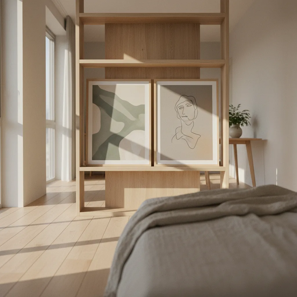
Studio apartment wall art ideas tend to land in two camps: people slapping one big canvas above the bed and calling it done, or people overcrowding every surface until the place feels like a storage unit. There's a third option that most guides skip - using prints as soft dividers that signal "this is the bedroom" or "this is the living area" without any furniture rearrangement or a single IKEA shelf unit blocking your light.
Why wall art works as a room divider in the first place
The brain reads visual boundaries faster than physical ones. Put a cluster of three large prints on the wall at the foot of your bed and your eye reads "zone change" when you cross that line. It's not magic, it's just how we parse space. A bookshelf does the same thing, but it takes up floor space and cuts your light. A gallery arrangement on the wall takes up nothing except the wall, which you weren't using anyway.
The prints need to be large enough to register as a boundary - a single 8x10 won't do it. You want at least one piece hitting 24 inches or wider, or a tight grouping of three smaller ones that collectively read as a block.
Choosing the right studio apartment wall art ideas for zoning
Contrast is the tool here. If your sleeping area has warm, low-key prints - think moody nature shots, earth-tone abstracts, something quieter - and your work-or-living area has something bolder, the shift in visual energy does the dividing for you. You walk past that wall cluster and something in your head switches gears.
A few combinations that actually work:
- Sleeping zone: desaturated landscape or soft abstract canvas. Living zone: high-contrast graphic print or something with real color punch - bold automotive art, a sharp geometric.
- Sleeping zone: warm botanical poster. Living zone: something with cooler tones, a cyberpunk cityscape, dark blue abstract.
- Sleeping zone: personal, a bit sentimental. Living zone: purely visual, almost decorative.
The point is that the prints don't match across zones. That's on purpose. Matching everything wall-to-wall turns a studio into one undifferentiated room again.
Placement: where to hang and how high
Standard advice says eye level, center at 57 inches. That works for single pieces. For a divider cluster, go slightly higher and tighter - you want it to feel like a panel, not like individual pictures floating at random heights. Hang them with maybe 3-4 inches between frames. Any more than that and the grouping dissolves into separate objects instead of one visual unit.
The wall at the foot of the bed is the classic studio divider wall, but the wall adjacent to your kitchen counter works too. Anything that sits perpendicular to how you move through the space will read as a threshold.
Canvas vs. poster: what holds up in a small space
Posters in frames are fine, but canvas prints have a slight edge in a studio because they have depth - literal physical depth off the wall, a few centimeters - and that makes them read as objects rather than paper. In a room where you're living very close to everything, that small tactile distinction matters. You can check the wall art section and filter by canvas if that's the direction you want to go.
Metal prints are worth considering too if you want something that reflects light and makes a small wall feel less flat. A dark abstract or a car print on metal in a studio with decent natural light will look genuinely different at different times of day. That kind of visual variation is useful when you're staring at the same four walls constantly.
How many prints is too many
For a true studio - one room, under 500 square feet - two distinct groupings maximum. One for the sleeping zone boundary, one somewhere in the living area, probably above the sofa or desk. More than that and you're just covering walls, which is a different project entirely.
Pick your two anchor walls, commit to them, and leave the rest alone. Empty wall in a small space isn't failure, it's breathing room. The prints you do hang will read louder for it.
Where to start if you don't know what to buy
Honestly, pick the zone you spend the most time in and decide how you want it to feel. Then work backward to a print. Abstract prints in the abstract category are a reliable starting point for living areas because they're visually active without being too literal. For sleeping zones, nature and landscape prints tend to do the job without demanding too much attention when you're trying to wind down. If you want something bolder for the living side, the cars section has high-contrast pieces that hold a wall without needing a second print nearby.
Start with one grouping. See if your brain starts reading the space differently after a week. It usually does.