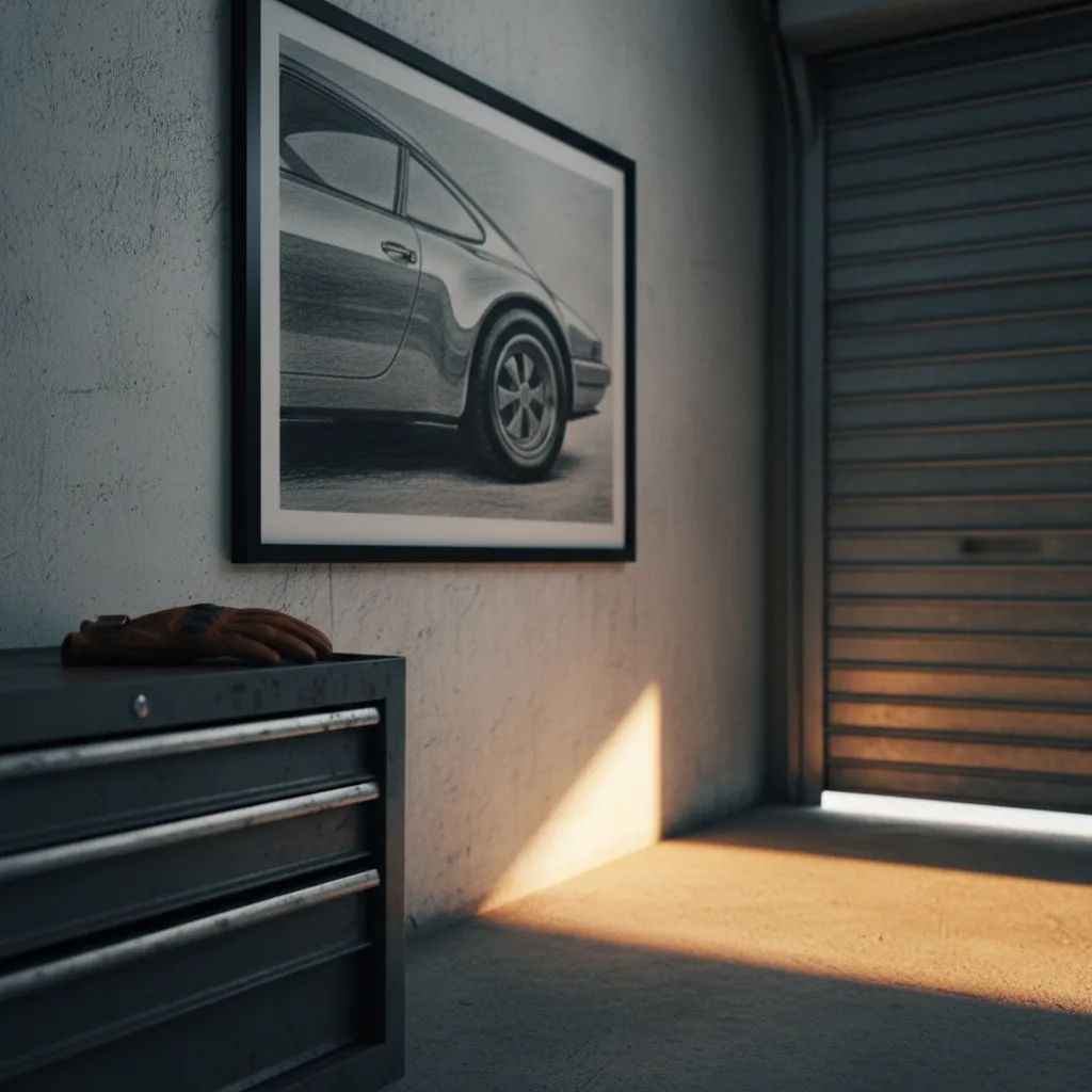
If you're hunting for Porsche wall art ideas that don't look like they came off a gas station spinner rack, you've probably already noticed the problem - most of what shows up in search results is the same three angles of a 911 in red, printed soft and framed in black. It's not bad exactly. It's just boring, and Porsche cars deserve better than boring.
Why most Porsche prints miss the point
The 911 is the obvious choice, and I get it. But when every print is a gloss red Carrera shot head-on against a white background, the subject stops mattering. It could be any sports car. The whole point of Porsche - the flat-six sound, the rear-engine weight bias, the way a 356 looks like it was drawn by someone who genuinely loved the shape - that stuff disappears when the image is just "red car, clean background."
Good car art captures something specific. A detail. A moment. A particular model that actually meant something to someone.
The best Porsche wall art ideas by car and style
The 911 is fine, but consider the 930 Turbo with that absurd whale tail. Or the 959, which looked like a concept car that somehow made it to a road. The 718 Boxster has a shape that rewards close-up photography in a way the 911 doesn't. And if you want something that stops people mid-step, a vintage 356 Speedster in almost any rendering does it - the lines are just clean in a way that works as art separate from the car context entirely.
Style matters as much as model. A black and white long-exposure shot of a 911 GT3 RS on track reads completely differently from an oil-style illustration of a 550 Spyder. One is a photograph, the other is closer to a painting. Both can work. Neither is wrong. What's wrong is picking something that looks like a stock photo that also happens to feature a Porsche.
If the room already has a lot going on - warm wood, patterned rug, mixed furniture - a line-art print or a minimal two-color illustration will sit better than a high-contrast photo print. If the wall is plain and you want the art to carry some weight, a large canvas with actual tonal range earns that space.
Canvas vs. metal for Porsche prints - an honest take
Canvas is the default and it works, but metal prints do something specific with automotive photography that canvas doesn't. The metallic substrate picks up the shine on bodywork in a way that feels right for a car that was built to look good. A Porsche in a dark studio shot, printed on metal, looks intentional. Same image on canvas looks a bit flat by comparison. Worth considering if the image has deep blacks and chrome.
You can browse the cars wall art section and filter toward whatever finish you're after - the product options are clearer when you're actually looking at a specific print rather than guessing.
Framing and sizing - don't cheap out here
A 12x16 print on a large wall just looks like you weren't sure about the art. Porsche prints specifically - especially the iconic silhouettes - need room. 24x36 is a solid minimum for a solo piece. If you're doing a pair or a triptych, smaller works, but the individual prints still need to be large enough that the detail reads from across the room.
Framing in black is the safe answer and also a bit of a cop-out. Thin natural wood or a dark walnut frame does more interesting things with both warm and cool images. If you're going frameless canvas wrap, make sure the image itself doesn't have critical detail right at the edge.
Porsche wall art as a gift - what actually works
If you're buying for someone else, skip the generic 911 unless you know for certain that's their car. Ask what they drive or what era they love. A person who grew up watching Group B rallying has different feelings about a 959 than someone whose first car poster was a 2005 Carrera S. The specificity is the gift.
A mug or a phone case with a matching print makes a decent pairing if you want to give a bit more. For the walls specifically, a large canvas print in a model they actually care about lands harder than anything in a gift bag.
Get the model right. Get the size right. Don't print it small.