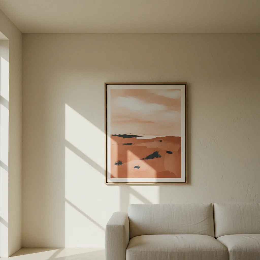
If you've been staring at a bare wall and thinking about filling it with a cluster of small frames, stop. The large wall art statement piece is a cleaner idea, a faster one, and honestly just better-looking in most rooms. This isn't about budget or trends - it's about how walls actually work.
Why the gallery wall became a trap
The gallery wall got popular because it felt low-commitment. You could start with two frames and add more forever. The problem is that most people never stop at the right moment. You end up with seventeen mismatched sizes, mixed frame colors, and a layout that took three hours to hang and still looks slightly off. The wall becomes noise. Your eye doesn't land anywhere - it just wanders and gives up.
Small prints fight each other. Each one is asking for attention at the same time and none of them get it. That's the real issue, not aesthetics or personal taste.
What a large wall art statement piece actually does to a room
One oversized print - something in the 24x36 range or bigger - gives the wall a job. Your eye goes there first, registers it, and then moves on to the rest of the room with some context. The space feels intentional. It doesn't look like you bought things over a long period of time and just hung them as they arrived.
There's also something about scale that makes a room feel larger, not smaller. A big canvas on a living room wall pulls the wall back, visually. A grid of small frames does the opposite - it closes the room in, makes it busier.
Concrete example: a 40-inch wide car print on a white wall above a low sofa. Done. The whole corner has an identity now. You could browse car wall art for twenty minutes and find something that carries that weight. One print, one decision.
The situations where small prints actually make sense
To be fair - narrow hallways. Stairwells. A small bathroom where a massive canvas would just be absurd. These are the real exceptions, not excuses to default to small everywhere. If you're working with a wall that's under four feet wide, a single large piece might not fit. Go smaller there. But that's genuinely a minority of walls in most homes.
Also, if you have a series - like three photographs from the same trip or a triptych print designed as one image split across panels - that's different. That's still one visual idea, just distributed. It reads as one piece. The problem is random assortments, not multiple frames per se.
Picking the right large print for your wall
The main mistake people make is ordering something that sounds large and discovering it's still too small on the actual wall. Measure first. A 24x36 poster looks big on a screen and relatively modest on a wall with nine-foot ceilings. For most living room feature walls, you want to be thinking 30x40 minimum, or a canvas in the 36x48 range if the wall can handle it.
Subject matter matters too. Abstract prints, big landscapes, and high-contrast photography all scale well. Detailed illustrative work with tiny elements can get lost if the viewing distance is more than six feet. Bold and simple reads better big.
For actual options, the wall art catalog has canvas prints and posters sorted by category - cars, nature, abstract, pets - and most can be ordered in larger sizes. Worth filtering by size before you fall in love with something only available at 12x16.
One more thing about commitment
People resist the large print because it feels more permanent. Like you're really deciding something. And yes, a 40-inch canvas is harder to swap out than a small poster in a clip frame. But that's also why it works - it's a real choice, and the room reflects that. Walls full of small interchangeable things look like you haven't decided yet. That comes through, even if you can't name why the room feels unsettled.
Make the call. Pick one strong image, order it big, hang it centered. The room will look like someone lives there on purpose.