The color of the year 2026 decor conversation started the moment Pantone and a handful of competing forecasters dropped their picks, and the internet split pretty cleanly: half the people want it everywhere, half think it belongs in a museum and nowhere near their living room. Both camps are right, actually. The color - a deep, mineral-heavy blue-violet sitting somewhere between midnight and bruise, closer to what Pantone calls a "quiet intensity" than anything cheerful - is genuinely beautiful in small doses and genuinely suffocating when you go too hard on it. The good news is you do not need a single can of paint to get it right.
What the color of the year 2026 actually looks like in a room
On a swatch card it reads almost navy. On a wall under warm lighting it pulls more purple. On a north-facing wall in a UK flat it will look almost black by 3pm in January. That unpredictability is exactly why painting with it is a gamble most people lose. You spend a weekend on it, hate it by Thursday, and now you have a repainting project on your hands.
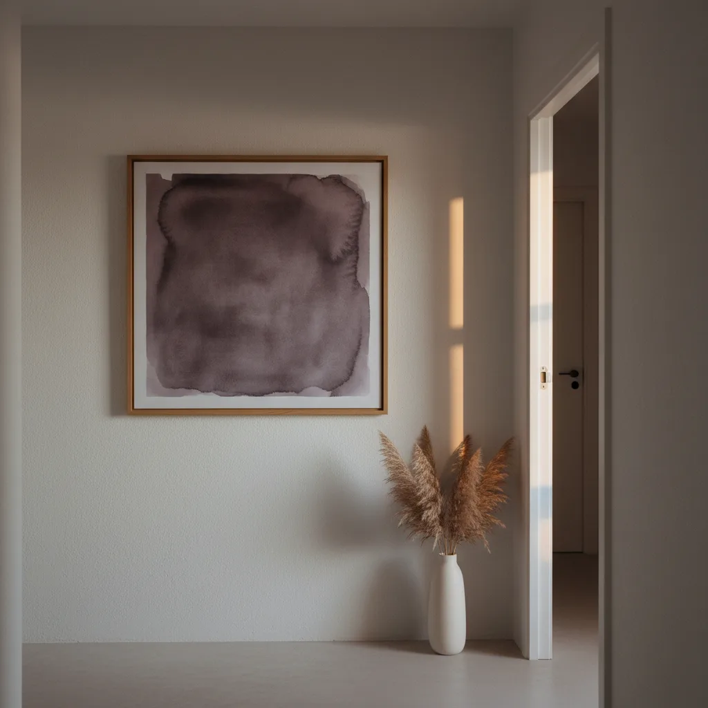
The smarter move is to bring the color in through prints and canvas. A 24x36 canvas in that blue-violet range gives you the weight of the color without the commitment. You can move it. You can swap it out in a year when the next color of the year arrives and everyone has already moved on.
Why wall art beats paint for trend colors
Paint is a six-hour job minimum. Primer, two coats, dry time, putting the furniture back. And trend colors are, by design, cyclical - they are hot for 18 months and then they start looking dated. Spending that kind of labor on a color with a shelf life is a bad trade.
A canvas print or a large-format poster costs a fraction of a paint job, ships to your door, and hangs in 10 minutes. If the color stops working for you, you take it down. That's the whole argument. Wall art is just a more rational way to chase a trend color than repainting.
The prints that actually carry the 2026 color well
Abstract prints are the obvious fit - loose, dark, gestural work in that blue-violet palette reads exactly like intentional 2026 decor without screaming "I just read a trend report." Nature photography with a cool cast works too: twilight ocean shots, overcast forest scenes, anything where the ambient light is doing that desaturated blue thing. Check the abstract wall art and nature wall art sections - there's a lot there that sits right in this palette without being labeled as such.
What does not work: trying to force a bright, warm-toned print into this conversation just because you own it. The 2026 color is cool and low-saturation. A vivid orange sunset poster next to it will fight it, not complement it.
Placement matters more than you think
One large piece over a sofa or bed reads as intentional. A cluster of three smaller prints in the same palette on a hallway wall works too. What looks accidental - bad accidental - is a single small print in the 2026 color floating on an otherwise beige wall with nothing anchoring it. The color is strong enough that it needs context: either enough surface area to hold its own, or enough company from similar tones in the room (cushions, a throw, a rug) that it does not just look like a mistake.
Other ways to get the color without the wall
If you are not ready to commit even a canvas to this, there are lower-stakes options. A mug in that blue-violet glaze on your desk every day is a surprisingly effective way to live with a color before you scale it up. Same with a notebook. These sound minor but color relationships in a space build gradually - you start to know whether you actually like a hue or just liked it on a mood board.
Honestly, the people who regret trend colors are usually the ones who went all-in on day one. Start with one print, one canvas, one small object. Give it a month. You will know.