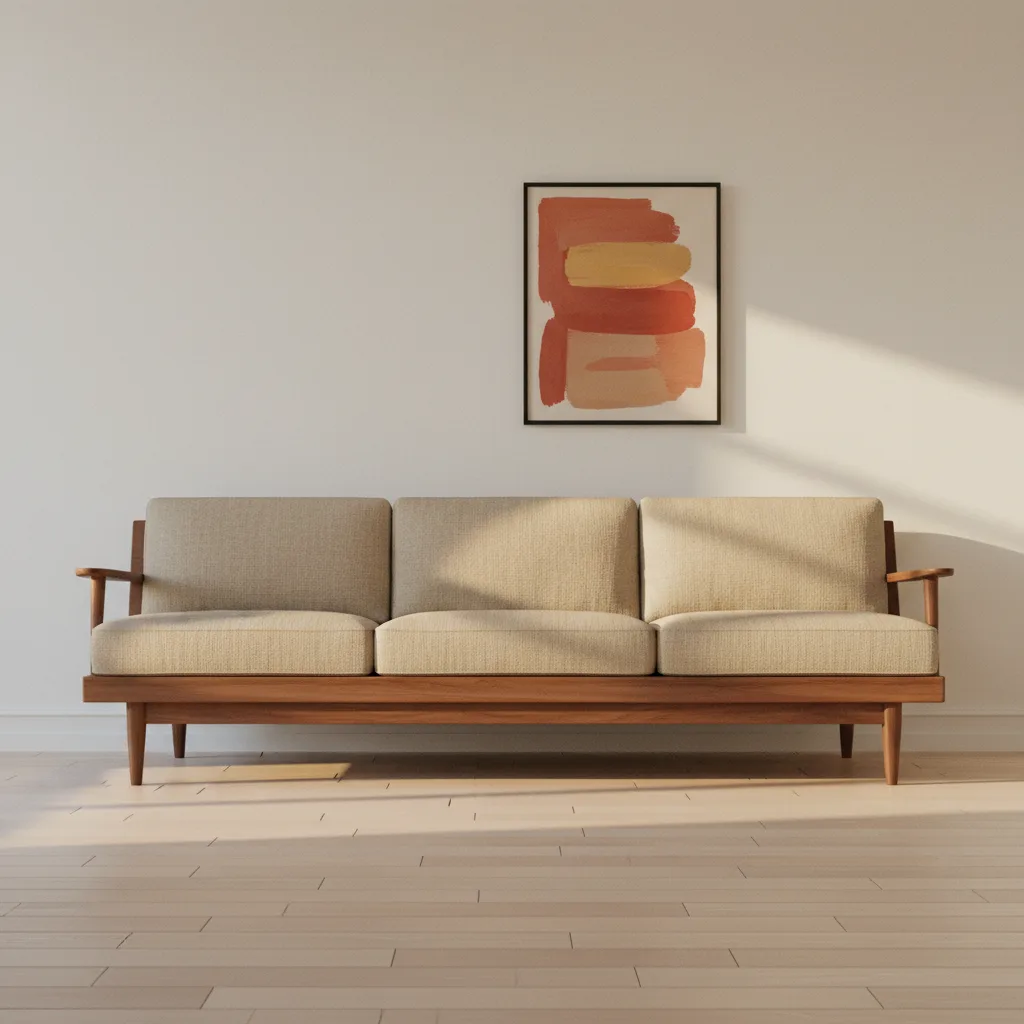
Wall art and furniture mismatch is one of the most common reasons a room looks "off" even after you've spent real money on it. The sofa is good. The rug is good. But something about the whole thing sits wrong, and you can't figure out what. Usually it's the wall.
Why wall art and furniture mismatch happens in the first place
Most people buy furniture and art at completely different times, from completely different headspaces. The couch gets bought on a Saturday with a tape measure and a budget in hand. The print gets bought six months later on a whim because it was on sale and you needed something on that blank wall. Those two objects were never meant to meet each other - they just ended up in the same room.
That's the root of it. Furniture is functional so people research it. Art is decorative so people treat it as an afterthought. But art takes up visual real estate the same way furniture does. Sometimes more, because your eye travels to the walls before it lands on anything else.
Scale is the first thing that goes wrong
A small print above a large sectional sofa looks like a postage stamp on a billboard. The sofa wins, the print disappears, and the wall looks like it's apologizing for existing. The reverse - a giant canvas over a small console - is less common but equally awkward. The art overwhelms the furniture beneath it and the two pieces look like they belong in different apartments.
The rough rule: art width should sit somewhere between half and two-thirds of the furniture it's hung above. Not a perfect science, but if you're way outside that range, you'll feel it.
Tone and color mismatches that people ignore
A high-contrast black-and-white abstract print on the wall behind a warm, earthy mid-century sofa - those two things are having an argument. Neither is wrong on its own. Together, they're exhausting to look at because they're pulling in opposite directions with no resolution.
This doesn't mean everything has to match. A cool-toned abstract print can work with warm furniture if the framing or background gives the two something to agree on. But when there's zero tonal conversation between the art and the furniture, the room feels restless. You just don't always know why.
If you're working with dark, moody furniture - think deep leather, walnut, charcoal upholstery - something like a bold abstract canvas print with depth and contrast tends to hold its own. Pale pastels get eaten alive in those rooms.
The furniture-heavy room with no art
Also worth saying: a room with expensive, well-chosen furniture and literally nothing on the walls isn't minimalism. It's just an unfinished room. People mistake bare walls for sophistication sometimes. It's not. It reads as empty, and all that good furniture floats in a void without anything to anchor it visually.
One strong piece of wall art does more for a room than three mediocre ones arranged in a gallery grid. If budget is a concern, buy one thing that actually works and stop there.
When the art is fine but the placement kills it
Hung too high is the most common placement mistake. People hang things at eye level when standing, but you're usually sitting in a living room. Art should be centered around 57-60 inches from the floor, which is roughly seated eye level. Hung at 72 inches, the art and the furniture beneath it stop talking to each other entirely - there's just a gap of dead wall between them.
Also: that gap. Six to eight inches between the top of the furniture and the bottom of the frame is about right. More than that and they look unrelated. Less and it looks like the art is resting on the furniture.
Fixing it doesn't require starting over
If your furniture is already bought and you've got a mismatch, the art is the easier thing to change. Figure out the dominant tones in your furniture - wood finish, upholstery color, rug pattern - and find a print that shares at least one of those tones without copying them exactly. Check the scale. Rehang at the right height.
For rooms built around specific furniture styles - industrial, mid-century, Scandinavian, maximalist - browsing by mood rather than subject matter helps. A large abstract print works across more furniture styles than a landscape because it leads with color and form rather than content.
It's not complicated. It just requires thinking about the two things together instead of separately, which almost nobody does the first time around.